
By Andrew Elliott
Introduction
For some reason, few people discussed the design process for the Canadian National Railway Company’s (CN) logo that came after the initial creative spurt of doodles that led to the iconic CN “noodle” unveiled in 1960. As we noted in the previous post, Library and Archives Canada has an extensive collection of material relating to the development of the new CN corporate logo.
The company had invented itself in the aftermath of World War I and tried out a number of logos and slogans including the memorable “The National Way,” which appears to have been used within a logo between 1919 and 1921 (as seen in the following image from a 1920 Canadian National Railways Magazine) and more broadly during the 1920s.

CN logo and slogan from a January 1920 edition of the Canadian National Railways Magazine. (OCLC 933318325)
Later, the 1959–1969 period was one of corporate reinvention for CN. Much of the reinvention had occurred in the 1950s, with upgrades to rolling stock, increased services to passengers and a phase-out of steam locomotives in favour of diesel. The creation of the new logo in 1960 came with the herculean task of making the reinvention visually attractive to the travelling public, as well as to CN employees. Today’s blog post will look at how the logo became fully incorporated within the company and out to the general public. The long-term impact of this extraordinary visual redesign implementation is quite an interesting story.
Visual redesign in practice: bringing the logo on-board
How do you impose a new logo design on the vast corporate network? One of the first places where the visual redesign team decided to put the CN logo was on the 1960 annual report. This introduction to the logo was quickly followed by the publication of a number of issues of the newly revamped employee magazine (formerly Canadian National Railways Magazine, now Keeping Track) devoted to aspects of the logo and its importance within the field of design.
The visual redesign team also received some awards. Former CN employee Lorne Perry wrote that they were the recipients of a number of prestigious awards from design organizations in Canada, the United States and overseas. At one Design Canada seminar, the head of the organization gave CN public commendation for being one of the first major companies to, as they called it, export big city design to the Canadian hinterlands.
Additionally, a lot of work was done to refresh the look of the company inside out and top to bottom, including upgraded train interiors supported by modern exterior schemes. Anybody could experience the finest in modern interior design and furnishings for price of a train ticket. In other words, the train sets were a mobile design exhibit for all to see. However, upgraded train interiors was just a small fraction of the overall refurbishment.
The visual redesign team worked closely with Valkus Inc. to deal with the enormity of the task. As mentioned previously, James Valkus was one of the hotshot graphic designers from New York who had helped with the initial logo design.
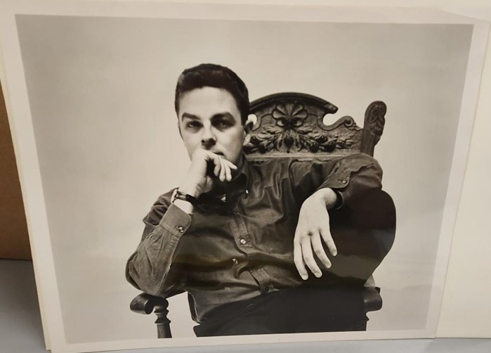
James Valkus, ca. 1963. (MIKAN 189541)
From 1960 to early 1968, CN retained his design firm’s services to provide overarching design guidance to help with the implementation of various aspects of the CN logo. The legal agreement drawn up between Valkus and CN is worth noting, as it indicates that CN was prepared to pay the firm up to $60,000 in the first six months of work if their design was chosen, and then $120,000 per year after the fact to help implement it. These are substantial sums for that time period. In subsequent years, the yearly fees varied around that figure.
Valkus broke down the various materials relating to the railway into some broad categories: train graphics; train objects; hotel graphics; hotel objects; station graphics; and station objects. He then broke it down further with what specifically needed to be updated. In the contract between CN and Valkus in 1962, the following items were listed:
- Motive power and car equipment
- Motor vehicles
- Maintenance of Way equipment
- Signs
- Manuals
- Forms and miscellaneous printed matter
- Keeping Track magazine
- Uniforms
- Promotional materials
- Advertising displays
In fact, Valkus and the visual redesign team asked various CN departments for more comprehensive lists of what required change. For example, the following four pages detail the magnitude of change needed to be brought to the CN Sleeping and Dining Car Department:

Four pages detailing changes to designs on items needed to be made within the CN Sleeping and Dining Car Department. (MIKAN 5891012)
It is worth noting that the visual redesign also extended to CN’s subsidiary companies, so CV (Central Vermont) and GT (Grand Trunk) corporate symbols were redone to mirror the simplicity of the CN noodle. In the late 1960s, even CN Hotels got their own logo, which was a red key.
During this time period, Allan Fleming had less to do with the actual work done at CN, and his services were mostly background consultancy work. Once the various designs for railway objects had been identified by the visual redesign team and Valkus had found new ways to incorporate the logo onto these objects, the information was then sent to a variety of advertising firms to be turned into publicity for the company.
Stay tuned for part 2 of this blog post.
For further information about the CN logo, please read about the Allan Fleming Project by Martha Fleming:
The following resources also provide some further reading on the subject:
- CN logo evolution (Canadian National Rail) | Logo Design Love
- The CN Brand | cn.ca
- CN Logo Designed by Allan Fleming & CN Brand Guidelines & History (imjustcreative.com)
- The CN Logo: A Masterpiece in Corporate Design, by Andrew Elliott, Library and Archives Canada Blog
Andrew Elliott is an archivist in the Archives Branch at Library and Archives Canada.
