
 Canada: Who Do We Think We Are? is a new exhibition by Library and Archives Canada (LAC) marking the 150th anniversary of Canadian Confederation. This exhibition is accompanied by a year-long blog series.
Join us every month during 2017 as experts, from LAC, across Canada and even farther afield, provide additional insights on items from the exhibition. Each “guest curator” discusses one item, then adds another to the exhibition—virtually.
Be sure to visit Canada: Who Do We Think We Are? at 395 Wellington Street in Ottawa between June 5, 2017, and March 1, 2018. Admission is free.
Mary Miles Minter in Anne of Green Gables … from the four famous “Anne” books, Realart Pictures, 1919
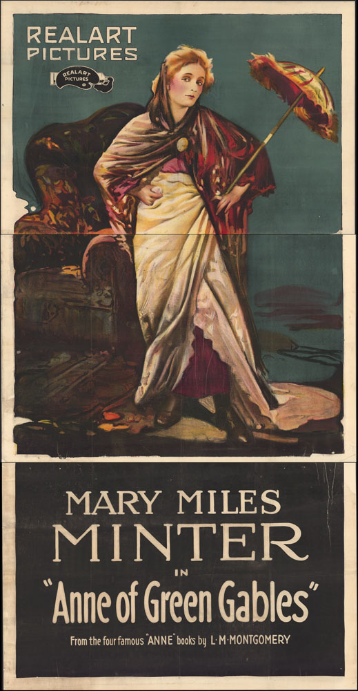
A colour lithograph poster of actor Mary Miles Minter in Anne of Green Gables from Realart Pictures, 1919 (AMICUS 27641454). “Anne of Green Gables” is a trademark and a Canadian official mark of the Anne of Green Gables Licensing Authority Inc.
You may not have recognized Lucy Maud Montgomery’s red-haired heroine from this American movie poster. It presents one of the earliest mass-produced images of “Anne.” She has since become a regulated symbol of Canada.
Tell us about yourself
My curiosity about artists’ materials and techniques has taken my research in many directions, from the pastels of Edgar Degas and other 19th-century artists to the complex printmaking techniques of Canadian artist Betty Goodwin. I have been practicing paper conservation for over 30 years, treating everything from Old Master prints to huge contemporary drawings. As well, I have a special love for weaving, playing the cello, and oversized paper artefacts that present great challenges in treatment and mounting.
Is there anything else about this item that you feel Canadians should know?
Our poster of Anne of Green Gables is rare. Like newspapers, movie posters are ephemeral objects that are not intended to have a long lifespan. These types of objects are usually printed on poor quality papers that were never meant to withstand the ravages of time, which makes the survival of our Anne of Green Gables poster so special.
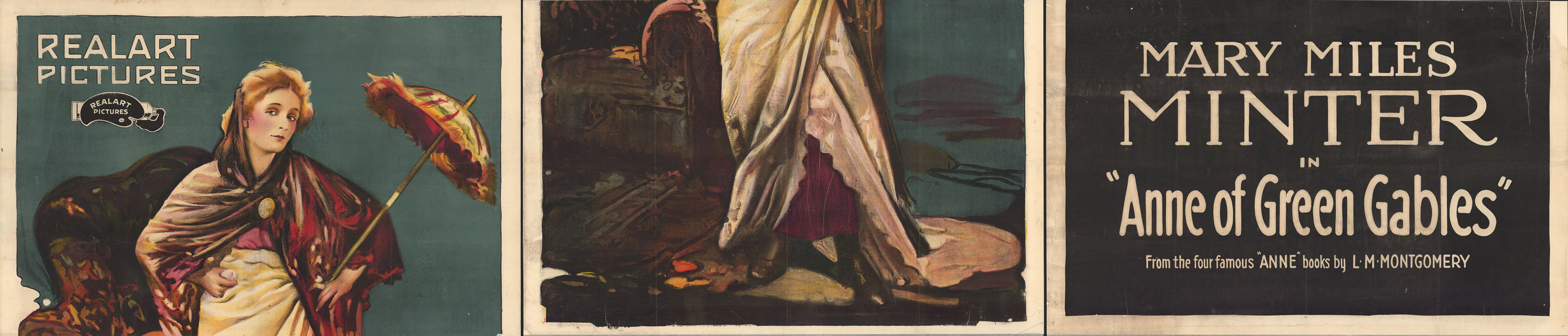
Figure 1. Three separate sections of the Anne of Green Gables poster (AMICUS 27641454). “Anne of Green Gables” is a trademark and a Canadian official mark of the Anne of Green Gables Licensing Authority Inc.
This 1919 poster was made with a process called lithography, a common printing method used at the turn of the century to mass-produce commercial products like posters, maps, advertisements and packaging. Lithography was invented in 1799 by Alois Senefelder and named for the limestone printing surface, from the Greek lithos, meaning “stone.” It became a popular and inexpensive way to create colourful, luminous images by the late 19th century. Unlike other printmaking processes, lithography is based on a chemical principle: oil and water do not mix. To make a lithographic image, the artist draws directly on the specially treated stone surface. A chemical process makes the greasy drawing receptive to the greasy printing ink, while the non-image areas are kept wet to repel the ink.
Because of its size, our poster was drawn on three separate stones and printed on three pieces of paper (Figure 1). Looking at the sides of the image, we can see the irregular edges of the lithographic stones (Figure 2). The thin white lines throughout the image are printing creases. The thinness and size of the paper make it difficult to place the sheets smoothly on the stone, hence the fine wrinkles that open after the ink is dry, leaving these characteristic white marks (Figure 3). In this detail, we can see that the artist used a greasy crayon to draw the image on the lithographic stone, and also applied the greasy ink in a fine spray. Colours are added by using additional stones that are printed in overlapping transparent inks (Figure 4). Special registration marks help guide the printer as each consecutive stone is printed (Figure 5).
Only four overlapping colours (red, yellow, blue and black) were used to produce this colourful image of Anne of Green Gables!
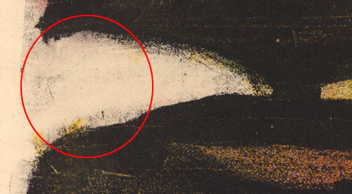
Figure 2. Detail of uneven edge of the lithographic stone

Figure 3. Detail of printer’s creases
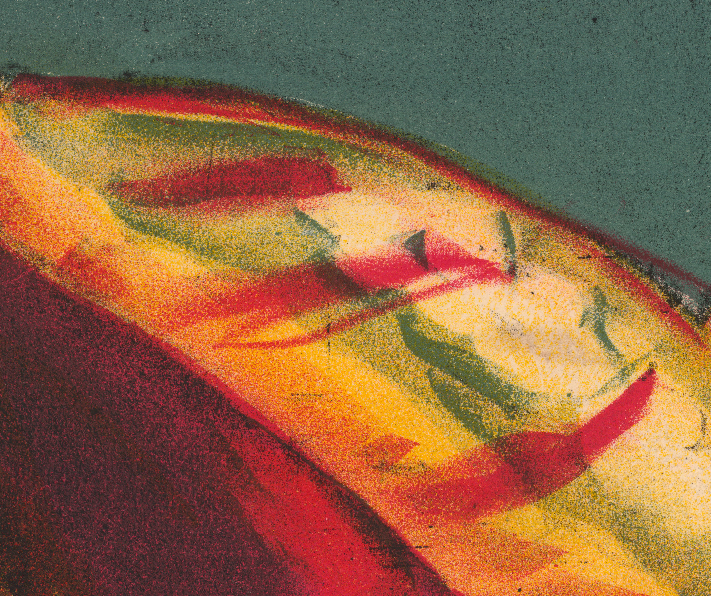
Figure 4. Detail of overlapping, transparent colours.

Figure 5. Detail of registration marks
Tell us about another related item that you would like to add to the exhibition
The Dionne Quintuplets come to mind as another example of celebrated Canadian icons (Figures 6, 7). In 1934, the “Quints” became international celebrities as the first documented surviving multiple-birth infants. In their early years, they were the subject of three feature films and drew tourist crowds to their small town in northern Ontario. The Quints provided lucrative endorsements for many products, like Quaker Oats, featured in this poster.
Like the Anne of Green Gables poster, this image of the Quints (“Quins” on the poster) was mass-produced using the lithographic printing method. The poster was intended to be used as a three-dimensional standing display and has suffered wear and tear from physical handling. It was recently conserved for an exhibition, and the treatment was kept to a minimum to preserve the evidence of its use. The poster was stabilized by repairing tears and replacing the deteriorating cardboard backing with a sturdier archival material. Damages from abrasion and use were reduced through careful toning with watercolour to make the image more readable (Figures 8, 9).
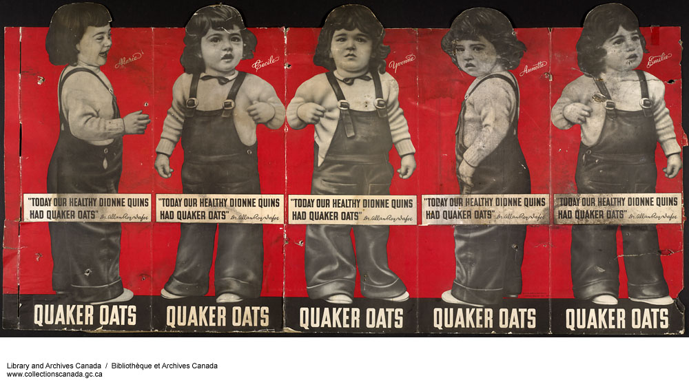
Figure 6. Today our healthy Dionne Quins had Quaker Oats. Full image, before treatment (MIKAN 3825441)
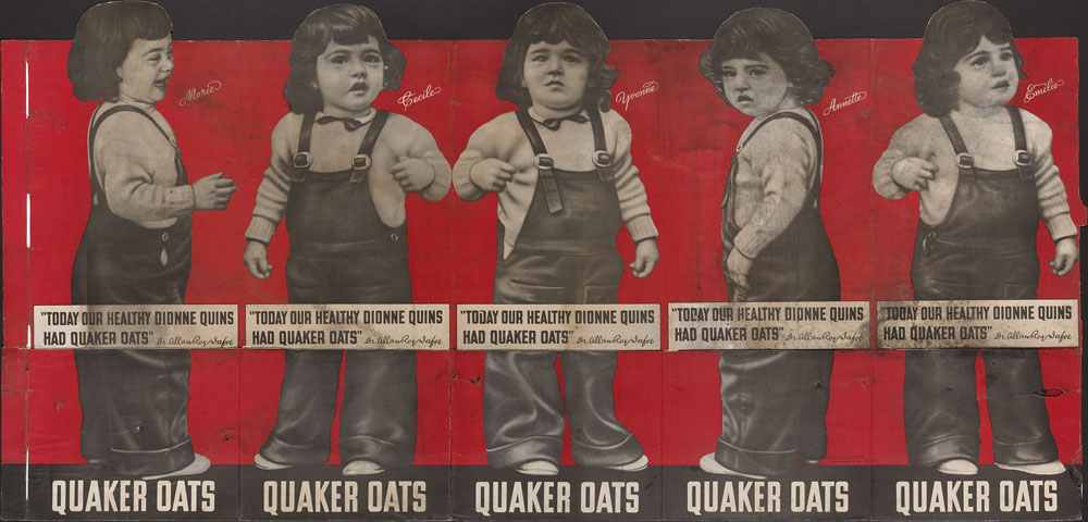
Figure 7. Today our healthy Dionne Quins had Quaker Oats. Full image, after treatment (MIKAN 3825441)
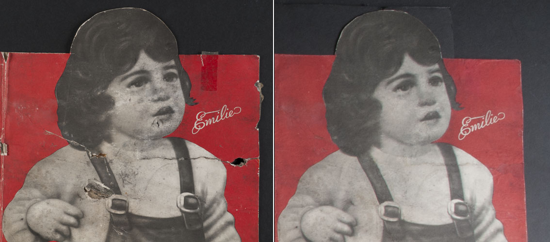
Figure 8. Detail of Émilie, before treatment
Figure 9. Detail of Émilie, after treatment
Biography
 Anne F. Maheux has a BA in Fine Art from the University of Guelph and received a Master’s in Art Conservation (MAC) from Queen’s University and a certificate in the conservation of works of art on paper at the Center for Conservation and Technical Studies, Harvard University Art Museums. She is a recipient of the American Academy in Rome Prize in Historic Preservation and Conservation, and is an accredited member of the Canadian Association of Professional Conservators. She was Conservator of Prints and Drawings at the National Gallery of Canada for over 25 years, and is now Head, Conservation of Works on Paper, Maps and Manuscripts at LAC. Her scholarly interests include 19th-century pastel painting, particularly the work of Edgar Degas and Giuseppe De Nittis. She has published extensively on pastels, and on innovative conservation techniques and treatments.
