Guest curator: Scott Dickinson

Banner for the guest curator series. CANADA 150 is in red along the left side of the banner and then the bilingual text: Canada: Who Do We Think We Are? and under that text is Guest curator series.Canada: Who Do We Think We Are? is a new exhibition by Library and Archives Canada (LAC) marking the 150th anniversary of Canadian Confederation. This exhibition is accompanied by a year-long blog series.

Join us every month during 2017 as experts, from LAC, across Canada and even farther afield, provide additional insights on items from the exhibition. Each “guest curator” discusses one item, then adds another to the exhibition—virtually.

Be sure to visit Canada: Who Do We Think We Are? at 395 Wellington Street in Ottawa between June 5, 2017, and March 1, 2018. Admission is free.


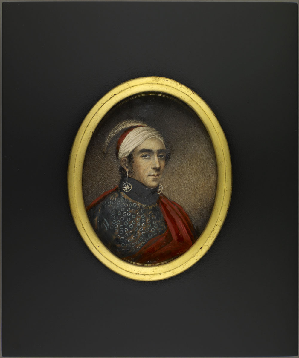
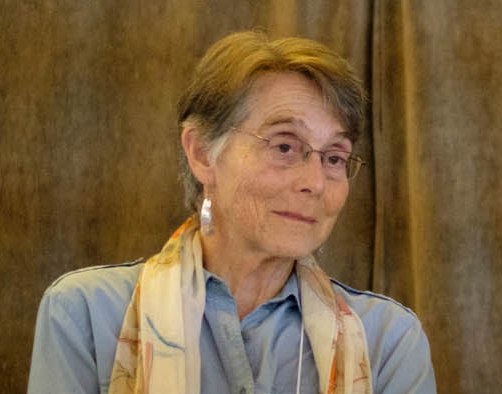
A wedding portrait of Samuel Leonard Tilley and Julia Ann Hanford

A colour photograph of a sepia-tone image in a wood and gold frame showing a seated man and woman. The man is wearing a suit, waistcoat and cravat. The woman is wearing a bonnet, dress and patterned shawl.

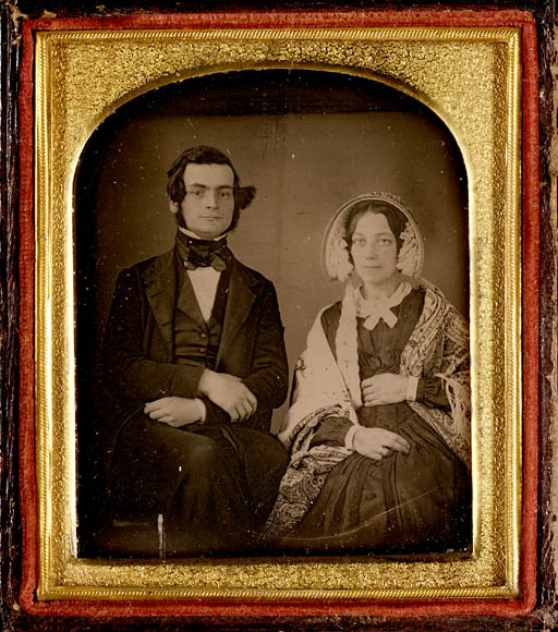
A daguerreotype of Samuel Leonard Tilley and Julia Ann Hanford, ca. 1843. (MIKAN 3192569)

Canada is no longer known as a “Dominion” of Great Britain. According to legend, Father of Confederation Samuel L. Tilley borrowed the word from a biblical psalm. It would become part of our nation’s first formal identity.


Tell us a bit about yourself

I became interested in history—more specifically, the history of technology and of industry—while growing up in Brantford, Ontario, an old factory town not too far from Hamilton. If Hamilton was known for making steel, Brantford was known for making farming equipment. By the time I lived there, all the big Canadian farming companies had left, leaving nothing but the old factory buildings and the memories of the older generation. Exploring that history left me deeply interested in the machines that Canadians invented, made and used—and the places where they did all three. It was the start of my journey into history. I no longer live in Brantford, but everywhere I go I find myself searching for signs of Canada’s industrial past.

Is there anything else about this item that you feel Canadians should know?

The first practical photographic process was invented in 1839 by Louis-Jacques-Mandé Daguerre, which is why this type of photograph is called a daguerreotype. Although the photograph is normal to us, the daguerreotype process is not, and probably requires a bit of explanation.

The daguerreotype used a silvered copper plate as “film.” The surface of the plate was chemically treated so that it would be sensitive to light. This light-sensitive plate was placed in a dark box—the camera—until it was exposed to the scene it was meant to capture. After another chemical treatment, the image of what the plate had been exposed to was plain to see, in a very crisp black and white. Daguerreotype images seem to float above their plates, giving them the illusion of depth, a unique property that no other form of photography has managed to duplicate.

Daguerreotype exposures are not instantaneous. One would have to hold still for up to two minutes, or the resulting image would be blurry. This is the reason why most early photographs are formal portraits of sitting individuals or other static scenes. The expense and time required also meant that taking a photograph was an event worth dressing up for.

Have you ever had to keep smiling as someone fumbles with their camera? Holding a smile for more than a few seconds can be painful. Now imagine trying to hold a smile for two whole minutes. Early photographs like this one show our ancestors to be grim, but a frown is much easier to hold than a smile!

When we look at historical photographs, we must think about not just the subject matter, but the technology used to capture the image. The Tilleys, pictured here in stiff and formal poses, were not necessarily stiff and formal people. We would never know it from these daguerreotypes, as the limitations of that technology meant only some sorts of scenes could be captured. When historians look at historic photographs, we have to think about what we have seen—and what we have not.

Tell us about another related item that you would like to add to the exhibition

A black-and-white photograph of two small boys wearing wool coats and hats sitting on a wooden bench. One is slumped over sleeping; the other is staring the camera and holding a suitcase. A blurred crowd of people can be seen in the background.

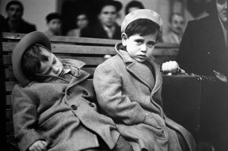
New arrivals aboard S.S. ARGENTINA awaiting clearance in the Immigration Examination Hall, Pier 21, March 1952 (MIKAN 3212241)

There is an item in LAC’s collection that complements this daguerreotype quite well. It is another photograph, one that shows a scene quite different from the genteel setting that the Tilleys were photographed in.

More than a century after the daguerreotype of Samuel Tilley was taken, Canada was in the midst of one of its periodic booms in immigration. Photography was now more than developed enough to do what the old daguerreotype could not—candid snapshots. More importantly, photographers were now interested in taking pictures of regular people, like those of new immigrants, and later of refugees. Both are represented in this exhibit.

This snapshot is of a pair of young immigrants, waiting to be processed through Pier 21 in Halifax. The year is 1952, and these two tired-eyed children have just disembarked from the S. S. Argentina. Their faces show exhaustion, trepidation and perhaps some annoyance at the wait.

Which of these photographs show a better image of Canada? I would suggest that the versions of Canada that these photographs depict are equally valid. Both photographs show stories that are worth telling.

This photograph does not show a Founding Father of Canada. The names of these two children are not recorded. But they are Canadians, all the same. Their experience of Canada was quite different from the experience of Samuel Tilley, but both were important to the growth of our nation. Photography has become a great social leveller. It is no longer the preserve of the well-off. We are indebted to those early daguerreotypists for capturing the faces of early Canadians, but they could not capture how they looked outside of the studio. More modern photographers have given us windows into what Canadians really look like.

Biography

A colour photograph of a young man standing with a diploma.Scott Dickinson is a young museum professional with a great interest in the history of the technology that Canadians use every day. He holds an Honours Specialization in History from the University of Western Ontario (2014) and a Master’s Degree in Public History, also from the University of Western Ontario (2015). He is currently a student in the Museum Management and Curatorship program at Fleming College.

Guest curator: Nicoletta Michienzi

Banner for the guest curator series. CANADA 150 is in red along the left side of the banner and then the bilingual text: Canada: Who Do We Think We Are? and under that text is Guest curator series.Canada: Who Do We Think We Are? is a new exhibition by Library and Archives Canada (LAC) marking the 150th anniversary of Canadian Confederation. This exhibition is accompanied by a year-long blog series.

Join us every month during 2017 as experts, from LAC, across Canada and even farther afield, provide additional insights on items from the exhibition. Each “guest curator” discusses one item, then adds another to the exhibition—virtually.

Be sure to visit Canada: Who Do We Think We Are? at 395 Wellington Street in Ottawa between June 5, 2017, and March 1, 2018. Admission is free.


Cover from a Canada West immigration atlas published by the Department of Immigration, ca. 1923

A colour atlas cover showing a blonde woman in a white Grecian-like robe holding open a curtain of golden grain to reveal a busy farming scene complete with green and gold fields, farmhouses, barns and cattle.

Cover from a Canada West immigration atlas published by the Department of Immigration, ca. 1923 (MIKAN 183827)

Behind golden curtains of grain, we see an idealized—and inaccurate—vision of Canada. Mythologizing was common in immigration advertising. At the time, the west was just not as modern or developed as shown here.


Tell us about yourself

I was born and raised in London, Ontario as part of a close-knit Italian-Canadian family. My family’s stories about my culture inspired me to become passionate about the history of Italy.

As a result, I have travelled Italy and other parts of Europe on several occasions, and try to travel whenever I can. I had the privilege of travelling to England for school. While there, I participated in an archaeological dig along Hadrian’s Wall, and during my spare time, I was able to visit parts of northern England and Scotland. I have also travelled Europe with family and friends. During my travels, I always make an effort to visit as many historical and cultural institutions as I can. Visiting these sorts of places is interesting, as it shows you what society values.

My next travel mission is to try to see more of Canada. While I have done quite a bit of travelling outside of North America, I have never taken the time to see my country. I hope that with Canada’s sesquicentennial I will have an opportunity to look more at my country and see what sorts of things we value as Canadians.

Is there anything else about this item that you feel Canadians should know?

This Canada West cover is a terrific example of Canadian immigration posters from the 20th century. The Canadian Department of Immigration had begun an aggressive advertising campaign in the late 19th century hoping to attract immigrants to the sparsely populated Western provinces.

A colour poster showing a landscape with green fields and mountains with two men standing in the foreground on opposite sides of a river. One has an American flag at his feet while the other holds the Union Jack and has a cornucopia at his feet; he is beckoning the American to come to Canada. Underneath are the departure and arrival locations and dates as well as the price ($12) for the journey.

Promotional immigration poster “40,000 Men Needed in Western Canada” (MIKAN 2837964)

Canada and the British government originally sought to recruit English-speaking immigrants, with many advertisements circulated around the British Isles and the United States. The Department of Immigration did eventually diversify, but in the beginning still focused on white European countries as main sources for immigration. The Netherlands, Germany, and Austria-Hungary were the main targets of immigration campaigns, with text translated from English to other languages. The poster below is an example of promoting Manitoba as a viable area to settle Dutch immigrants.

A colour poster showing giant hands pointing to little vignettes of the different cities in Canada: Montréal, Ottawa, Toronto, Winnipeg and Vancouver against a light green background bordered by green and red stripes. The text is in Dutch and advertises the available land and the length of the journey by boat (10 days from Holland).

Immigration poster “Lees Dit!” [Read this!] advertising Manitoba to Dutch immigrants, ca. 1890 (MIKAN 2837963)

The Canada West cover is part of a larger tradition that used the ideal of land opportunity, abundance and farming as an idyllic lifestyle to attract newcomers to Canada. The focus was to promote Canada’s natural resource as a lifestyle for people who were not landowners in their home countries. Attractive images of wheat fields, cornucopias, and picturesque farming communities were made to sell Canada as a peaceful country full of opportunities, though the art idealized the reality. Atlases like this one also contained pages worth of information on Canada with maps of the western provinces. The information included was to further showcase Canada as a country where land and resources were readily available. Canada West was heavily distributed by the Department of Immigration all over the United States and mainland Europe.

Though these simplistic campaigns seem ineffective now, the Canadian Department of Immigration was successful. By 1911 immigration numbers were around 331, 288 per year. After the First World War, the numbers jumped to over 400,000 per year. Imaged-based advertisements, and the notion of Canada as a land of abundance were successful. These early endorsements sold Canada to people who identified as something other than Canadian. Though the images depicted in the propaganda, were not always realistic, they portrayed Canada as a land of opportunity and abundance.

Tell us about another related item that you would like to add to the exhibition

Canadian immigration and advertising has evolved substantially since the early 20th century. Our ideas of who is an immigrant, and why people choose to come to Canada has changed. How we document immigration has also changed. Technology such as photography and videography have been used to record immigration stories in the modern period.

Library and Archives Canada has an amazing collection of contemporary photographs of immigrants ranging from the late 19th century to the present. These images often depict a different immigrant experience. Photos in the archives show that our immigration policies had a global impact. Many of the immigrants who arrived in Canada would not only work in rural areas, but in urban centers and have an impact on the way Canada has formed. Presently, Library and Archives Canada is working on adding more photos to their collection, highlighting the different materials in their collections. More modern photos like those in the exhibition join older photos like those shown here.

A black-and-white photograph of groups of immigrants on a train platform wearing a variety of clothing from traditional Indian garb with turbans to European styles of clothing. Behind them is the railway station, a small hut with the town’s name on the roof. The mountain rises behind the station, and a young boy stands on the tracks.

Group including Indian immigrants on platform of Canadian Pacific Railway station, Frank, Alberta. ca. 1903 (MIKAN 3367767)

A small black-and-white photograph of a man and woman on either side of a hay bale. A description of the family includes their family name, where they came from, how they arrived, where they live, and a short description of their farm.

Mr. and Mrs. Friedrich Pahl on their farm, Romanian immigrants who arrived May 13, 1927, aboard the S.S. Estonia, Baltic-America Steamship Line (MIKAN 3516853)

Library and Archives Canada also has a collection of videos and oral histories related to the immigrant experience. This collection includes videos on the history of Pier 21, one of the largest immigration points in Canada. These video testimonies show the changes in immigration trends, and how the idea of Canada is continually evolving. While we no longer see Canada as an expanse of open field, the idea behind immigration to Canada is the same. Canada is a land of opportunity for global people, and like our earlier poster, Canada is available for immigrants.

Biography

Nicoletta Michienzi has completed an undergraduate degree from the University of Western Ontario with an Honors Specialization in History and a Major in Classical Studies. During her degree, she participated in an archaeological dig in the north of England and was able to see the effects of tourism on historic sites. She continued her education at Western, completing a Master’s degree in Public History. Since graduation she has been employed by various historical institutions in London, Ontario. She is currently working as the Public Programmer at the Royal Canadian Regiment Museum and as a Historical Interpreter at Eldon House. At the Royal Canadian Regiment Museum, she organizes and conducts tours, educating the public about London’s military history and its connection to global conflict. At Eldon House, she interacts with tourists and helps conduct education programs about London’s oldest heritage home. At both institutions, she focuses on visitor services and educating the public, hopefully making visitors enthusiastic about the history of their community and their country.

Related Resources

Francis, Daniel. Selling Canada: Three Propaganda Campaigns that Shaped the Nation. Vancouver: Stanton Atkins & Dosil Publishers, c.2011.

Guest curator: Katie Cholette

Banner for the guest curator series. CANADA 150 is in red along the left side of the banner and then the bilingual text: Canada: Who Do We Think We Are? and under that text is Guest curator series.Canada: Who Do We Think We Are? is a new exhibition by Library and Archives Canada (LAC) marking the 150th anniversary of Canadian Confederation. This exhibition is accompanied by a year-long blog series.

Join us every month during 2017 as experts, from LAC, across Canada and even farther afield, provide additional insights on items from the exhibition. Each “guest curator” discusses one item, then adds another to the exhibition—virtually.

Be sure to visit Canada: Who Do We Think We Are? at 395 Wellington Street in Ottawa between June 5, 2017, and March 1, 2018. Admission is free.


Red and black Norwegian text on a cream background awards the prize to Lester Bowles Pearson. Text is topped by a red lion holding an axe on a blue mountain bordered by blue waves with a circled star at the top.

Nobel Peace Prize awarded to Lester B. Pearson for his role in establishing United Nations Peacekeeping, 1957. Designed by Gerhard Munthe for the Nobel Committee (MIKAN 4900031)

Former Prime Minister Lester B. Pearson’s idea for a neutral military force, to help stabilize conflict zones, earned him the Nobel Prize. Most Canadians now regard peacekeeping as uniquely ours.


Tell us about yourself

I have always had an interest in graphic design. My first career was as a graphic artist and typesetter. I eventually found my way into art history, teaching and now archival work. Although I work primarily with textual documents these days, I am frequently delighted by the array of aesthetically pleasing items in LAC’s collection.

Is there anything else about this item that you feel Canadians should know?

Lester B. Pearson won the Nobel Prize for his role in negotiating a peaceful resolution to the 1956 Suez Canal Crisis. The crisis erupted when Egyptian President Gamel Abdel Nasser seized and nationalized the Suez Canal (then jointly owned by France and Great Britain), a move that threatened the supply of oil to Europe. In retaliation, France, Great Britain and Israel secretly collaborated to attack the Sinai Peninsula. The United States and the Soviet Union subsequently became embroiled in the conflict, with the Soviet Union threatening to use nuclear weapons against the assailants. Pearson, at the time Secretary of State for External Affairs and head of Canada’s delegation at the United Nations, stepped in and helped establish the United Nations Emergency Force, which was instrumental in de-escalating the conflict.

At the presentation ceremony on December 10, 1957, in Oslo, Norway, the Chairman of the Nobel Committee, Gunnar Jahn, stated that the prize was being awarded to Pearson because of “the powerful initiative, strength, and perseverance he has displayed in attempting to prevent or limit war operations and to restore peace in situations where quick, tactful, and wise action has been necessary to prevent unrest from spreading and developing into a worldwide conflagration.”

Although Pearson was awarded the Nobel Prize in 1957, the design of the certificate dates from the beginning of the 20th century. In addition to hand-drawn calligraphy, it features a lithograph designed by Gerhard Munthe in 1901, the year the Nobel Peace Prize was first awarded. A Norwegian painter, decorative artist and illustrator, Munthe took many of his artistic motifs from his native Norway. He worked in the National Romantic Style, the Scandinavian version of Art Nouveau in the late 19th and early 20th centuries. This style, which was a reaction against industrialism, promoted ideas of northern nationalism based on the renewal of interest in Norse mythology and sagas. The illustration at the top of the certificate shows a lion holding an axe, a symbol of power and courage that appeared in Norwegian folk art as far back as the 13th century. The motif also appears on the coat of arms of Norway. Atop a decorative frieze of stylized fir trees, the lion stands proudly in a wild northern landscape. Northern lights swirl above his head, and the image is surmounted by the North Star. Although the overall design is delicately rendered and restrained, it is nevertheless a powerfully evocative image.

Detail of the certificate showing a red lion holding an axe on a blue mountain bordered by blue waves and a star in a circle.

Detail of Pearson’s Nobel Peace Prize showing the lion on the certificate  (MIKAN 4900031)

Tell us about another related item that you would like to add to the exhibition

Pearson wearing a suit with a bow tie and holding a pencil in his upraised hand.

Lester B. Pearson holding a pencil. Photo taken August 11, 1944. (MIKAN 3607934)

A smiling man speaking with another man against a curtained window with the drapes drawn back. Both men are wearing suits and ties.

Anthony Eden. Photo by the Alexandra Studio. (MIKAN 3215249)

I was particularly struck by a photograph that shows Lester B. Pearson with another of the key players in the Suez Crisis: British Prime Minister Sir Anthony Eden. Duncan Cameron, an Ottawa photographer from Capital Press Limited (and the only Canadian contract photographer for Time Life Inc.), snapped the photo of Pearson and Eden outside the Parliament Buildings in Ottawa on February 6, 1956. Eden, who had known Pearson since the 1930s, was visiting Canada and had just given a speech to the House of Commons. A long-time politician known for his skill in public affairs, Eden succeeded Winston Churchill as prime minister of the United Kingdom in 1955. In the photograph, the two men appear relaxed and happy; there is no premonition that a rift would develop between Canada and Great Britain a few months later, after Eden collaborated with France and Israel to invade Egypt. While Pearson went on to win the Nobel Peace Prize, become Canada’s 14th prime minister, and gain a reputation for international diplomacy, Eden’s popularity took a nosedive, and as he was in ill health, he resigned in February 1957. Interesting side note: the photographer, Duncan Cameron, would eventually join the Public Archives of Canada, where he became Photo Custodian of the National Photographic Collection. LAC holds his fonds, which consists of 175,000 prints, negatives and slides.

Biography

Katie Cholette is an archivist in the Governance and Political Archives section. She is currently working in the private military and non-LAC Act institutions areas. Katie has a BA in Art History, an MA in Canadian Art History, and a PhD in Canadian Studies. She has previously worked as the Curator of Acquisitions and Research and the Curator of Exhibitions at the Portrait Gallery of Canada (2007–2008; 2011), held two Research Fellowships in Canadian Art at the National Gallery of Canada (2006; 2012–2013), and taught courses in Art History and Canadian Studies and at the College of the Humanities at Carleton University (2003 to present). She has delivered papers and published articles on various aspects of art, architecture, culture and identity, and has worked on a number of freelance curatorial and research projects. As a student at Carleton, she was a regular patron of Mike’s Place, the graduate student pub named in Lester B. Pearson’s honour.

Guest curator: Jill Delaney

Banner for the guest curator series. CANADA 150 is in red along the left side of the banner and then the bilingual text: Canada: Who Do We Think We Are? and under that text is Guest curator series.Canada: Who Do We Think We Are? is a new exhibition by Library and Archives Canada (LAC) marking the 150th anniversary of Canadian Confederation. This exhibition is accompanied by a year-long blog series.

Join us every month during 2017 as experts, from LAC, across Canada and even farther afield, provide additional insights on items from the exhibition. Each “guest curator” discusses one item, then adds another to the exhibition—virtually.

Be sure to visit Canada: Who Do We Think We Are? at 395 Wellington Street in Ottawa between June 5, 2017, and March 1, 2018. Admission is free.


This article contains historical language and content that some may consider offensive, such as language used to refer to racial, ethnic and cultural groups. Please see our historical language advisory for more information.

Temples of Today by John Vanderpant, ca. 1934

Black-and-white photo of a grain elevator with tall, circular towers in front of a taller rectangular building.

“Temples of Today” by John Vanderpant, ca. 1934. (MIKAN 3784205)

Photographer John Vanderpant saw Canada’s grain elevators as temples. They were part of his utopian vision for the country, based on a faith in trade and industry. For him, industry would define the nation’s future.


Tell us about yourself

It is amazing to think that I have been working at LAC for almost two decades now. The work in the photography section is incredibly diverse as are the collections themselves, and my time here has gone by incredibly quickly.

I come from an art history background, but I have always been as interested in the context of the work, as in its aesthetic qualities. By exploring the social, cultural and historical context of a photograph, we can begin to understand why it exists in the first place. Why was it created, who asked for it to be created, where and how it was circulated—all of these questions fascinate me. I suppose this is how I ended up as an archivist, because context and provenance are the pillars of any archival collection. I enjoy both the detective aspect of working on the historical photographs in the collection, and working with current photographers, digging into the rationale behind the taking of a photograph. I’ve published and presented on a wide variety of LAC photographs and collections over the years, including photos by John Vanderpant and Yousuf Karsh that were taken on cross-Canada trips in 1930 and the early 1950s respectively. These cross-country trips really intrigue me. They seem like a Canadian rite of passage even today, but they also speak volumes to the ever-shifting notion of Canadian identity.

Is there anything else about this item that you feel Canadians should know?

The John Vanderpant fonds has become one of LAC’s most important photographic fonds, as his work has grown in stature through the research of a number of Canadian art historians over the last 30 or 40 years. The photograph was taken around 1934 in the Vancouver ports area. Vanderpant was one of Canada’s leading pictorialist and straight photographers, and his series of images of the grain silos in Vancouver is now considered iconic.

When Vanderpant arrived in Canada from Holland in 1911, he saw the nation as most other Europeans did—a vast and empty wilderness. By the time he took the photograph “Temples of Today” in 1934, he dreamed of a country with the immense potential and unexploited resources to become an industrial powerhouse of the future. Of course he was not alone in this sentiment, and the interwar years were a period of great urban and industrial development in Canada. This photograph in particular illustrates his turn away from the more painterly, “fuzzy” qualities of pictorialism toward straight photography. This style embraced a stripped down modernist aesthetic and, just as importantly, a subject matter that represented a strong belief in a future dominated by an urban and industrial life. “Temples of Today” purposely eschews beauty, focussing instead on the massiveness of the silos coming out of the shadows into full light, with the foregrounding of the hydro poles reinforcing the industrial message. The photograph perfectly illustrates the development of a popular philosophy about the natural progression of mankind through industrialization. Vanderpant strongly subscribed to this view and wrote articles and gave many public lectures on the topic. But along with this forward focus, Vanderpant, with so many other Canadians of the time, completely dismissed the Indigenous peoples of the country, seeing Canada as a kind of terra nullius or unoccupied land ready to be exploited and developed however the settler culture wanted. Vanderpant’s photographs are rightly lauded today as an exceptional representation of an aspect of Canadian life that was largely viewed as unpalatable up to that point, but they also concealed, by omission, the importance of the founding communities of the nation.

Tell us about another related item that you would like to add to the exhibition

It is interesting to compare Vanderpant’s ideas about Canada, as represented in “Temples of Today,” with those of the German photographer Felix Man who visited Canada at almost the same time this photograph was taken. Man, considered to be a pioneer of photojournalism and of the photo essay format, travelled across Canada for six months in 1933, commissioned by the German picture magazine Berliner Illustrirte to “visit Canada and photograph all the most important things.” LAC acquired about 200 of his images in 1985 in order to document how Canada was perceived by a European during the interwar period. Like Vanderpant, Man was overwhelmed and inspired by the vastness of the country he visited. He visited almost every region, but was particularly taken with the prairies and the northern regions—going as far as Churchill, Manitoba, and Great Bear Lake, Northwest Territories.

But in most other ways, Man’s view of Canada could not have been more different than Vanderpant’s. Both held what could be described as romantic views of Canada. Vanderpant romanticized a future, industrialized and urban Canada, while Man held a more typically European view of a Canada frozen in a romanticized past. He was heavily influenced by the stories of Indigenous heroes written by fellow German Karl May (who famously only visited North America after his books were published). His idealized fantasies of the “noble savage” remain popular in central and Eastern Europe to this day. Man’s photographs vividly depict this romantic image of Canada. While Vanderpant’s images focus on the development of Canada, Man, as photographic historian Joan Schwartz has noted, largely excluded urban Canada in his photographs. Instead, his camera captured such views as the unrelenting snow and ice around Churchill in winter, and the “Banff Indian Days,” a popular tourist attraction in which Indigenous peoples donned stereotypical costumes, erected wigwams, and put on displays of hunting and horsemanship for pay.

Woman on horseback holding a little girl to her side. The woman is wearing a plain dress with a patterned belt and a feathered headdress over her braided hair.

“Indian Woman with Child” by Felix Man, taken during “Banff Indian Days” in Banff, Alberta, 1933. (MIKAN 3333566)

His photograph of the Indigenous woman and child on horseback is an excellent example, with its grainy aesthetic, and the woman in an elaborate headdress (which in reality were only worn by women in exceptional circumstances) reaching back to embrace the small child. The “Madonna and child” symbolism presents all the qualities necessary to build a stereotypical and generalized narrative of 20th-century Indigenous peoples as still living their so-called traditional lives, and the images of the Banff “Indian Days” were very popular with the European press.

The exclusion of Indigenous peoples in John Vanderpant’s representations of an industrial and urban Canada, and the fixing of them into a mythical past by Felix Man, also tie into the works of urban Iroquoian photographer Jeff Thomas in this exhibition. Using toy figurines posed with the Parliament buildings in the first instance, and in front of a rail car emblazoned with the word “Canada” in the second, Thomas seeks to reinsert Indigenous peoples into both Canada’s history and present. Thomas’ photographs introduce critical concerns about the roles Indigenous people played in the building of the nation-state of Canada and in the building of the railroad. Using the figurines, he plays on the stereotypes which were perpetuated and disseminated by photographers like Man, but also with the omission of Indigenous peoples from the narrative of the past, present and future of Canada. Considering these two seemingly unconnected photographs from the 1930s together allows us to bring these two stereotypical views of Canada together, and to see how the knowledge of the immediate and broader contexts in which they were created can deepen our understanding of not only the photographs themselves, but of Canada’s past and present as well.

First Nations figure set in front of a train marked “Canada” with grain graffiti on its side.

Canada Day 2005, Brandon, Manitoba, Canada from The Delegate on Tour Series by Jeff Thomas, 2005 (MIKAN 3932014) ©Jeff Thomas

Indigenous figurine set across the river from Parliament Hill.

Parliament Hill, Ottawa, Canada, 2007 from The Delegates on Tour Series by Jeff Thomas. (MIKAN 3932081) ©Jeff Thomas

Biography

Jill Delaney is an archivist in the acquisition of photography of the Visual, Sound and Landscape section, Private Archives Branch. She holds a Master of Canadian Studies from Carleton University (1991) and a doctorate in Art and Architectural History and Theory from SUNY-Binghamton (1997). Jill joined LAC in 1998 as a photography archivist and has been working with the collections ever since, with the exception of an assignment in the architectural records section.

Guest curator: Taryn Dewar

Banner for the guest curator series. CANADA 150 is in red along the left side of the banner and then the bilingual text: Canada: Who Do We Think We Are? and under that text is Guest curator series.Canada: Who Do We Think We Are? is a new exhibition by Library and Archives Canada (LAC) marking the 150th anniversary of Canadian Confederation. This exhibition is accompanied by a year-long blog series.

Join us every month during 2017 as experts, from LAC, across Canada and even farther afield, provide additional insights on items from the exhibition. Each “guest curator” discusses one item, then adds another to the exhibition—virtually.

Be sure to visit Canada: Who Do We Think We Are? at 395 Wellington Street in Ottawa between June 5, 2017, and March 1, 2018. Admission is free.


Tourism Poster from Canada Vacations Unlimited, ca. 1947

Colourful poster depicting a moose, deer, bears, a rabbit, a squirrel, a beaver, a fisherman, a piper, a woman spinning wool, a Mountie, an Indigenous woman and child, a boy driving a dog cart, and a totem pole. The words “Canada” and “Vacations Unlimited” are printed across the top and bottom of the poster.

Tourism poster from Canada Vacations Unlimited, ca. 1947 (MIKAN 3007692)

More American tourists preferred seeing sights to going camping, according to early market research. This ad campaign, featuring Canadian cultural symbols, was the—often questionable—response. Is any Canadian stereotype missing?


Tell us a bit about yourself

In 2015, I moved to Fort McMurray, Alberta to work at the Oil Sands Discovery Centre as an interpreter. I grew up in Hamilton Township, Ontario, near Lake Ontario. Our family spent a lot of time camping and visiting museums on vacations. My move from Ontario to Fort McMurray let me travel across the country and gave me a much better perspective on just how big Canada really is.

Is there anything else about this item that you feel Canadians should know?

Three detailed images from the poster. One has a uniformed Mountie, and a First Nations woman wearing a blue-and-red striped dress carrying a baby on her back with deer and a rabbit in the foreground. The second has a fisherman in yellow rain gear holding a large fish and a man in a blue dress coat playing the bag pipes with a white haired woman seated between them. The third has a colourful totem pole shaped like an eagle with its wings spread on top surrounded by wildlife.

Detail of individual images from the poster: a Mountie and First Nations woman and child, a fisherman and a piper, and a totem pole. (MIKAN 3007692)

This Canada Vacations Unlimited poster captures a number of different Canadian stereotypes from the east to the west—the fisherman, the Mountie, the First Nations woman and child, and the totem pole. The poster also references some of the settlers who came to Canada such as the piper. Since the 1930s to 1950s when this poster was created, Canada has become even more diverse. While these are some of the prominent images of Canadians during that time period, it is important to recognize that not every “Canadian-ism” could ever be captured in a single image.

Details of a small brown squirrel; a crouching brown bear with his front paws spread out; a small brown beaver with his front paws spread out; a flying duck; and two brown deer, a stag and a doe.

Details of smaller animals from the poster. (MIKAN 3007692)

This poster features many wild animals as well as a forest in the background. While Canada has a lot of natural beauty, not everyone has a view of the Rocky Mountains or the Canadian Shield outcroppings. According to Statistics Canada, 66% of Canada’s population now lives within 100 kilometres of our southern border with the United States. This represents only four percent of Canada’s land area, which means there are many people living in metropolitan areas now. Some of our biggest cities such as Toronto, Vancouver, and Montréal have attractions that are also well known as tourist destinations.

Tell us about another related item that you would like to add to the exhibition

One thing that struck me when I was looking at the Canada Vacations Unlimited poster was that there were no signs of winter. While there are a number of other artifacts in Canada: Who Do We Think We Are that do focus on winter, it struck me that in this particular poster that focused on Canadian stereotypes there was no snow. For most of us in Canada, winter takes up a fair bit of the year. Yes, shovelling snow and driving through snowstorms are not activities that we tend to enjoy, but it is still better to make the most of what we have instead of just waiting for spring to arrive. To help provide a better look at what happens in Canada year-round, I think that this painting from the mid-1800s would be a good pairing for the Canada Vacations Unlimited poster.

A series of vignettes against a blue background depicting a male figure walking through soft snow, falling in various positions, or getting hit by snow. A running line of text describes each image: "If there is one time of the year when Canada is more delightful that another / it is when a thaw comes after / a heavy fall of snow / because / It makes the snow so nice & soft. / particularly for falling / and because it (sic) so pretty to see the snow falling from the Roofs. / and because you are sure after / falling on your face / to fall on your back in / trying to get up."

One time of year when Canada is more delightful than another. (MIKAN 2837052)

The painting focuses on a series of images of a man trying to walk through heavy snow. Its witty title is “One time of year when Canada is more delightful than another.” I think this is an interesting way to poke fun at something many of us grumble about during the winter—slogging through the snow, trying not to fall into it. The inscription that accompanies each figure works to turn an unpleasant experience into a tale of adventure.

Putting these two posters together shows Canadians in different walks of life surrounded by nature and finding ways to deal with the winter. This helps to express some of what Canada has to be proud of. Canada is more than just its natural beauty or its weather. Canadians are the ones who make the most of what this country has to offer and help to make it a better place to visit and live in.

Biography

A colour photo of a woman with glasses smiling at the photographer.

Taryn Dewar has a Master of Arts in Public History from the University of Western Ontario. She works as an Interpreter at the Oil Sands Discovery Centre in Fort McMurray, Alberta.

Guest curator: Carole Gerson

Banner for the guest curator series. CANADA 150 is in red along the left side of the banner and then the bilingual text: Canada: Who Do We Think We Are? and under that text is Guest curator series.Canada: Who Do We Think We Are? is a new exhibition by Library and Archives Canada (LAC) marking the 150th anniversary of Canadian Confederation. This exhibition is accompanied by a year-long blog series.

Join us every month during 2017 as experts, from LAC, across Canada and even farther afield, provide additional insights on items from the exhibition. Each “guest curator” discusses one item, then adds another to the exhibition—virtually.

Be sure to visit Canada: Who Do We Think We Are? at 395 Wellington Street in Ottawa between June 5, 2017, and March 1, 2018. Admission is free.


“Ode to Brant” by Pauline Johnson, 1886

Two pages of a handwritten poem signed and dated by the author, Pauline Johnson.

Handwritten poem by Pauline Johnson, 1886. (MIKAN 4936704)

This poet’s mixed Mohawk-British heritage helped shape her vision for Canada’s future. She writes that Indigenous and British-Canadians should form a “brotherhood.” And all should be loyal servants—together—of the British Empire.


Tell us about yourself

As a child, I was an obsessive reader—my friends called me a “reader-bug” because I always had my nose in a book. Perhaps that’s why I became an English professor—so that I could read as much as I wanted, and encourage others to do the same. I think that it is especially important to read works by Canadian writers, who help us to understand our history and who we are today.

Is there anything else about this item that you feel Canadians should know?

A black-and-white photograph of a bronze statue atop a large stone pedestal decorated with bronze reliefs and statues around the sides. A park with bare trees can be seen in the background.

View of the Brant Memorial in Brantford, Ontario by photographer Hannah Maynard, Park & Co. (MIKAN 3559483)

“Brant” was one of Pauline Johnson’s first published poems. She composed it for the unveiling of a statue of the Mohawk leader, Joseph Brant, in the town of Brantford on October 8, 1886, and it was included in a souvenir brochure prepared for the occasion. During Johnson’s lifetime, fans of literature often collected autographs from their favourite writers. Regarded as one of Canada’s most important poets, Johnson not only signed many copies of her books for her admirers, but also frequently wrote out her poems in longhand for them to keep.

A black-and-white newspaper column describing Pauline Johnson’s family, her work and her role in the unveiling of the Brant memorial.

An interview with Pauline Johnson by Canadian journalist Garth Grafton (Sarah Jeannette Duncan) about Johnson’s work, her family, and the unveiling of the Brant Memorial, in Woman’s World, October 14, 1886. (AMICUS 8086919)

Tell us about another related item that you would like to add to the exhibition.

LAC holds a large collection of letters that L.M. Montgomery (author of Anne of Green Gables) wrote to her friend, George Boyd Macmillan, a pen pal who lived in Scotland. This correspondence lasted for many years, from 1903 to 1941. Montgomery’s letters are very long and newsy, discussing everything from the books that she read and the places she visited, to the doings of her family and her beloved cats. Over the years, the tone changes from youthful optimism to sad disappointment as she lives through the First World War and the Great Depression, giving us an inner view of the Canadian experience during a tumultuous time. Montgomery’s distinctive handwriting is less stylish than Johnson’s elegant script, perhaps reflecting her early years as teacher, when she needed to show children how to form their letters.

A black-and-white page of a letter from Lucy Maude Montgomery to George Boyd Macmillan. Discusses her love of historical books and recalls her love of fairies as a child.

A page from a letter (page 757) from Lucy Maud Montgomery to George Boyd Macmillan, a Scottish writer, dated April 7, 1904 discussing her love of historical books and fairies as a child (MIKAN 120237)

A black-and-white page of a letter from Lucy Maude Montgomery to George Boyd Macmillan. Discusses the popularity of “In Flanders Fields” and its use in election campaigns.

A page of a letter (25) from Lucy Maud Montgomery to George Boyd Macmillan, April 7, 1917 which discusses the popularity of “In Flanders Fields” and its use in election campaigns. (MIKAN 120237)

Biography

A colour photograph of a woman with short hair looking over to the side.Carole Gerson is a professor in the Department of English at Simon Fraser University. Co-editor of Volume 3 (1918–1980) of History of the Book in Canada / Histoire du livre et de l’imprimé au Canada, she has published extensively on Canada’s literary and cultural history with a focus on women writers, including L.M. Montgomery and Pauline Johnson. Her book, Canadian Women in Print, 1750–1918 (2010), won the Gabrielle Roy Prize for Canadian criticism. In 2013 she received the Marie Tremaine Medal from the Bibliographical Society of Canada.

Related resources

Guest curator: Annabelle Schattmann

Banner for the guest curator series. CANADA 150 is in red along the left side of the banner and then the bilingual text: Canada: Who Do We Think We Are? and under that text is Guest curator series.Canada: Who Do We Think We Are? is a new exhibition by Library and Archives Canada (LAC) marking the 150th anniversary of Canadian Confederation. This exhibition is accompanied by a year-long blog series.

Join us every month during 2017 as experts, from LAC, across Canada and even farther afield, provide additional insights on items from the exhibition. Each “guest curator” discusses one item, then adds another to the exhibition—virtually.

Be sure to visit Canada: Who Do We Think We Are? at 395 Wellington Street in Ottawa between June 5, 2017, and March 1, 2018. Admission is free.


The Chewett Globe by W.C. Chewett & Co., ca. 1869

A large globe in a wood and brass stand.

Terrestrial globe by W.C. Chewett & Co. for the Ontario Department of Education, ca. 1869. (AMICUS 41333460)

This globe was one of the first produced in Canada, around the time of Confederation. Designed for use in schools, it was part of a nationalistic push to define and explain the brand new country.


Tell us about yourself

I have travelled extensively for both pleasure and work. I have been to Europe multiple times, and Peru for archaeological digs as a student. I also spent over a year living in Japan as a high school student, and it was an unforgettable experience. The most important lesson I learned was to appreciate and respect things that are different, strange, and sometimes incomprehensible. It taught me to be critical of my biases and the culture I live in, reflexes which promote cohesive living in a multicultural world.

Is there anything else about this item that you feel Canadians should know?

Because of my expertise and love of travel, I have chosen to discuss the Chewett Globe. Maps are a lot of fun! Whenever I travel, I like to look up the country’s world map because they always put their country in the middle of the map. This inevitably causes distortion in the distances between countries and the size of oceans as our planet is spherical. Seeing Canada shrink and stretch has always made me smile and helped me understand how other people see and understand their world, if only a little bit.

Our world is also ever changing, from its physical features, such as rivers and mountains, or abstract constructs, such as names and borders. Therefore, maps must be continuously updated, which allows us to trace history through changes in maps. Maps are critical to my work as an archaeologist. Old city plans might reveal where old buildings once stood or abandoned cemeteries were located but have since been built over and faded from our collective memory. I also must consider how the landscape may have looked like in the past to understand what resources people could access, and what might have inspired them to choose a specific location to camp or imbue meaning onto the landscape through stories and legends.

I think Mr. William Cameron Chewett, the person whose company created this globe, would have appreciated these thoughts. Although his profession was printing, his family were involved with mapping Upper Canada. His grandfather, William Chewett, worked as surveyor-general and surveyed most of what is now Ontario, while his father, James Chewett also worked as a surveyor before building many known Toronto buildings. W.C. Chewett and Co. was considered one of Canada’s foremost printing and publishing firms. The firm produced award-winning lithographs between 1862 and 1867, with yearly first place awards, and had a large publication output ranging from periodicals, directories, and the Canadian Almanac, to law and medicine books. In addition, the retail store was a popular social gathering spot. The globe was created in the company’s last year (1869) prior to it being bought and renamed the Copp, Clark and Company.

A map of Canada West, what is now southern Ontario, with coloured outlines to indicate counties. The legend contains a list of railway stations with their respective distances [to Toronto?].

Map of Canada West, engraved and published in the Canadian Almanack for 1865 by W.C. Chewett & Co., Toronto. (MIKAN 3724052)

For Canada’s150th anniversary, I think it is worth reflecting on the changes that have come to pass in the last 150 years, which the Chewett Globe can literally show us. In my lifetime, I observed the creation of the territory of Nunavut and the renaming of various streets in my neighbourhood. What changes have you seen in your life and how did they affect you and your community?

Tell us about another related item that you would like to add to the exhibition

When most people think of maps, they think of geography and political borders, but maps can also be used to illustrate and describe almost anything, including census information, spoken languages, and group affiliations amongst others. To continue the topic, I have selected an 1857 map of North America that shows the regions where various First Nations groups resided at the time. Ideally, if I were to add this map to the exhibition, I would also want to include a modern map of where First Nation groups reside to show the public the momentous changes lived by our fellow citizens to allow them to see these changes as clearly as those they can pick out by comparing the globe to any modern map of Canada.

My other reasoning is a little more selfish. As an anthropologist, I understand and have learned through experience that the best way to appreciate and respect another culture is to learn about it, about the people, and where possible, live in it. Growing up, I had very little exposure to First Nations, their culture and history. Because of this, I never developed much of an appreciation for their culture or interest in learning about them. As an anthropologist and Canadian, I was ashamed of these feelings and sad when fellow Canadians express similar views. For the last few years, I have actively sought to educate myself. By including this piece, I hope to inspire others to appreciate, respect, and learn more about their fellow Canadians. The topic is particularly meaningful on Canada’s milestone year as this is the year we should celebrate coming together and developing stronger bonds, one nation to another.

A large colour map of North America denoting territories of various Aboriginal bands with legends in the corners.

Map of North America denoting the boundaries and location of various Aboriginal groups. (MIKAN 183842)

Biography

Colour headshot of a woman with glasses and long hair.Annabelle Schattmann is a physical anthropologist. She holds a Master of Arts in Anthropology from McMaster University (2015) and a Bachelor of Arts in Anthropology from Trent University (2012). She has participated in multiple research projects including a dig in Peru, cemetery excavation in Poland, and research on vitamin C and D deficiencies from various time periods in Canada and Europe.

Related Resources

McLeod, Donald W. “Chewett, William Cameron.” Dictionary of Canadian Biography.

Guest curator: Shane McCord

Banner for the guest curator series. CANADA 150 is in red along the left side of the banner and then the bilingual text: Canada: Who Do We Think We Are? and under that text is Guest curator series.Canada: Who Do We Think We Are? is a new exhibition by Library and Archives Canada (LAC) marking the 150th anniversary of Canadian Confederation. This exhibition is accompanied by a year-long blog series.

Join us every month during 2017 as experts, from LAC, across Canada and even farther afield, provide additional insights on items from the exhibition. Each “guest curator” discusses one item, then adds another to the exhibition—virtually.

Be sure to visit Canada: Who Do We Think We Are? at 395 Wellington Street in Ottawa between June 5, 2017, and March 1, 2018. Admission is free.


Major John Norton, Teyoninhokarawen, by Mary Ann Knight, 1805

Oval portrait miniature of Major John Norton, Teyoninhokarawen wearing a white and red headdress with an ostrich feather and long earrings with circled stars. He is also wearing a patterned shirt with a red mantle.

Portrait miniature of Major John Norton, Teyoninhokarawen, the Mohawk Chief by Mary Ann Knight, 1805 (MIKAN 2836984)

The British public held Romantic ideas about Canada, especially its First Nations peoples. Teyoninhokarawen probably played up to these when he sat for this portrait. Here, he wears his own adapted version of Indigenous dress.


Tell us about yourself

I hail from the Ganaraska Forest. Technically, the address of my family home was in a small village called Campbellcroft, in rural Ontario however the nearest neighbor was over a kilometer away and there was little sense of a village. While there, my parents fostered a strong interest in art and culture. Sadly, while the nearly 12,000-acre Ganaraska forest is a place of much wonder and variety, one thing that one does not find there is a major art gallery with an internationally renowned collection. Consequently, as a teen I toured the world’s galleries through reproductions like those I found in the now rare Carnegie Art Reference Set for Colleges. The media fascinated me as much as the message and I developed an interest in reproductions of art works and their spread and dissemination in Canada. I circuitously followed this interest through my studies and ended up writing about bookworks, or artist’s books as they are variously known in my field. From the study of books and reproductions it was a short leap to library and archival school.

Is there anything else about this item that you feel Canadians should know?

Teyoninhokarawen (ca. 1760–1823) was born John Norton in Salen, Scotland, of Scottish and Cherokee parentage. Military records show he went to Canada, and after discharge from the army in 1788 went to live with the Grand River Mohawk Indians, later becoming the adopted nephew of Joseph Brant. His portrait was painted by Mary Ann Knight, an English miniaturist. It was painted during Norton’s visit to England when he acted as an emissary for the Grand River Mohawks, and it was exhibited at the Royal Academy in 1805.

This portrait is a fantastic gateway into late 18th, early 19th century Canadian history. I chose to write about this item, first because it is so visually appealing. The portrait was painted in Europe where Romanticism is very much part of the spirit of the age and this shines through in the presentation of Norton. It was becoming unfashionable for portraits to depict people wearing contemporary European dress. My knee-jerk point of comparison is Thomas Phillips’ portrait of Byron wearing an Albanian scarf wrapped as a turban—though many of Jean-Etienne “The Turk” Liotard’s brilliant portraits might also serve as interesting comparative foils for this miniature.

Norton’s headwear is this portrait is fascinating in the way it perpetuates then prevailing orientalizing mythologies—naturally at this time drawing connections to Rousseau’s by then famous concept of the noble savage—but also truthfully representing Norton’s transatlantic identity. The feather in the headdress is that of an ostrich. Not a common bird on the shores of the Great Lakes where Norton had been adopted as a Mohawk, nor in his father’s Cherokee territory in Tennessee. Ostrich feathers however were popular as part of headwear in the UK, including in Scotland where, as in John Michael Wright’s portrait of Lord Mungo Murray, they gave the wearer an adventurous look. The feather at once connects Norton to the established visual trope of depicting Indigenous peoples of North America wearing ceremonial feather headdresses, while at the same time, the European inclusion of the imported ostrich feather illuminates Norton’s Scottish side.

Detailed view of Norton’s headdress which is white and red with an ostrich feather joined to the front.

Detailed view of Norton’s headdress. (MIKAN 2836984)

All that in just the feather! The rest of Norton’s wardrobe is equally interesting in different ways. This portrait is so rich that there are books full of things Canadians should know! Actually, I would quite literally start by recommending further reading (this is Library and Archives Canada after all). The first book is The Journal of Major John Norton. Norton completed the journal in 1815–16 while in England and it covers a wide range of subjects including his travel from Upper Canada to Tennessee and other southern U.S. states, as well as the frontier wars in the 1780s and 90s. Throughout The Journal, Norton provides an interesting and unique discussion of North America’s Indigenous people. Of particular note is his discussion of Joseph Brandt. Two editions of The Journal have been published, both by The Champlain Society. The more recent edition includes an introduction and additional notes by Carl Benn, who is a preeminent expert on Norton and whose works are a great source for more information.

Another book I would recommend to those intrigued by Norton is The Valley of the Six Nations, also published by The Champlain Society. This book, prepared by Charles M. Johnston, presents a collection of significant documents relating to the Six Nations in the region where Norton spent much of his adult life. It includes many documents discussing the land disputes that the Mohawk people of the Six Nations had with the British and colonial government. Some of documents presented in this volume are by Norton himself, and the originals of many of the documents are in LAC’s archival holdings.

Tell us about another related item that you would like to add to the exhibition

Oval miniature portrait of Colonel William Claus dressed in a dark jacket and white cravat, against a blue background.

Colonel William Claus by Andrew Plimer, c.1792. (MIKAN 2895040)

I’ve chosen this portrait of Claus, because his role in Canadian history has been squarely in the opposite corner from Norton. Eight years after this portrait was painted, Claus was appointed as the Indian Department’s Deputy Superintendent General for Upper Canada. In this role, he was very much Norton’s adversary. In Robert Allen’s entry on Claus for the Dictionary of Canadian Biography, he described the relationship between the two as an “acrimonious feud.”

This feud centred around Six Nations claims to land around the Grand River. While correspondence shows that the two came into conflict with each other several times, Claus struck a devastating blow to Norton when he discredited Norton to colonial authorities, thus causing Norton’s trip to England as a representative of the Six Nations to fail. Claus’ criticisms of Norton were not entirely without foundation as Norton did not truly represent the perspectives of all of the chiefs of the Six Nations.

There is a great deal more that could be said, and in fact has been said, in the sources mentioned above and elsewhere about the relationship between Norton and Claus and the Six Nations dispute with the Indian Department. These two portraits are a fascinating entry point into this chapter of history which still has reverberations today.

Biography

Colour photograph of a young boy peering up at an elaborate model shipShane McCord has worked as an art archivist at Library and Archives Canada since 2010, where the focus of his work has ranged from 17th-century plaques to contemporary art. He has a Master in Art History from Concordia University and a joint Master of Archival Studies and Master of Library and Information Science from the University of British Columbia.

Guest curator: Anne Maheux

Banner for the guest curator series. CANADA 150 is in red along the left side of the banner and then the bilingual text: Canada: Who Do We Think We Are? and under that text is Guest curator series.Canada: Who Do We Think We Are? is a new exhibition by Library and Archives Canada (LAC) marking the 150th anniversary of Canadian Confederation. This exhibition is accompanied by a year-long blog series.

Join us every month during 2017 as experts, from LAC, across Canada and even farther afield, provide additional insights on items from the exhibition. Each “guest curator” discusses one item, then adds another to the exhibition—virtually.

Be sure to visit Canada: Who Do We Think We Are? at 395 Wellington Street in Ottawa between June 5, 2017, and March 1, 2018. Admission is free.


Mary Miles Minter in Anne of Green Gables … from the four famous “Anne” books, Realart Pictures, 1919

Colourful print of Anne wearing dress-up clothes against a green backdrop. She is holding a red and yellow parasol, and wearing black boots, a red skirt under a high white overskirt, and a brown shawl. The Realart Pictures logo is in the top left corner, with the actress’s name and the title of the movie along the bottom.

A colour lithograph poster of actor Mary Miles Minter in Anne of Green Gables from Realart Pictures, 1919 (AMICUS 27641454). “Anne of Green Gables” is a trademark and a Canadian official mark of the Anne of Green Gables Licensing Authority Inc.

You may not have recognized Lucy Maud Montgomery’s red-haired heroine from this American movie poster. It presents one of the earliest mass-produced images of “Anne.” She has since become a regulated symbol of Canada.


Tell us about yourself

My curiosity about artists’ materials and techniques has taken my research in many directions, from the pastels of Edgar Degas and other 19th-century artists to the complex printmaking techniques of Canadian artist Betty Goodwin. I have been practicing paper conservation for over 30 years, treating everything from Old Master prints to huge contemporary drawings. As well, I have a special love for weaving, playing the cello, and oversized paper artefacts that present great challenges in treatment and mounting.

Is there anything else about this item that you feel Canadians should know?

Our poster of Anne of Green Gables is rare. Like newspapers, movie posters are ephemeral objects that are not intended to have a long lifespan. These types of objects are usually printed on poor quality papers that were never meant to withstand the ravages of time, which makes the survival of our Anne of Green Gables poster so special.

Three separate sections of the above poster. The first section shows the top half of Anne’s body; the second, the bottom half of her body; and the third, the actress’s name and the title of the movie.

Figure 1. Three separate sections of the Anne of Green Gables poster (AMICUS 27641454). “Anne of Green Gables” is a trademark and a Canadian official mark of the Anne of Green Gables Licensing Authority Inc.

This 1919 poster was made with a process called lithography, a common printing method used at the turn of the century to mass-produce commercial products like posters, maps, advertisements and packaging. Lithography was invented in 1799 by Alois Senefelder and named for the limestone printing surface, from the Greek lithos, meaning “stone.” It became a popular and inexpensive way to create colourful, luminous images by the late 19th century. Unlike other printmaking processes, lithography is based on a chemical principle: oil and water do not mix. To make a lithographic image, the artist draws directly on the specially treated stone surface. A chemical process makes the greasy drawing receptive to the greasy printing ink, while the non-image areas are kept wet to repel the ink.

Because of its size, our poster was drawn on three separate stones and printed on three pieces of paper (Figure 1). Looking at the sides of the image, we can see the irregular edges of the lithographic stones (Figure 2). The thin white lines throughout the image are printing creases. The thinness and size of the paper make it difficult to place the sheets smoothly on the stone, hence the fine wrinkles that open after the ink is dry, leaving these characteristic white marks (Figure 3). In this detail, we can see that the artist used a greasy crayon to draw the image on the lithographic stone, and also applied the greasy ink in a fine spray. Colours are added by using additional stones that are printed in overlapping transparent inks (Figure 4). Special registration marks help guide the printer as each consecutive stone is printed (Figure 5).

Only four overlapping colours (red, yellow, blue and black) were used to produce this colourful image of Anne of Green Gables!

Colour closeup of a detail of the poster where you can see that the different doesn't overlap perfectly.

Figure 2. Detail of uneven edge of the lithographic stone

Colour closeup of the poster showing white line crossecting the image.

Figure 3. Detail of printer’s creases

Colour closeup of the poster showing the translucent quality of the image.

Figure 4. Detail of overlapping, transparent colours.

A colour close-up of the poster showing the registration markers in the lower right-hand corner.

Figure 5. Detail of registration marks

Tell us about another related item that you would like to add to the exhibition

The Dionne Quintuplets come to mind as another example of celebrated Canadian icons (Figures 6, 7). In 1934, the “Quints” became international celebrities as the first documented surviving multiple-birth infants. In their early years, they were the subject of three feature films and drew tourist crowds to their small town in northern Ontario. The Quints provided lucrative endorsements for many products, like Quaker Oats, featured in this poster.

Like the Anne of Green Gables poster, this image of the Quints (“Quins” on the poster) was mass-produced using the lithographic printing method. The poster was intended to be used as a three-dimensional standing display and has suffered wear and tear from physical handling. It was recently conserved for an exhibition, and the treatment was kept to a minimum to preserve the evidence of its use. The poster was stabilized by repairing tears and replacing the deteriorating cardboard backing with a sturdier archival material. Damages from abrasion and use were reduced through careful toning with watercolour to make the image more readable (Figures 8, 9).

Creased and torn advertisement depicting black-and-white die-cut prints of the little girls wearing overalls and white shirts on a red background. The logo sits across the top of each girl’s legs, with the company name along the bottom of the poster.

Figure 6. Today our healthy Dionne Quins had Quaker Oats. Full image, before treatment (MIKAN 3825441)

The same poster after treatment, without most of the tears and creases.

Figure 7. Today our healthy Dionne Quins had Quaker Oats. Full image, after treatment (MIKAN 3825441)

A colour close-up of the poster showing the extent of the damage before and after treatment.

Figure 8. Detail of Émilie, before treatment
Figure 9. Detail of Émilie, after treatment

Biography

A black and white photograph of a woman on a dark background.Anne F. Maheux has a BA in Fine Art from the University of Guelph and received a Master’s in Art Conservation (MAC) from Queen’s University and a certificate in the conservation of works of art on paper at the Center for Conservation and Technical Studies, Harvard University Art Museums. She is a recipient of the American Academy in Rome Prize in Historic Preservation and Conservation, and is an accredited member of the Canadian Association of Professional Conservators. She was Conservator of Prints and Drawings at the National Gallery of Canada for over 25 years, and is now Head, Conservation of Works on Paper, Maps and Manuscripts at LAC. Her scholarly interests include 19th-century pastel painting, particularly the work of Edgar Degas and Giuseppe De Nittis. She has published extensively on pastels, and on innovative conservation techniques and treatments.


Guest Curator: Andrea Kunard

Banner for the guest curator series. CANADA 150 is in red along the left side of the banner and then the bilingual text: Canada: Who Do We Think We Are? and under that text is Guest curator series.Canada: Who Do We Think We Are? is a new exhibition by Library and Archives Canada (LAC) marking the 150th anniversary of Canadian Confederation. This exhibition is accompanied by a year-long blog series.

Join us every month during 2017 as experts, from LAC, across Canada and even farther afield, provide additional insights on items from the exhibition. Each “guest curator” discusses one item, then adds another to the exhibition—virtually.

Be sure to visit Canada: Who Do We Think We Are? at 395 Wellington Street in Ottawa between June 5, 2017, and March 1, 2018. Admission is free.


Entrance to Blacklead Island, Cumberland Gulf, Baffin Island, Northwest Territories (present-day Nunavut) by Albert Peter Low, 1903–1904.

Black-and-white panorama of a large iceberg close to a rocky island shot from a boat.

Entrance to Blacklead Island, Cumberland Gulf, Baffin Island, Northwest Territories (present-day Nunavut) by Albert Peter Low, 1903–1904. (MIKAN 3203732)

Canada claimed sovereignty of its Arctic territory in 1904: the law moved north and surveyors catalogued the land. This act reinforced old ideas on identity. It defined Canada, all over again, as a northern nation.


Tell us about yourself

When I first started doing historical research in photography during my master’s program at Carleton University, I practically lived at Library and Archives Canada. The collection is fantastic, and it was the most amazing experience for me to be looking at photographs taken over a 150 years ago. Since then I have continued to research historical photographs, as well as acting as curator for contemporary photography at the Canadian Museum of Contemporary Photography and now the National Gallery of Canada. I have always been interested in exploration photography, or government uses of the medium. The Humphrey Lloyd Hime photographs are particularly interesting in that they are the first known paper photographs made of the North American interior. The camera was a tool for various interests, but it also was a way to encapsulate many preoccupations of the period, especially the shifts that occurred in religion because of scientific discoveries. Many so-called objective photographs made at this time also reflect spiritual beliefs and morality. As well, Western aesthetic values play a part in communicating ideals and the best photographers of the period, such as Alexander Henderson, are highly adept at manipulating tone, line, shape and texture to merge the sublimity of the landscape with the period’s fervent faith in scientific and technological progress.

Is there anything else about this item that you feel Canadians should know?

Although this photograph presents a barren and seemingly empty landscape, the area was anything but inactive. Albert Peter Low (1861–1942), a senior Geological Survey of Canada officer, took this photograph of the entrance to Blacklead Island during a Canadian government funded expedition in 1903–04. He published an account of his journey in his famous book, The Cruise of the Neptune. Historically, Blacklead Island was an important whaling station, but at the time of Low’s expedition, whale stocks had nearly all but vanished in the area. As well, whaling stations had radically changed Inuit lifestyle, hunting cycles, and economies. The purpose of Low’s expedition was to establish Canadian sovereignty in the north through proclamations and rule of law. Low’s photograph, however, reveals nothing of this political agenda. Rather he presents a peaceful view, taking advantage of the panorama’s extended format and classic elements of the sublime. The iceberg appears gargantuan and overwhelming, alluring in its whiteness. The island, in contrast, is dark and more detailed. The two subjects, ice and rock, appear held in opposition, suspended between a cloudless sky and a rippling, frigid sea.

Tell us about another related item that you would like to add to the exhibition.

Sepia-toned image of prairie grass stretching to meet the sky with a skull and a bone in the foreground.

The Prairie Looking West by Humphrey Lloyd Hime, 1858 (MIKAN 3243322)

Humphrey Lloyd Hime’s The Prairie Facing West (1858) is one of most enigmatic images in the history of Canadian photography. It depicts an austere landscape in which a human skull and (human?) bone appear. The photograph was taken near the Red River settlement, now the city of Winnipeg. Hime was working for the Assiniboine and Saskatchewan Exploring Expedition sent by the government to assess the agricultural potential of the area, and its suitability for settlement. He depicts the land as empty, ostensibly awaiting human occupation. However, the presence of the skull is provocative. Most likely, Hime staged the photograph using the skull of an Aboriginal woman he had found earlier in an area of southern Manitoba. As he wrote in his diary on June 28, 1858, “…found a skull close to grave on prairie—it was all pulled about by wolves—kept the skull.…” This encounter informs the image in numerous ways. The photograph may represent Hime’s recreation of his experience, or be a way to incite drama into an otherwise nondescript landscape. The appearance of the skull is also tied to the fascination of 19th-century society with Indigenous methods of burial. However, as the caption does not state that the skull belonged to a native person, viewers might anxiously interpret the land as containing the possibility of their own death and hardship. At this point, the interior of the country was largely unknown, with many thinking it contained a wasteland of Biblical proportions.

Biography

A colour photograph of a woman wearing glasses looking directly at the viewerAndrea Kunard is an Associate Curator of Photographs at the National Gallery of Canada. She has presented several group and monographic exhibitions on contemporary photography including Shifting Sites (2000), Susan McEachern: Structures of Meaning (2004), Steeling the Gaze (2008), Scott McFarland: A Cultivated View (2009), Fred Herzog (2011), Clash: Conflict and Its Consequences (2012), and Michel Campeau: Icons of Obsolescence (2013). She is presently co-curating a major retrospective on Newfoundland-based artist Marlene Creates as well as a survey exhibition Photography in Canada: 1960–2000 for 2017. She has taught the history of photography, Canadian art and cultural theory at Carleton and Queen’s University. In addition, she co-edited The Cultural Work of Photography in Canada, published by McGill-Queen’s University Press. She has lectured on photography throughout Canada, and written articles on contemporary and historical photography in a variety of publications including The Journal of Canadian Art History, the International Journal of Canadian Studies, Early Popular Visual Culture, Muse, BlackFlash, and ETC Montréal. She is currently working on a major web-based project on documentary photography that centres on the National Film Board Still Photography Division collection at the National Gallery and Library and Archives Canada.