How the death of one prime minister inspired Canadian art on an unusually grand scale

A head and shoulders portrait of former Canadian prime minister Sir John Sparrow Thompson

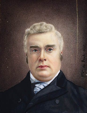
Sir John Sparrow David Thompson by Bonne de Bock, c. 1895 (e000000122)

Canadians were shocked and saddened when Canada’s fourth prime minister, Sir John Sparrow David Thompson (1845–1894), died suddenly during a formal lunch in the United Kingdom, at Windsor Castle. They were honoured when Queen Victoria laid the funerary wreath upon “her dead premier’s” casket with her own hands.

This was a period of shared national mourning. The unexpected nature of the death, combined with the extended, high-profile pomp and splendour of the funerary proceedings—on both sides of the Atlantic—made it the major Canadian news story of the day. Much of the coverage took on an imperial-nationalistic tone.

Head and shoulders photograph of Frederic Marlett Bell-Smith

Portraits of Artists from Archives Of American Art, Smithsonian Institution

One Canadian artist, Frederic Marlett Bell-Smith (1846–1923) was inspired to capture the sentiment through a timely and ambitious program of commemorative public art.

Bell-Smith planned and prepared a series of three monumental canvases, which he intended to sell to the Canadian government. Ultimately, Bell-Smith hoped the series would be displayed in perpetuity, either at the National Gallery of Canada or on Parliament Hill.

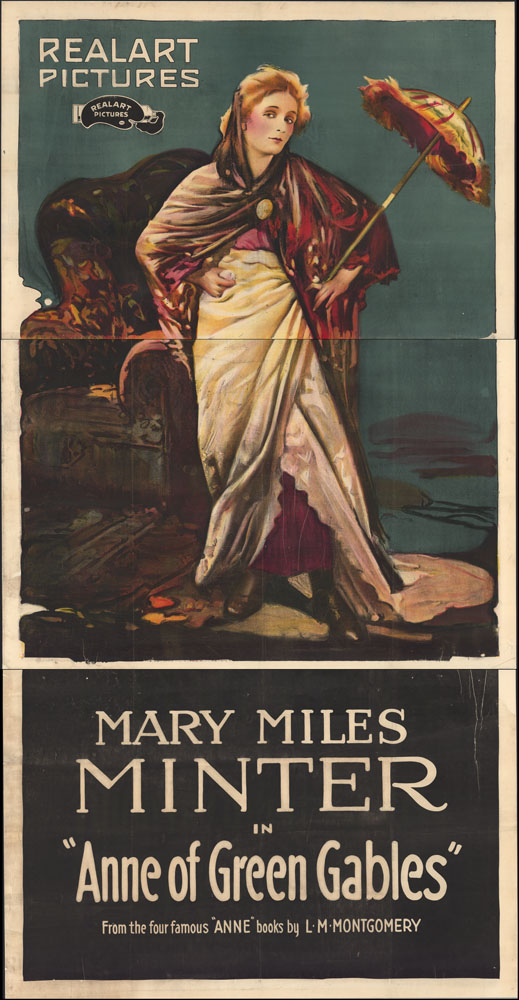
In each of the three paintings that make up the series, the artist chose to portray one important homage to the dead prime minister. The first, Queen Victoria’s Tribute to Her Dead Canadian Premier, which is known as “The Tribute,” is set at Windsor Castle and centres around Queen Victoria’s official act of laying the wreath on Thompson’s casket.

A portrait of those attending the mass held at Windsor Castle for former prime minister Sir John Thompson. Queen Victoria lays a wreath on Thompson’s casket while prominent guests and members of her court look on

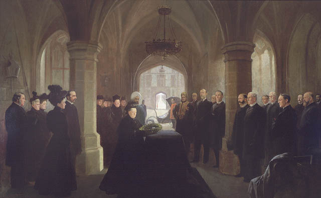
Queen Victoria’s Tribute to her Dead Canadian Premier, by Frederic Marlett Bell-Smith, 1896, (c141808k)

The second, The Arrival of the Blenheim at Halifax, known as “The Arrival,” portrays solemnities held on the deck of Queen Victoria’s “fastest warship,” the HMS Blenheim. The Blenheim was chosen to convey Thompson’s body back to Canada, with highest honours. The ship’s sides were painted black and its gangway draped in black cloth.

A photograph of an original oil painting which shows the deck of the HMS Blenheim upon its arrival in Halifax with former prime minister Thompson’s remains.

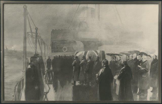
The Arrival of the Blenheim at Halifax, photograph of the original 1895 painting, c. 1902, by Cunningham Studios, (e011213232)

Unfortunately, the only remaining record of this painting is a black and white photograph. The original was destroyed in the Parliament Hill fire of 1916.

The third, and final, painting in the series, The State Funeral of Sir John Thompson at Halifax, known as “The State Funeral,” portrays Thompson’s Canadian state funeral, which was held in Halifax, Nova Scotia, on January 3, 1896.

A painting of the state funeral of Sir John Thompson, in Halifax, Nova Scotia, featuring portraits of many of those attending

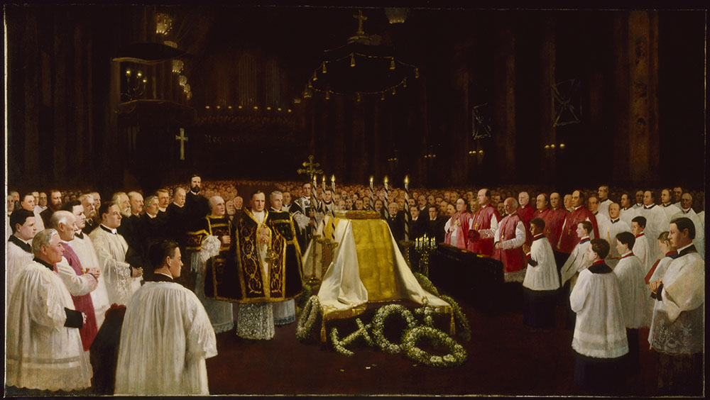
The State Funeral of Sir John Thompson at Halifax, by Frederic Marlett Bell-Smith, 1897, Library and Archives Canada (c147277k)

Bell-Smith’s paintings don’t portray Thompson himself: instead they provide accurate portraits of the former prime minister’s most prominent mourners. While these include British royalty (Queen Victoria granted Bell-Smith a life sitting) and court personalities (the queen’s “loyal Indian servant,” Mohammed Abdul Karim (1863–1909), often referred to as “Abdul,” features prominently in the first canvas), the cast is primarily made up of politicians and prominent citizens in Halifax and Ottawa—those with the power to eventually buy the works for the people of Canada.

Detail shows Mohammed Abdul Karim

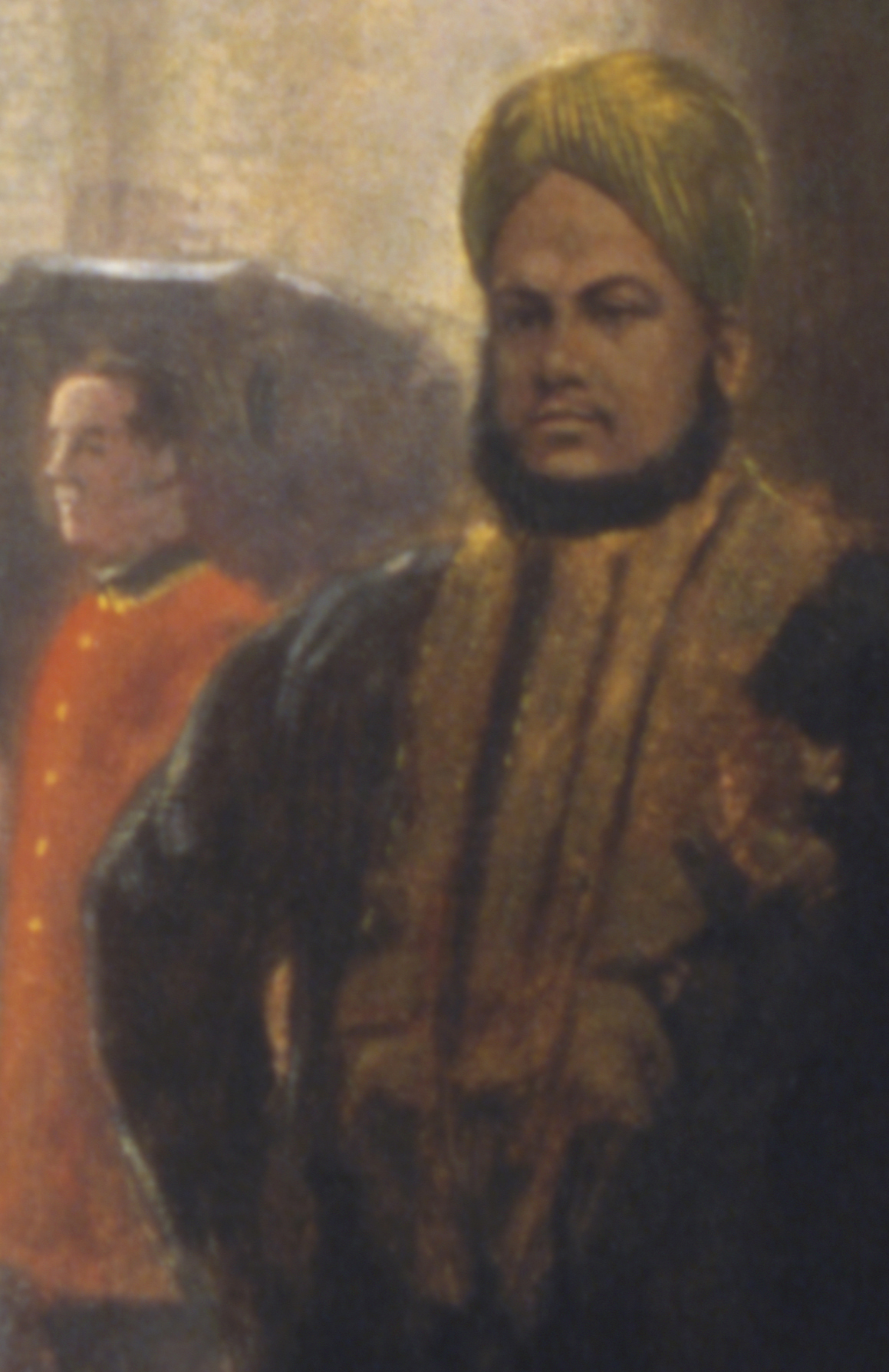
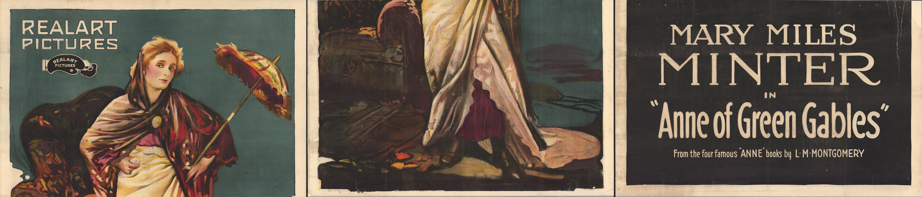
Detail of “Abdul,” from “The Tribute” (c141808k)


Detail shows politicians and prominent citizens of the day

Detail of mourners , from “The State Funeral”, (c141808k)

Unfortunately, Bell Smith’s very attempts to connect the paintings to potential patrons may have led to the failure of his commemoration.

By the time the works were finished, the government had changed hands. As Eva Major-Marothy, former chief curator and senior art archivist at Library and Archives Canada, has written in her important study on the series: “The new Liberal government was not interested in acquiring portraits of its opponents or paintings of activities that glorified them.”

The aesthetic quality of the works may also have been a determining factor. The composition of “the State Funeral” appears especially clunky and forced, perhaps due to Bell-Smith’s overzealous attempts to include every important sitter. In some cases, the size of the figures is exaggerated. In most cases the positions are as unnatural as if the portraits had been cut and pasted from another source. At the time, the then-curator of the National Gallery of Canada felt “unable to recommend their purchase….”

In the end, the entire series fell into obscurity, and two of the paintings were presumed lost for a number of years. But what really happened to each of Bell-Smith’s monumental canvases?

“The Tribute” was purchased by the Women’s Canadian Historical Society of Toronto in about 1914 and donated to the then National Archives sometime before 1931. It was lost in the archives and discovered again much later, during an inventory of large rolled up items. The canvas had been badly damaged, but Library and Archives Canada’s team of conservators was able to restore it expertly… it remains an example of an extraordinary conservation effort.

“The Arrival” was purchased by a senator whose portrait figures prominently in it. After his death, his widow donated the work to the National Gallery, but it was transferred to the Railway Room, on Parliament Hill, where it was destroyed in the fire.

“The State Funeral,” the third and last painting in Bell-Smith’s series, was never sold and remained in the artist’s family. It was donated to Library and Archives Canada by the artist’s descendants in 1997.

Today, the two remaining paintings—reunited in Library and Archives Canada’s collection—provide us with a fascinating insight into the history of public commemoration in Canada.

For further information, see Eva Major-Marothy, The Wrong Commemoration: Frederic Marlett Bell-Smith’s Paintings of the State Funeral of Sir John Thompson, in Public Art in Canada, Toronto (2009).
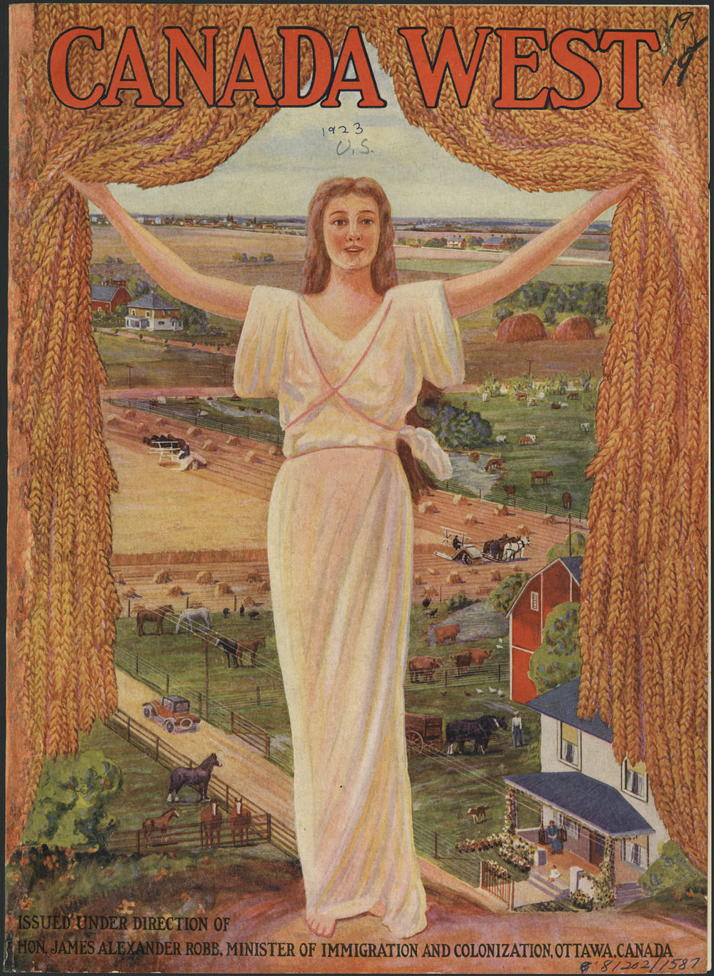
Guest curator: Scott Dickinson

Banner for the guest curator series. CANADA 150 is in red along the left side of the banner and then the bilingual text: Canada: Who Do We Think We Are? and under that text is Guest curator series.Canada: Who Do We Think We Are? is a new exhibition by Library and Archives Canada (LAC) marking the 150th anniversary of Canadian Confederation. This exhibition is accompanied by a year-long blog series.

Join us every month during 2017 as experts, from LAC, across Canada and even farther afield, provide additional insights on items from the exhibition. Each “guest curator” discusses one item, then adds another to the exhibition—virtually.

Be sure to visit Canada: Who Do We Think We Are? at 395 Wellington Street in Ottawa between June 5, 2017, and March 1, 2018. Admission is free.


A wedding portrait of Samuel Leonard Tilley and Julia Ann Hanford

A colour photograph of a sepia-tone image in a wood and gold frame showing a seated man and woman. The man is wearing a suit, waistcoat and cravat. The woman is wearing a bonnet, dress and patterned shawl.

A daguerreotype of Samuel Leonard Tilley and Julia Ann Hanford, ca. 1843. (MIKAN 3192569)

Canada is no longer known as a “Dominion” of Great Britain. According to legend, Father of Confederation Samuel L. Tilley borrowed the word from a biblical psalm. It would become part of our nation’s first formal identity.


Tell us a bit about yourself

I became interested in history—more specifically, the history of technology and of industry—while growing up in Brantford, Ontario, an old factory town not too far from Hamilton. If Hamilton was known for making steel, Brantford was known for making farming equipment. By the time I lived there, all the big Canadian farming companies had left, leaving nothing but the old factory buildings and the memories of the older generation. Exploring that history left me deeply interested in the machines that Canadians invented, made and used—and the places where they did all three. It was the start of my journey into history. I no longer live in Brantford, but everywhere I go I find myself searching for signs of Canada’s industrial past.

Is there anything else about this item that you feel Canadians should know?

The first practical photographic process was invented in 1839 by Louis-Jacques-Mandé Daguerre, which is why this type of photograph is called a daguerreotype. Although the photograph is normal to us, the daguerreotype process is not, and probably requires a bit of explanation.

The daguerreotype used a silvered copper plate as “film.” The surface of the plate was chemically treated so that it would be sensitive to light. This light-sensitive plate was placed in a dark box—the camera—until it was exposed to the scene it was meant to capture. After another chemical treatment, the image of what the plate had been exposed to was plain to see, in a very crisp black and white. Daguerreotype images seem to float above their plates, giving them the illusion of depth, a unique property that no other form of photography has managed to duplicate.

Daguerreotype exposures are not instantaneous. One would have to hold still for up to two minutes, or the resulting image would be blurry. This is the reason why most early photographs are formal portraits of sitting individuals or other static scenes. The expense and time required also meant that taking a photograph was an event worth dressing up for.

Have you ever had to keep smiling as someone fumbles with their camera? Holding a smile for more than a few seconds can be painful. Now imagine trying to hold a smile for two whole minutes. Early photographs like this one show our ancestors to be grim, but a frown is much easier to hold than a smile!

When we look at historical photographs, we must think about not just the subject matter, but the technology used to capture the image. The Tilleys, pictured here in stiff and formal poses, were not necessarily stiff and formal people. We would never know it from these daguerreotypes, as the limitations of that technology meant only some sorts of scenes could be captured. When historians look at historic photographs, we have to think about what we have seen—and what we have not.

Tell us about another related item that you would like to add to the exhibition

A black-and-white photograph of two small boys wearing wool coats and hats sitting on a wooden bench. One is slumped over sleeping; the other is staring the camera and holding a suitcase. A blurred crowd of people can be seen in the background.

New arrivals aboard S.S. ARGENTINA awaiting clearance in the Immigration Examination Hall, Pier 21, March 1952 (MIKAN 3212241)

There is an item in LAC’s collection that complements this daguerreotype quite well. It is another photograph, one that shows a scene quite different from the genteel setting that the Tilleys were photographed in.

More than a century after the daguerreotype of Samuel Tilley was taken, Canada was in the midst of one of its periodic booms in immigration. Photography was now more than developed enough to do what the old daguerreotype could not—candid snapshots. More importantly, photographers were now interested in taking pictures of regular people, like those of new immigrants, and later of refugees. Both are represented in this exhibit.

This snapshot is of a pair of young immigrants, waiting to be processed through Pier 21 in Halifax. The year is 1952, and these two tired-eyed children have just disembarked from the S. S. Argentina. Their faces show exhaustion, trepidation and perhaps some annoyance at the wait.

Which of these photographs show a better image of Canada? I would suggest that the versions of Canada that these photographs depict are equally valid. Both photographs show stories that are worth telling.

This photograph does not show a Founding Father of Canada. The names of these two children are not recorded. But they are Canadians, all the same. Their experience of Canada was quite different from the experience of Samuel Tilley, but both were important to the growth of our nation. Photography has become a great social leveller. It is no longer the preserve of the well-off. We are indebted to those early daguerreotypists for capturing the faces of early Canadians, but they could not capture how they looked outside of the studio. More modern photographers have given us windows into what Canadians really look like.

Biography

A colour photograph of a young man standing with a diploma.Scott Dickinson is a young museum professional with a great interest in the history of the technology that Canadians use every day. He holds an Honours Specialization in History from the University of Western Ontario (2014) and a Master’s Degree in Public History, also from the University of Western Ontario (2015). He is currently a student in the Museum Management and Curatorship program at Fleming College.

Guest curator: Nicoletta Michienzi

Banner for the guest curator series. CANADA 150 is in red along the left side of the banner and then the bilingual text: Canada: Who Do We Think We Are? and under that text is Guest curator series.Canada: Who Do We Think We Are? is a new exhibition by Library and Archives Canada (LAC) marking the 150th anniversary of Canadian Confederation. This exhibition is accompanied by a year-long blog series.

Join us every month during 2017 as experts, from LAC, across Canada and even farther afield, provide additional insights on items from the exhibition. Each “guest curator” discusses one item, then adds another to the exhibition—virtually.

Be sure to visit Canada: Who Do We Think We Are? at 395 Wellington Street in Ottawa between June 5, 2017, and March 1, 2018. Admission is free.


Cover from a Canada West immigration atlas published by the Department of Immigration, ca. 1923

A colour atlas cover showing a blonde woman in a white Grecian-like robe holding open a curtain of golden grain to reveal a busy farming scene complete with green and gold fields, farmhouses, barns and cattle.

Cover from a Canada West immigration atlas published by the Department of Immigration, ca. 1923 (MIKAN 183827)

Behind golden curtains of grain, we see an idealized—and inaccurate—vision of Canada. Mythologizing was common in immigration advertising. At the time, the west was just not as modern or developed as shown here.


Tell us about yourself

I was born and raised in London, Ontario as part of a close-knit Italian-Canadian family. My family’s stories about my culture inspired me to become passionate about the history of Italy.

As a result, I have travelled Italy and other parts of Europe on several occasions, and try to travel whenever I can. I had the privilege of travelling to England for school. While there, I participated in an archaeological dig along Hadrian’s Wall, and during my spare time, I was able to visit parts of northern England and Scotland. I have also travelled Europe with family and friends. During my travels, I always make an effort to visit as many historical and cultural institutions as I can. Visiting these sorts of places is interesting, as it shows you what society values.

My next travel mission is to try to see more of Canada. While I have done quite a bit of travelling outside of North America, I have never taken the time to see my country. I hope that with Canada’s sesquicentennial I will have an opportunity to look more at my country and see what sorts of things we value as Canadians.

Is there anything else about this item that you feel Canadians should know?

This Canada West cover is a terrific example of Canadian immigration posters from the 20th century. The Canadian Department of Immigration had begun an aggressive advertising campaign in the late 19th century hoping to attract immigrants to the sparsely populated Western provinces.

A colour poster showing a landscape with green fields and mountains with two men standing in the foreground on opposite sides of a river. One has an American flag at his feet while the other holds the Union Jack and has a cornucopia at his feet; he is beckoning the American to come to Canada. Underneath are the departure and arrival locations and dates as well as the price ($12) for the journey.

Promotional immigration poster “40,000 Men Needed in Western Canada” (MIKAN 2837964)

Canada and the British government originally sought to recruit English-speaking immigrants, with many advertisements circulated around the British Isles and the United States. The Department of Immigration did eventually diversify, but in the beginning still focused on white European countries as main sources for immigration. The Netherlands, Germany, and Austria-Hungary were the main targets of immigration campaigns, with text translated from English to other languages. The poster below is an example of promoting Manitoba as a viable area to settle Dutch immigrants.

A colour poster showing giant hands pointing to little vignettes of the different cities in Canada: Montréal, Ottawa, Toronto, Winnipeg and Vancouver against a light green background bordered by green and red stripes. The text is in Dutch and advertises the available land and the length of the journey by boat (10 days from Holland).

Immigration poster “Lees Dit!” [Read this!] advertising Manitoba to Dutch immigrants, ca. 1890 (MIKAN 2837963)

The Canada West cover is part of a larger tradition that used the ideal of land opportunity, abundance and farming as an idyllic lifestyle to attract newcomers to Canada. The focus was to promote Canada’s natural resource as a lifestyle for people who were not landowners in their home countries. Attractive images of wheat fields, cornucopias, and picturesque farming communities were made to sell Canada as a peaceful country full of opportunities, though the art idealized the reality. Atlases like this one also contained pages worth of information on Canada with maps of the western provinces. The information included was to further showcase Canada as a country where land and resources were readily available. Canada West was heavily distributed by the Department of Immigration all over the United States and mainland Europe.

Though these simplistic campaigns seem ineffective now, the Canadian Department of Immigration was successful. By 1911 immigration numbers were around 331, 288 per year. After the First World War, the numbers jumped to over 400,000 per year. Imaged-based advertisements, and the notion of Canada as a land of abundance were successful. These early endorsements sold Canada to people who identified as something other than Canadian. Though the images depicted in the propaganda, were not always realistic, they portrayed Canada as a land of opportunity and abundance.

Tell us about another related item that you would like to add to the exhibition

Canadian immigration and advertising has evolved substantially since the early 20th century. Our ideas of who is an immigrant, and why people choose to come to Canada has changed. How we document immigration has also changed. Technology such as photography and videography have been used to record immigration stories in the modern period.

Library and Archives Canada has an amazing collection of contemporary photographs of immigrants ranging from the late 19th century to the present. These images often depict a different immigrant experience. Photos in the archives show that our immigration policies had a global impact. Many of the immigrants who arrived in Canada would not only work in rural areas, but in urban centers and have an impact on the way Canada has formed. Presently, Library and Archives Canada is working on adding more photos to their collection, highlighting the different materials in their collections. More modern photos like those in the exhibition join older photos like those shown here.

A black-and-white photograph of groups of immigrants on a train platform wearing a variety of clothing from traditional Indian garb with turbans to European styles of clothing. Behind them is the railway station, a small hut with the town’s name on the roof. The mountain rises behind the station, and a young boy stands on the tracks.

Group including Indian immigrants on platform of Canadian Pacific Railway station, Frank, Alberta. ca. 1903 (MIKAN 3367767)

A small black-and-white photograph of a man and woman on either side of a hay bale. A description of the family includes their family name, where they came from, how they arrived, where they live, and a short description of their farm.

Mr. and Mrs. Friedrich Pahl on their farm, Romanian immigrants who arrived May 13, 1927, aboard the S.S. Estonia, Baltic-America Steamship Line (MIKAN 3516853)

Library and Archives Canada also has a collection of videos and oral histories related to the immigrant experience. This collection includes videos on the history of Pier 21, one of the largest immigration points in Canada. These video testimonies show the changes in immigration trends, and how the idea of Canada is continually evolving. While we no longer see Canada as an expanse of open field, the idea behind immigration to Canada is the same. Canada is a land of opportunity for global people, and like our earlier poster, Canada is available for immigrants.

Biography

Nicoletta Michienzi has completed an undergraduate degree from the University of Western Ontario with an Honors Specialization in History and a Major in Classical Studies. During her degree, she participated in an archaeological dig in the north of England and was able to see the effects of tourism on historic sites. She continued her education at Western, completing a Master’s degree in Public History. Since graduation she has been employed by various historical institutions in London, Ontario. She is currently working as the Public Programmer at the Royal Canadian Regiment Museum and as a Historical Interpreter at Eldon House. At the Royal Canadian Regiment Museum, she organizes and conducts tours, educating the public about London’s military history and its connection to global conflict. At Eldon House, she interacts with tourists and helps conduct education programs about London’s oldest heritage home. At both institutions, she focuses on visitor services and educating the public, hopefully making visitors enthusiastic about the history of their community and their country.

Related Resources

Francis, Daniel. Selling Canada: Three Propaganda Campaigns that Shaped the Nation. Vancouver: Stanton Atkins & Dosil Publishers, c.2011.

Portraits on Metal: Tintypes from Library and Archives Canada – an exhibition at the National Gallery of Canada

By Jennifer Roger

The tintype process was introduced in 1855 and quickly became one of the most popular ways for people to access and experience photography.

Tintypes are direct positive images, meaning they have no negatives. Created on a thin sheet of iron that is coated in a dark lacquer or enamel and layered with a collodion emulsion, tintypes are one of the most durable photographic processes. Prevalent in both museum and personal collections, they are compelling records of 19th-century life.

Much more affordable than a daguerreotype, tintypes became the medium of choice for people seeking to have their portrait made. Portrait studios offered tintypes for mere pennies. Their ease of processing created more portability, allowing mobile studios to flourish and expand their services to outdoor fairs or tourist destinations. Tintypes were used to record many outdoor scenes and events. The new medium offered the public an accessible option for capturing likenesses, and it became a catalyst in the acceptance of photography into popular culture.

A hand-tinted, black-and-white portrait of a seated woman.

Portrait of a woman, possibly a member of the Boivin family, mid 19th century (MIKAN 3262334)

Because of their affordability and ease of production, tintypes were appealing to the middle and working classes. The move from the controlled environment of the studio to the outdoors led to a proliferation of never-before photographed scenes of 19th-century life, including people at work, street scenes, buildings and structures, and even battle scenes.

A black-and-white photograph of five men assembling wooden boxes inside a mill.

Interior of a mill, showing men assembling cheese boxes, Maberly, Ontario, mid 19th century (MIKAN 3316695)

A new exhibition at the National Gallery of Canada features a selection of these intriguing objects. Drawn from the collection of Library and Archives Canada, these tintype portraits were created both inside and outside the studio and offer glimpses of life in 19th-century Canada.

The exhibition features several studio portraits, such as one of an unidentified woman posing in front of a Niagara Falls backdrop. Backdrops and studio props were widely used in 19th-century portrait studios, not only for aesthetic reasons but also as a method of self-expression.

Niagara Falls was one of the most desirable tourist destinations in the 19th century, so when used as a backdrop, it could have served as an expression of prestige or of personal interest in the attraction. If one could not personally travel to the site, a backdrop could be the next best thing. Backdrops can also provide clues as to the identity of the photographic studio.

A black-and-white studio portrait of an unidentified woman standing next to a fence with a scene of Niagara Falls in the background.

A studio portrait of an unidentified woman standing next to a fence with a scene of Niagara Falls as the backdrop, mid 19th century (MIKAN 3210905)

People often posed with personal items that were of sentimental value or professional significance, as a way to convey who they were or express what was important to them. Sitters chose items that they felt characterized them, such as tools of their trade, musical instruments and photography equipment. Known as “occupational” portraits, these images are revealing and intimate records of past identities.

A black-and-white portrait of two young men seated. One is holding a violin and the other is holding a cello.

Two young men seated, one is holding a violin and the other is holding a cello, mid 19th century (MIKAN 3262290)

For more examples of these intriguing tintype portraits, visit Portraits on Metal: Tintypes from Library and Archives Canada on display within the Canadian Indigenous Galleries at the National Gallery of Canada in Ottawa from December 12, 2017 to July 6, 2018.


Jennifer Roger is a Curator in the Exhibition and Loans section at Library and Archives Canada.

Guest curator: Jill Delaney

Banner for the guest curator series. CANADA 150 is in red along the left side of the banner and then the bilingual text: Canada: Who Do We Think We Are? and under that text is Guest curator series.Canada: Who Do We Think We Are? is a new exhibition by Library and Archives Canada (LAC) marking the 150th anniversary of Canadian Confederation. This exhibition is accompanied by a year-long blog series.

Join us every month during 2017 as experts, from LAC, across Canada and even farther afield, provide additional insights on items from the exhibition. Each “guest curator” discusses one item, then adds another to the exhibition—virtually.

Be sure to visit Canada: Who Do We Think We Are? at 395 Wellington Street in Ottawa between June 5, 2017, and March 1, 2018. Admission is free.


This article contains historical language and content that some may consider offensive, such as language used to refer to racial, ethnic and cultural groups. Please see our historical language advisory for more information.

Temples of Today by John Vanderpant, ca. 1934

Black-and-white photo of a grain elevator with tall, circular towers in front of a taller rectangular building.

“Temples of Today” by John Vanderpant, ca. 1934. (MIKAN 3784205)

Photographer John Vanderpant saw Canada’s grain elevators as temples. They were part of his utopian vision for the country, based on a faith in trade and industry. For him, industry would define the nation’s future.


Tell us about yourself

It is amazing to think that I have been working at LAC for almost two decades now. The work in the photography section is incredibly diverse as are the collections themselves, and my time here has gone by incredibly quickly.

I come from an art history background, but I have always been as interested in the context of the work, as in its aesthetic qualities. By exploring the social, cultural and historical context of a photograph, we can begin to understand why it exists in the first place. Why was it created, who asked for it to be created, where and how it was circulated—all of these questions fascinate me. I suppose this is how I ended up as an archivist, because context and provenance are the pillars of any archival collection. I enjoy both the detective aspect of working on the historical photographs in the collection, and working with current photographers, digging into the rationale behind the taking of a photograph. I’ve published and presented on a wide variety of LAC photographs and collections over the years, including photos by John Vanderpant and Yousuf Karsh that were taken on cross-Canada trips in 1930 and the early 1950s respectively. These cross-country trips really intrigue me. They seem like a Canadian rite of passage even today, but they also speak volumes to the ever-shifting notion of Canadian identity.

Is there anything else about this item that you feel Canadians should know?

The John Vanderpant fonds has become one of LAC’s most important photographic fonds, as his work has grown in stature through the research of a number of Canadian art historians over the last 30 or 40 years. The photograph was taken around 1934 in the Vancouver ports area. Vanderpant was one of Canada’s leading pictorialist and straight photographers, and his series of images of the grain silos in Vancouver is now considered iconic.

When Vanderpant arrived in Canada from Holland in 1911, he saw the nation as most other Europeans did—a vast and empty wilderness. By the time he took the photograph “Temples of Today” in 1934, he dreamed of a country with the immense potential and unexploited resources to become an industrial powerhouse of the future. Of course he was not alone in this sentiment, and the interwar years were a period of great urban and industrial development in Canada. This photograph in particular illustrates his turn away from the more painterly, “fuzzy” qualities of pictorialism toward straight photography. This style embraced a stripped down modernist aesthetic and, just as importantly, a subject matter that represented a strong belief in a future dominated by an urban and industrial life. “Temples of Today” purposely eschews beauty, focussing instead on the massiveness of the silos coming out of the shadows into full light, with the foregrounding of the hydro poles reinforcing the industrial message. The photograph perfectly illustrates the development of a popular philosophy about the natural progression of mankind through industrialization. Vanderpant strongly subscribed to this view and wrote articles and gave many public lectures on the topic. But along with this forward focus, Vanderpant, with so many other Canadians of the time, completely dismissed the Indigenous peoples of the country, seeing Canada as a kind of terra nullius or unoccupied land ready to be exploited and developed however the settler culture wanted. Vanderpant’s photographs are rightly lauded today as an exceptional representation of an aspect of Canadian life that was largely viewed as unpalatable up to that point, but they also concealed, by omission, the importance of the founding communities of the nation.

Tell us about another related item that you would like to add to the exhibition

It is interesting to compare Vanderpant’s ideas about Canada, as represented in “Temples of Today,” with those of the German photographer Felix Man who visited Canada at almost the same time this photograph was taken. Man, considered to be a pioneer of photojournalism and of the photo essay format, travelled across Canada for six months in 1933, commissioned by the German picture magazine Berliner Illustrirte to “visit Canada and photograph all the most important things.” LAC acquired about 200 of his images in 1985 in order to document how Canada was perceived by a European during the interwar period. Like Vanderpant, Man was overwhelmed and inspired by the vastness of the country he visited. He visited almost every region, but was particularly taken with the prairies and the northern regions—going as far as Churchill, Manitoba, and Great Bear Lake, Northwest Territories.

But in most other ways, Man’s view of Canada could not have been more different than Vanderpant’s. Both held what could be described as romantic views of Canada. Vanderpant romanticized a future, industrialized and urban Canada, while Man held a more typically European view of a Canada frozen in a romanticized past. He was heavily influenced by the stories of Indigenous heroes written by fellow German Karl May (who famously only visited North America after his books were published). His idealized fantasies of the “noble savage” remain popular in central and Eastern Europe to this day. Man’s photographs vividly depict this romantic image of Canada. While Vanderpant’s images focus on the development of Canada, Man, as photographic historian Joan Schwartz has noted, largely excluded urban Canada in his photographs. Instead, his camera captured such views as the unrelenting snow and ice around Churchill in winter, and the “Banff Indian Days,” a popular tourist attraction in which Indigenous peoples donned stereotypical costumes, erected wigwams, and put on displays of hunting and horsemanship for pay.

Woman on horseback holding a little girl to her side. The woman is wearing a plain dress with a patterned belt and a feathered headdress over her braided hair.

“Indian Woman with Child” by Felix Man, taken during “Banff Indian Days” in Banff, Alberta, 1933. (MIKAN 3333566)

His photograph of the Indigenous woman and child on horseback is an excellent example, with its grainy aesthetic, and the woman in an elaborate headdress (which in reality were only worn by women in exceptional circumstances) reaching back to embrace the small child. The “Madonna and child” symbolism presents all the qualities necessary to build a stereotypical and generalized narrative of 20th-century Indigenous peoples as still living their so-called traditional lives, and the images of the Banff “Indian Days” were very popular with the European press.

The exclusion of Indigenous peoples in John Vanderpant’s representations of an industrial and urban Canada, and the fixing of them into a mythical past by Felix Man, also tie into the works of urban Iroquoian photographer Jeff Thomas in this exhibition. Using toy figurines posed with the Parliament buildings in the first instance, and in front of a rail car emblazoned with the word “Canada” in the second, Thomas seeks to reinsert Indigenous peoples into both Canada’s history and present. Thomas’ photographs introduce critical concerns about the roles Indigenous people played in the building of the nation-state of Canada and in the building of the railroad. Using the figurines, he plays on the stereotypes which were perpetuated and disseminated by photographers like Man, but also with the omission of Indigenous peoples from the narrative of the past, present and future of Canada. Considering these two seemingly unconnected photographs from the 1930s together allows us to bring these two stereotypical views of Canada together, and to see how the knowledge of the immediate and broader contexts in which they were created can deepen our understanding of not only the photographs themselves, but of Canada’s past and present as well.

First Nations figure set in front of a train marked “Canada” with grain graffiti on its side.

Canada Day 2005, Brandon, Manitoba, Canada from The Delegate on Tour Series by Jeff Thomas, 2005 (MIKAN 3932014) ©Jeff Thomas

Indigenous figurine set across the river from Parliament Hill.

Parliament Hill, Ottawa, Canada, 2007 from The Delegates on Tour Series by Jeff Thomas. (MIKAN 3932081) ©Jeff Thomas

Biography

Jill Delaney is an archivist in the acquisition of photography of the Visual, Sound and Landscape section, Private Archives Branch. She holds a Master of Canadian Studies from Carleton University (1991) and a doctorate in Art and Architectural History and Theory from SUNY-Binghamton (1997). Jill joined LAC in 1998 as a photography archivist and has been working with the collections ever since, with the exception of an assignment in the architectural records section.

Guest curator: Catherine Bailey

Banner for the guest curator series. CANADA 150 is in red along the left side of the banner and then the bilingual text: Canada: Who Do We Think We Are? and under that text is Guest curator series.Canada: Who Do We Think We Are? is a new exhibition by Library and Archives Canada (LAC) marking the 150th anniversary of Canadian Confederation. This exhibition is accompanied by a year-long blog series.

Join us every month during 2017 as experts, from LAC, across Canada and even farther afield, provide additional insights on items from the exhibition. Each “guest curator” discusses one item, then adds another to the exhibition—virtually.

Be sure to visit Canada: Who Do We Think We Are? at 395 Wellington Street in Ottawa between June 5, 2017, and March 1, 2018. Admission is free.


Plan for a group of eight farms by Sir William Cornelius Van Horne for the Canadian Pacific Railway, ca. 1889

Page with two grids drawn in black ink separated into squares or triangles to represent farms.

Plan for a group of eight farms by Sir William Cornelius Van Horne for the Canadian Pacific Railway, ca. 1889 (MIKAN 2925396)

This doodled design hints at the power railroad companies held to influence the look of the country. Settlements along Canada’s railway lines still reflect the grid plans imposed on them back then.


Tell us about yourself

During four very happy summers as an archival assistant at the Provincial Archives of Alberta, I worked with government records, private manuscripts and cartographic records, and I answered many reference inquiries for homestead applications (through which homesteaders obtained letters patent to confirm that they had settled former Crown land and had received legal title). During my last summer, I catalogued the series of historical township plans (maps) that covered all of Alberta.

Is there anything else about this item that you feel Canadians should know?

Portrait of a seated man in a suit, straddling a café chair and holding a cigar between two fingers.

Sir William Van Horne, builder of the Canadian Pacific Railway, ca. 1900–1910 by W.A. Cooper (MIKAN 3575931)

Since I am well acquainted with the Western Canadian land survey system and the homestead applications and township plans at the Provincial Archives of Alberta, this item from the Sir William Cornelius Van Horne fonds resonated with me. Those grid lines looked very familiar! But the Canadian Pacific Railway’s (CPR) influence on the look of Western Canada extends beyond this doodled sketch of a grid-based settlement plan; there is more to the story.

The CPR’s construction was supported by the government through the Canadian Pacific Railway Charter, which bestowed on the company a monetary subsidy of $25 million and land grants of 25 million acres (an area roughly the size of England), in addition to lands for rights-of-way, stations and yard works. Van Horne had direct responsibility for the CPR’s construction between 1882 and 1885, and was subsequently its Vice President, President and Chairman. Soon after the railway was completed in 1885, he and the other directors of the company realized that whatever small profits were made would be almost immediately swallowed up by the operating and maintenance costs of the difficult mountain sections.

Recognizing not only the potential lure of new settlement lands but also the grandeur of mountain scenery, Van Horne and the CPR used artwork and carefully crafted words in advertising campaigns that targeted settlement and tourism in Canada. The CPR’s influence and actions thus helped to shape Canada’s image abroad and contributed directly to the national economy.

Tell us about another related item that you would like to add to the exhibition

Van Horne is famously quoted as saying, “If we can’t export the scenery, we’ll import the tourists.” Both his passion for art and his business acumen gave him a keen interest in the development of the CPR’s tourism campaign.

While there is a plethora of beautiful visual records at LAC and across Canada that could show how the CPR and Van Horne influenced the image of Canada abroad, I will focus instead on the complementary power of words, specifically those found in the 1891 version of the CPR tourist pamphlet The Canadian Pacific: The New Highway to the Orient Across the Mountains, Prairies and Rivers of Canada.

Image of mountain range with a small train leaving a train station, set between the title of the pamphlet at the top and bottom of the page.

Title page of The Canadian Pacific: The New Highway to the Orient Across the Mountains, Prairies and Rivers of Canada, published in Montréal by the Canadian Pacific Railway, 1891 (AMICUS 8155839)

Conceived and written by Van Horne himself, the 48-page pamphlet was originally begun in 1884 before the CPR was even completed, but it was not produced until 1887 because Van Horne insisted on having nothing but the best mountain illustrations to complement the text. He was one of the patrons behind the “Railway School” of Canadian artists that included John Arthur Fraser, Thomas Mower Martin, Frederic Marlett Bell-Smith and Lucius O’Brien. The artists were given free rail passes, with the only stipulation often being that the CPR would have first choice of the finished works for its own use.

Colourful watercolour scene depicting a green forest in front of cloud-shrouded blue mountains.

View of the Rockies by Lucius O’Brien, 1887 (MIKAN 2886889)

Etching of two men on a beach putting a dead deer in a canoe. Another canoe and a wigwam can be seen at the side in front of trees with a mountain across the river.

Aboriginal Hunters with Wigwam and Canoe by a River by Thomas Mower Martin, 1885 (MIKAN 3018705)

Notwithstanding Van Horne’s passion for art, as a businessman he was not above clearly reminding artists that they owed it to the CPR to portray the mountains in a suitably grand manner to entice visitors. In one notable circumstance, described in E.J. Hart’s book The Selling of Canada: The CPR and the Beginnings of Canadian Tourism (AMICUS 3976336), Van Horne wrote to John Arthur Fraser (who had been sent out in 1886 to sketch the entire CPR line):

The black and white sketches will hardly answer our purposes, the mountains not being sufficiently imposing. I made last night a rough sketch … which will illustrate my ideas; it is made mostly from memory and I have taken a great deal of license but I do not think that any one going to the spot without the picture in hand will ever accuse us of exaggeration. For the great glacier and Syndicate Peak I would like something similar to this. … I find the perspective in the glacier not right and the peaks projecting through the glacier are not treated broadly enough to give their proper distance. You will of course be able to make a great many improvements on my sketch, but I hope you will preserve the size.

Please make a sketch of Mount Stephen, treating it in something the same manner. (The Selling of Canada, p. 35)

The New Highway pamphlet itself was clearly aimed to entice tourists:

May I not tempt you, kind reader, to leave England for a few short weeks and journey with me across that broad land, the beauties and glories of which have so recently been brought within our reach? There will be no hardships to endure, no difficulties to overcome, and no dangers or annoyances whatever. You shall see mighty rivers, vast forests, boundless plains, stupendous mountains and wonders innumerable; and you shall see all in comfort, nay in luxury. If you are a jaded tourist, sick of Old World scenes and smells, you will find everything fresh and novel. … If you are a mountain climber, you shall have cliffs and peaks and glaciers worthy of your alpenstock. (New Highway, 1891, p. 8)

The language is so evocative that reading this today, we can actually imagine what it was like to travel across Canada on the CPR in the late 19th century. The story begins with an explanation of how to reach the Montréal terminus by steamship (unless it is winter, in which case Halifax is the destination), then noting: “But you are impatient to see the mountains, and if you will permit me to choose, dear reader, we will start from Montreal by the main line of railway, and in order that we may miss nothing we will return by the great lakes, and see Toronto and the Falls of Niagara then.” (p. 12)

The pamphlet goes on to extol the facilities of the train itself before providing a detailed description of each part of the journey to the West. The voyager is taken step by step from Montréal through the Ottawa Valley, then north of Lake Superior and into Manitoba, over the great plains of the then Northwest Territories, and into the majestic mountain ranges west of Banff, before emerging from the grand yet “terrible” Fraser Canyon into the Fraser Valley and Vancouver, and concluding with a combination of apology and exhortation:

I ask your pardon, patient reader, for my persistence in showing you all sorts of things as we came along, whether you wished to see them or not. My anxiety that you should miss nothing you might wish to see is my only excuse. You have been bored nearly to death, no doubt, and I have noticed signs of impatience which lead me to suspect your desire for freedom to go and see as you like, and as you have found that no guide is necessary, I will, with your permission, leave you here … (pp. 43–44)

In the end, the CPR’s appeal to the hearts and minds of tourists to promote and exploit the mountain scenery paid off not only for the company but also for Canada’s overseas image and the national economy, a fact that was recognized and further capitalized on by the federal government in the coming years. J.B. Harkin, the first Commissioner of Dominion Parks (1911–1936), shared Van Horne’s appreciation of the economic value of Canadian scenery, regularly including statistics in his annual reports to the Minister of the Interior. Citing the expenditures of foreign and Canadian visitors to Banff between 1910 and 1915 (approximately $15 million and $8.5 million respectively), he further praised the economic value of national park scenery:

It is unique in this regard that while it brings in large sums of money it means that the country does not give in return anything which represents a loss to the country. When wheat is sold we sell a portion of the fertility of our soil. But the tourist who pays his money to see our mountains and lakes and falls, our canyons and glaciers, not only leaves his money but also leaves whole and unimpaired all those natural attractions which brought him here. These beauties remain forever to attract more tourists and more tourist dollars.”

Want to learn more about the foundations of the Canadian tourist industry and the impact of Canadian railways? Take a look at the archived LAC web exhibition Canada, by Train.

Biography

Colour photograph of a woman with short hair and wearing a crimson blazer smiling.Catherine Bailey is a senior government records archivist at LAC, where she has been responsible for the health and social welfare, transportation, justice and security portfolios. While working on her Honours BA in Canadian History (UBC, 1986), she spent summers working as an archival assistant at the Provincial Archives of Alberta, before moving on to complete her Master of Archival Studies degree (UBC, 1988). General Editor of the Association of Canadian Archivists’ journal Archivaria from 2007–2008, she received the ACA Member Recognition Award (2004) and the Archives Association of Ontario’s James J. Talman Award (2012). She has written and presented widely on archival appraisal, especially the development of macroappraisal within the Canadian federal government.

Related resources

Guest curator: Taryn Dewar

Banner for the guest curator series. CANADA 150 is in red along the left side of the banner and then the bilingual text: Canada: Who Do We Think We Are? and under that text is Guest curator series.Canada: Who Do We Think We Are? is a new exhibition by Library and Archives Canada (LAC) marking the 150th anniversary of Canadian Confederation. This exhibition is accompanied by a year-long blog series.

Join us every month during 2017 as experts, from LAC, across Canada and even farther afield, provide additional insights on items from the exhibition. Each “guest curator” discusses one item, then adds another to the exhibition—virtually.

Be sure to visit Canada: Who Do We Think We Are? at 395 Wellington Street in Ottawa between June 5, 2017, and March 1, 2018. Admission is free.


Tourism Poster from Canada Vacations Unlimited, ca. 1947

Colourful poster depicting a moose, deer, bears, a rabbit, a squirrel, a beaver, a fisherman, a piper, a woman spinning wool, a Mountie, an Indigenous woman and child, a boy driving a dog cart, and a totem pole. The words “Canada” and “Vacations Unlimited” are printed across the top and bottom of the poster.

Tourism poster from Canada Vacations Unlimited, ca. 1947 (MIKAN 3007692)

More American tourists preferred seeing sights to going camping, according to early market research. This ad campaign, featuring Canadian cultural symbols, was the—often questionable—response. Is any Canadian stereotype missing?


Tell us a bit about yourself

In 2015, I moved to Fort McMurray, Alberta to work at the Oil Sands Discovery Centre as an interpreter. I grew up in Hamilton Township, Ontario, near Lake Ontario. Our family spent a lot of time camping and visiting museums on vacations. My move from Ontario to Fort McMurray let me travel across the country and gave me a much better perspective on just how big Canada really is.

Is there anything else about this item that you feel Canadians should know?

Three detailed images from the poster. One has a uniformed Mountie, and a First Nations woman wearing a blue-and-red striped dress carrying a baby on her back with deer and a rabbit in the foreground. The second has a fisherman in yellow rain gear holding a large fish and a man in a blue dress coat playing the bag pipes with a white haired woman seated between them. The third has a colourful totem pole shaped like an eagle with its wings spread on top surrounded by wildlife.

Detail of individual images from the poster: a Mountie and First Nations woman and child, a fisherman and a piper, and a totem pole. (MIKAN 3007692)

This Canada Vacations Unlimited poster captures a number of different Canadian stereotypes from the east to the west—the fisherman, the Mountie, the First Nations woman and child, and the totem pole. The poster also references some of the settlers who came to Canada such as the piper. Since the 1930s to 1950s when this poster was created, Canada has become even more diverse. While these are some of the prominent images of Canadians during that time period, it is important to recognize that not every “Canadian-ism” could ever be captured in a single image.

Details of a small brown squirrel; a crouching brown bear with his front paws spread out; a small brown beaver with his front paws spread out; a flying duck; and two brown deer, a stag and a doe.

Details of smaller animals from the poster. (MIKAN 3007692)

This poster features many wild animals as well as a forest in the background. While Canada has a lot of natural beauty, not everyone has a view of the Rocky Mountains or the Canadian Shield outcroppings. According to Statistics Canada, 66% of Canada’s population now lives within 100 kilometres of our southern border with the United States. This represents only four percent of Canada’s land area, which means there are many people living in metropolitan areas now. Some of our biggest cities such as Toronto, Vancouver, and Montréal have attractions that are also well known as tourist destinations.

Tell us about another related item that you would like to add to the exhibition

One thing that struck me when I was looking at the Canada Vacations Unlimited poster was that there were no signs of winter. While there are a number of other artifacts in Canada: Who Do We Think We Are that do focus on winter, it struck me that in this particular poster that focused on Canadian stereotypes there was no snow. For most of us in Canada, winter takes up a fair bit of the year. Yes, shovelling snow and driving through snowstorms are not activities that we tend to enjoy, but it is still better to make the most of what we have instead of just waiting for spring to arrive. To help provide a better look at what happens in Canada year-round, I think that this painting from the mid-1800s would be a good pairing for the Canada Vacations Unlimited poster.

A series of vignettes against a blue background depicting a male figure walking through soft snow, falling in various positions, or getting hit by snow. A running line of text describes each image: "If there is one time of the year when Canada is more delightful that another / it is when a thaw comes after / a heavy fall of snow / because / It makes the snow so nice & soft. / particularly for falling / and because it (sic) so pretty to see the snow falling from the Roofs. / and because you are sure after / falling on your face / to fall on your back in / trying to get up."

One time of year when Canada is more delightful than another. (MIKAN 2837052)

The painting focuses on a series of images of a man trying to walk through heavy snow. Its witty title is “One time of year when Canada is more delightful than another.” I think this is an interesting way to poke fun at something many of us grumble about during the winter—slogging through the snow, trying not to fall into it. The inscription that accompanies each figure works to turn an unpleasant experience into a tale of adventure.

Putting these two posters together shows Canadians in different walks of life surrounded by nature and finding ways to deal with the winter. This helps to express some of what Canada has to be proud of. Canada is more than just its natural beauty or its weather. Canadians are the ones who make the most of what this country has to offer and help to make it a better place to visit and live in.

Biography

A colour photo of a woman with glasses smiling at the photographer.

Taryn Dewar has a Master of Arts in Public History from the University of Western Ontario. She works as an Interpreter at the Oil Sands Discovery Centre in Fort McMurray, Alberta.

Guest curator: Annabelle Schattmann

Banner for the guest curator series. CANADA 150 is in red along the left side of the banner and then the bilingual text: Canada: Who Do We Think We Are? and under that text is Guest curator series.Canada: Who Do We Think We Are? is a new exhibition by Library and Archives Canada (LAC) marking the 150th anniversary of Canadian Confederation. This exhibition is accompanied by a year-long blog series.

Join us every month during 2017 as experts, from LAC, across Canada and even farther afield, provide additional insights on items from the exhibition. Each “guest curator” discusses one item, then adds another to the exhibition—virtually.

Be sure to visit Canada: Who Do We Think We Are? at 395 Wellington Street in Ottawa between June 5, 2017, and March 1, 2018. Admission is free.


The Chewett Globe by W.C. Chewett & Co., ca. 1869

A large globe in a wood and brass stand.

Terrestrial globe by W.C. Chewett & Co. for the Ontario Department of Education, ca. 1869. (AMICUS 41333460)

This globe was one of the first produced in Canada, around the time of Confederation. Designed for use in schools, it was part of a nationalistic push to define and explain the brand new country.


Tell us about yourself

I have travelled extensively for both pleasure and work. I have been to Europe multiple times, and Peru for archaeological digs as a student. I also spent over a year living in Japan as a high school student, and it was an unforgettable experience. The most important lesson I learned was to appreciate and respect things that are different, strange, and sometimes incomprehensible. It taught me to be critical of my biases and the culture I live in, reflexes which promote cohesive living in a multicultural world.

Is there anything else about this item that you feel Canadians should know?

Because of my expertise and love of travel, I have chosen to discuss the Chewett Globe. Maps are a lot of fun! Whenever I travel, I like to look up the country’s world map because they always put their country in the middle of the map. This inevitably causes distortion in the distances between countries and the size of oceans as our planet is spherical. Seeing Canada shrink and stretch has always made me smile and helped me understand how other people see and understand their world, if only a little bit.

Our world is also ever changing, from its physical features, such as rivers and mountains, or abstract constructs, such as names and borders. Therefore, maps must be continuously updated, which allows us to trace history through changes in maps. Maps are critical to my work as an archaeologist. Old city plans might reveal where old buildings once stood or abandoned cemeteries were located but have since been built over and faded from our collective memory. I also must consider how the landscape may have looked like in the past to understand what resources people could access, and what might have inspired them to choose a specific location to camp or imbue meaning onto the landscape through stories and legends.

I think Mr. William Cameron Chewett, the person whose company created this globe, would have appreciated these thoughts. Although his profession was printing, his family were involved with mapping Upper Canada. His grandfather, William Chewett, worked as surveyor-general and surveyed most of what is now Ontario, while his father, James Chewett also worked as a surveyor before building many known Toronto buildings. W.C. Chewett and Co. was considered one of Canada’s foremost printing and publishing firms. The firm produced award-winning lithographs between 1862 and 1867, with yearly first place awards, and had a large publication output ranging from periodicals, directories, and the Canadian Almanac, to law and medicine books. In addition, the retail store was a popular social gathering spot. The globe was created in the company’s last year (1869) prior to it being bought and renamed the Copp, Clark and Company.

A map of Canada West, what is now southern Ontario, with coloured outlines to indicate counties. The legend contains a list of railway stations with their respective distances [to Toronto?].

Map of Canada West, engraved and published in the Canadian Almanack for 1865 by W.C. Chewett & Co., Toronto. (MIKAN 3724052)

For Canada’s150th anniversary, I think it is worth reflecting on the changes that have come to pass in the last 150 years, which the Chewett Globe can literally show us. In my lifetime, I observed the creation of the territory of Nunavut and the renaming of various streets in my neighbourhood. What changes have you seen in your life and how did they affect you and your community?

Tell us about another related item that you would like to add to the exhibition

When most people think of maps, they think of geography and political borders, but maps can also be used to illustrate and describe almost anything, including census information, spoken languages, and group affiliations amongst others. To continue the topic, I have selected an 1857 map of North America that shows the regions where various First Nations groups resided at the time. Ideally, if I were to add this map to the exhibition, I would also want to include a modern map of where First Nation groups reside to show the public the momentous changes lived by our fellow citizens to allow them to see these changes as clearly as those they can pick out by comparing the globe to any modern map of Canada.

My other reasoning is a little more selfish. As an anthropologist, I understand and have learned through experience that the best way to appreciate and respect another culture is to learn about it, about the people, and where possible, live in it. Growing up, I had very little exposure to First Nations, their culture and history. Because of this, I never developed much of an appreciation for their culture or interest in learning about them. As an anthropologist and Canadian, I was ashamed of these feelings and sad when fellow Canadians express similar views. For the last few years, I have actively sought to educate myself. By including this piece, I hope to inspire others to appreciate, respect, and learn more about their fellow Canadians. The topic is particularly meaningful on Canada’s milestone year as this is the year we should celebrate coming together and developing stronger bonds, one nation to another.

A large colour map of North America denoting territories of various Aboriginal bands with legends in the corners.

Map of North America denoting the boundaries and location of various Aboriginal groups. (MIKAN 183842)

Biography

Colour headshot of a woman with glasses and long hair.Annabelle Schattmann is a physical anthropologist. She holds a Master of Arts in Anthropology from McMaster University (2015) and a Bachelor of Arts in Anthropology from Trent University (2012). She has participated in multiple research projects including a dig in Peru, cemetery excavation in Poland, and research on vitamin C and D deficiencies from various time periods in Canada and Europe.

Related Resources

McLeod, Donald W. “Chewett, William Cameron.” Dictionary of Canadian Biography.

Guest curator: Shane McCord

Banner for the guest curator series. CANADA 150 is in red along the left side of the banner and then the bilingual text: Canada: Who Do We Think We Are? and under that text is Guest curator series.Canada: Who Do We Think We Are? is a new exhibition by Library and Archives Canada (LAC) marking the 150th anniversary of Canadian Confederation. This exhibition is accompanied by a year-long blog series.

Join us every month during 2017 as experts, from LAC, across Canada and even farther afield, provide additional insights on items from the exhibition. Each “guest curator” discusses one item, then adds another to the exhibition—virtually.

Be sure to visit Canada: Who Do We Think We Are? at 395 Wellington Street in Ottawa between June 5, 2017, and March 1, 2018. Admission is free.


Major John Norton, Teyoninhokarawen, by Mary Ann Knight, 1805

Oval portrait miniature of Major John Norton, Teyoninhokarawen wearing a white and red headdress with an ostrich feather and long earrings with circled stars. He is also wearing a patterned shirt with a red mantle.

Portrait miniature of Major John Norton, Teyoninhokarawen, the Mohawk Chief by Mary Ann Knight, 1805 (MIKAN 2836984)

The British public held Romantic ideas about Canada, especially its First Nations peoples. Teyoninhokarawen probably played up to these when he sat for this portrait. Here, he wears his own adapted version of Indigenous dress.


Tell us about yourself

I hail from the Ganaraska Forest. Technically, the address of my family home was in a small village called Campbellcroft, in rural Ontario however the nearest neighbor was over a kilometer away and there was little sense of a village. While there, my parents fostered a strong interest in art and culture. Sadly, while the nearly 12,000-acre Ganaraska forest is a place of much wonder and variety, one thing that one does not find there is a major art gallery with an internationally renowned collection. Consequently, as a teen I toured the world’s galleries through reproductions like those I found in the now rare Carnegie Art Reference Set for Colleges. The media fascinated me as much as the message and I developed an interest in reproductions of art works and their spread and dissemination in Canada. I circuitously followed this interest through my studies and ended up writing about bookworks, or artist’s books as they are variously known in my field. From the study of books and reproductions it was a short leap to library and archival school.

Is there anything else about this item that you feel Canadians should know?

Teyoninhokarawen (ca. 1760–1823) was born John Norton in Salen, Scotland, of Scottish and Cherokee parentage. Military records show he went to Canada, and after discharge from the army in 1788 went to live with the Grand River Mohawk Indians, later becoming the adopted nephew of Joseph Brant. His portrait was painted by Mary Ann Knight, an English miniaturist. It was painted during Norton’s visit to England when he acted as an emissary for the Grand River Mohawks, and it was exhibited at the Royal Academy in 1805.

This portrait is a fantastic gateway into late 18th, early 19th century Canadian history. I chose to write about this item, first because it is so visually appealing. The portrait was painted in Europe where Romanticism is very much part of the spirit of the age and this shines through in the presentation of Norton. It was becoming unfashionable for portraits to depict people wearing contemporary European dress. My knee-jerk point of comparison is Thomas Phillips’ portrait of Byron wearing an Albanian scarf wrapped as a turban—though many of Jean-Etienne “The Turk” Liotard’s brilliant portraits might also serve as interesting comparative foils for this miniature.

Norton’s headwear is this portrait is fascinating in the way it perpetuates then prevailing orientalizing mythologies—naturally at this time drawing connections to Rousseau’s by then famous concept of the noble savage—but also truthfully representing Norton’s transatlantic identity. The feather in the headdress is that of an ostrich. Not a common bird on the shores of the Great Lakes where Norton had been adopted as a Mohawk, nor in his father’s Cherokee territory in Tennessee. Ostrich feathers however were popular as part of headwear in the UK, including in Scotland where, as in John Michael Wright’s portrait of Lord Mungo Murray, they gave the wearer an adventurous look. The feather at once connects Norton to the established visual trope of depicting Indigenous peoples of North America wearing ceremonial feather headdresses, while at the same time, the European inclusion of the imported ostrich feather illuminates Norton’s Scottish side.

Detailed view of Norton’s headdress which is white and red with an ostrich feather joined to the front.

Detailed view of Norton’s headdress. (MIKAN 2836984)

All that in just the feather! The rest of Norton’s wardrobe is equally interesting in different ways. This portrait is so rich that there are books full of things Canadians should know! Actually, I would quite literally start by recommending further reading (this is Library and Archives Canada after all). The first book is The Journal of Major John Norton. Norton completed the journal in 1815–16 while in England and it covers a wide range of subjects including his travel from Upper Canada to Tennessee and other southern U.S. states, as well as the frontier wars in the 1780s and 90s. Throughout The Journal, Norton provides an interesting and unique discussion of North America’s Indigenous people. Of particular note is his discussion of Joseph Brandt. Two editions of The Journal have been published, both by The Champlain Society. The more recent edition includes an introduction and additional notes by Carl Benn, who is a preeminent expert on Norton and whose works are a great source for more information.

Another book I would recommend to those intrigued by Norton is The Valley of the Six Nations, also published by The Champlain Society. This book, prepared by Charles M. Johnston, presents a collection of significant documents relating to the Six Nations in the region where Norton spent much of his adult life. It includes many documents discussing the land disputes that the Mohawk people of the Six Nations had with the British and colonial government. Some of documents presented in this volume are by Norton himself, and the originals of many of the documents are in LAC’s archival holdings.

Tell us about another related item that you would like to add to the exhibition

Oval miniature portrait of Colonel William Claus dressed in a dark jacket and white cravat, against a blue background.

Colonel William Claus by Andrew Plimer, c.1792. (MIKAN 2895040)

I’ve chosen this portrait of Claus, because his role in Canadian history has been squarely in the opposite corner from Norton. Eight years after this portrait was painted, Claus was appointed as the Indian Department’s Deputy Superintendent General for Upper Canada. In this role, he was very much Norton’s adversary. In Robert Allen’s entry on Claus for the Dictionary of Canadian Biography, he described the relationship between the two as an “acrimonious feud.”

This feud centred around Six Nations claims to land around the Grand River. While correspondence shows that the two came into conflict with each other several times, Claus struck a devastating blow to Norton when he discredited Norton to colonial authorities, thus causing Norton’s trip to England as a representative of the Six Nations to fail. Claus’ criticisms of Norton were not entirely without foundation as Norton did not truly represent the perspectives of all of the chiefs of the Six Nations.

There is a great deal more that could be said, and in fact has been said, in the sources mentioned above and elsewhere about the relationship between Norton and Claus and the Six Nations dispute with the Indian Department. These two portraits are a fascinating entry point into this chapter of history which still has reverberations today.

Biography

Colour photograph of a young boy peering up at an elaborate model shipShane McCord has worked as an art archivist at Library and Archives Canada since 2010, where the focus of his work has ranged from 17th-century plaques to contemporary art. He has a Master in Art History from Concordia University and a joint Master of Archival Studies and Master of Library and Information Science from the University of British Columbia.

Guest curator: Anne Maheux

Banner for the guest curator series. CANADA 150 is in red along the left side of the banner and then the bilingual text: Canada: Who Do We Think We Are? and under that text is Guest curator series.Canada: Who Do We Think We Are? is a new exhibition by Library and Archives Canada (LAC) marking the 150th anniversary of Canadian Confederation. This exhibition is accompanied by a year-long blog series.

Join us every month during 2017 as experts, from LAC, across Canada and even farther afield, provide additional insights on items from the exhibition. Each “guest curator” discusses one item, then adds another to the exhibition—virtually.

Be sure to visit Canada: Who Do We Think We Are? at 395 Wellington Street in Ottawa between June 5, 2017, and March 1, 2018. Admission is free.


Mary Miles Minter in Anne of Green Gables … from the four famous “Anne” books, Realart Pictures, 1919

Colourful print of Anne wearing dress-up clothes against a green backdrop. She is holding a red and yellow parasol, and wearing black boots, a red skirt under a high white overskirt, and a brown shawl. The Realart Pictures logo is in the top left corner, with the actress’s name and the title of the movie along the bottom.

A colour lithograph poster of actor Mary Miles Minter in Anne of Green Gables from Realart Pictures, 1919 (AMICUS 27641454). “Anne of Green Gables” is a trademark and a Canadian official mark of the Anne of Green Gables Licensing Authority Inc.

You may not have recognized Lucy Maud Montgomery’s red-haired heroine from this American movie poster. It presents one of the earliest mass-produced images of “Anne.” She has since become a regulated symbol of Canada.


Tell us about yourself

My curiosity about artists’ materials and techniques has taken my research in many directions, from the pastels of Edgar Degas and other 19th-century artists to the complex printmaking techniques of Canadian artist Betty Goodwin. I have been practicing paper conservation for over 30 years, treating everything from Old Master prints to huge contemporary drawings. As well, I have a special love for weaving, playing the cello, and oversized paper artefacts that present great challenges in treatment and mounting.

Is there anything else about this item that you feel Canadians should know?

Our poster of Anne of Green Gables is rare. Like newspapers, movie posters are ephemeral objects that are not intended to have a long lifespan. These types of objects are usually printed on poor quality papers that were never meant to withstand the ravages of time, which makes the survival of our Anne of Green Gables poster so special.

Three separate sections of the above poster. The first section shows the top half of Anne’s body; the second, the bottom half of her body; and the third, the actress’s name and the title of the movie.

Figure 1. Three separate sections of the Anne of Green Gables poster (AMICUS 27641454). “Anne of Green Gables” is a trademark and a Canadian official mark of the Anne of Green Gables Licensing Authority Inc.

This 1919 poster was made with a process called lithography, a common printing method used at the turn of the century to mass-produce commercial products like posters, maps, advertisements and packaging. Lithography was invented in 1799 by Alois Senefelder and named for the limestone printing surface, from the Greek lithos, meaning “stone.” It became a popular and inexpensive way to create colourful, luminous images by the late 19th century. Unlike other printmaking processes, lithography is based on a chemical principle: oil and water do not mix. To make a lithographic image, the artist draws directly on the specially treated stone surface. A chemical process makes the greasy drawing receptive to the greasy printing ink, while the non-image areas are kept wet to repel the ink.

Because of its size, our poster was drawn on three separate stones and printed on three pieces of paper (Figure 1). Looking at the sides of the image, we can see the irregular edges of the lithographic stones (Figure 2). The thin white lines throughout the image are printing creases. The thinness and size of the paper make it difficult to place the sheets smoothly on the stone, hence the fine wrinkles that open after the ink is dry, leaving these characteristic white marks (Figure 3). In this detail, we can see that the artist used a greasy crayon to draw the image on the lithographic stone, and also applied the greasy ink in a fine spray. Colours are added by using additional stones that are printed in overlapping transparent inks (Figure 4). Special registration marks help guide the printer as each consecutive stone is printed (Figure 5).

Only four overlapping colours (red, yellow, blue and black) were used to produce this colourful image of Anne of Green Gables!

Colour closeup of a detail of the poster where you can see that the different doesn't overlap perfectly.

Figure 2. Detail of uneven edge of the lithographic stone

Colour closeup of the poster showing white line crossecting the image.

Figure 3. Detail of printer’s creases

Colour closeup of the poster showing the translucent quality of the image.

Figure 4. Detail of overlapping, transparent colours.

A colour close-up of the poster showing the registration markers in the lower right-hand corner.

Figure 5. Detail of registration marks

Tell us about another related item that you would like to add to the exhibition

The Dionne Quintuplets come to mind as another example of celebrated Canadian icons (Figures 6, 7). In 1934, the “Quints” became international celebrities as the first documented surviving multiple-birth infants. In their early years, they were the subject of three feature films and drew tourist crowds to their small town in northern Ontario. The Quints provided lucrative endorsements for many products, like Quaker Oats, featured in this poster.

Like the Anne of Green Gables poster, this image of the Quints (“Quins” on the poster) was mass-produced using the lithographic printing method. The poster was intended to be used as a three-dimensional standing display and has suffered wear and tear from physical handling. It was recently conserved for an exhibition, and the treatment was kept to a minimum to preserve the evidence of its use. The poster was stabilized by repairing tears and replacing the deteriorating cardboard backing with a sturdier archival material. Damages from abrasion and use were reduced through careful toning with watercolour to make the image more readable (Figures 8, 9).

Creased and torn advertisement depicting black-and-white die-cut prints of the little girls wearing overalls and white shirts on a red background. The logo sits across the top of each girl’s legs, with the company name along the bottom of the poster.

Figure 6. Today our healthy Dionne Quins had Quaker Oats. Full image, before treatment (MIKAN 3825441)

The same poster after treatment, without most of the tears and creases.

Figure 7. Today our healthy Dionne Quins had Quaker Oats. Full image, after treatment (MIKAN 3825441)

A colour close-up of the poster showing the extent of the damage before and after treatment.

Figure 8. Detail of Émilie, before treatment
Figure 9. Detail of Émilie, after treatment

Biography

A black and white photograph of a woman on a dark background.Anne F. Maheux has a BA in Fine Art from the University of Guelph and received a Master’s in Art Conservation (MAC) from Queen’s University and a certificate in the conservation of works of art on paper at the Center for Conservation and Technical Studies, Harvard University Art Museums. She is a recipient of the American Academy in Rome Prize in Historic Preservation and Conservation, and is an accredited member of the Canadian Association of Professional Conservators. She was Conservator of Prints and Drawings at the National Gallery of Canada for over 25 years, and is now Head, Conservation of Works on Paper, Maps and Manuscripts at LAC. Her scholarly interests include 19th-century pastel painting, particularly the work of Edgar Degas and Giuseppe De Nittis. She has published extensively on pastels, and on innovative conservation techniques and treatments.