
By Andrew Elliott
“Imagination is our third partner.”
– Cooper & Beatty, Allan Fleming, 1958
Introduction
In the history of corporate logos, one stands out above many others as an example of the intricate relationship between branding, consumer culture, and national pride. That happens to be Canadian National Railway Company’s (CN) corporate logo, the “noodle” that is an instantly recognizable mark on its trains, its buildings and its marketing material. The logo represents both tradition and creative boldness, linking instantaneously to the brand of an international transportation company. Yet it also seems to float apart from its corporate parent and feels like it has always been with us. How did this happen?
Railway logos have played a key role in defining their associated companies and have been visual markers, or reminders, of what they stand for. During the 19th century and well into the 20th century, Canadian railway companies were influenced by British and American design typography, and particular design patterns developed. Some were very traditional, such as the Canadian Pacific Railway logo (beavers and a shield), while others were eye-catching and forward-looking, such as the almost futuristic Canadian Northern Railway logo (letters inside a zigzag pattern).
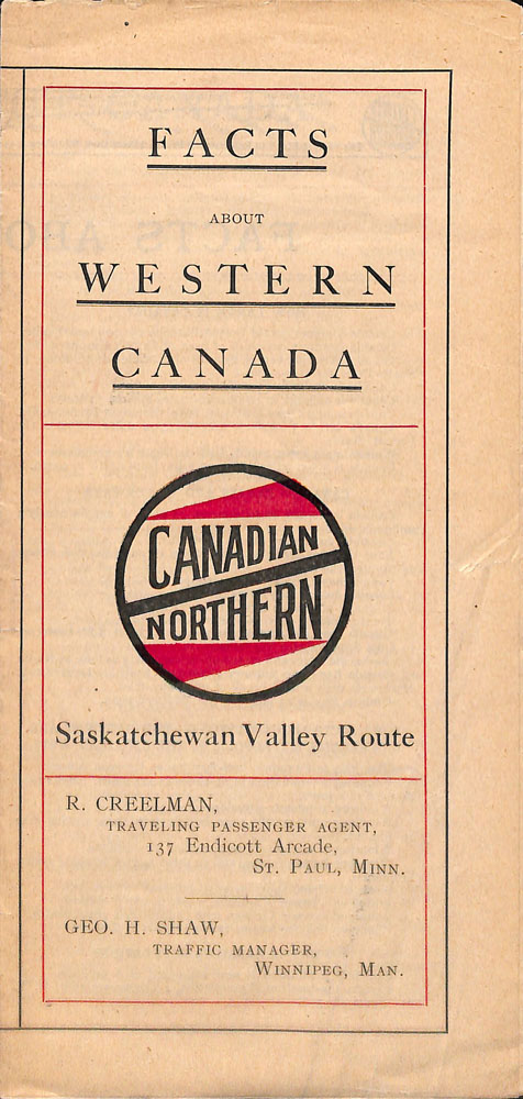
Canadian Northern logo on a pamphlet for the Saskatchewan Valley Route. (MIKAN 5751636)
By the time Canadian National Railways was formed in 1919, it had plenty of options to choose from.
CN logo background
In the beginning, between 1919 and the early 1920s, Canadian National Railways just took the old Canadian Northern Railway design, changed the word “Northern” to “National” and voilà: a new logo mark!

Close-up of the first CN logo, showing the zigzag design, on the front of an observation car, ca. 1920. (MIKAN 3349475)
CN then moved to other, more traditionally styled logo designs from the mid 1920s through to the mid 1950s, as evidenced here:

Close-up of the Canadian National Railways logo from the 1920s. (MIKAN 5750861)
Close-up of the Canadian National Railways logo from the 1940s. (MIKAN 5752559)
The visual redesign project: CN’s perspective
Then, in the late 1950s, with the advent of new technology and the move from steam to diesel locomotives, the company was looking to reinvent itself and recapture the imagination of the travelling public. And something remarkable happened! At this stage, top executives decided to do something bold.
This was due to a convergence of many different things. There was flexibility on the part of management to try something new. There were employees in the Public Relations Department who understood the value of having a corporate logo that could be an effective marketing tool. A survey by CN had found that much of the Canadian public thought CN was an old and tired company, even though the company had spent a decade investing in becoming a more modern, efficient organization.
The head of CN public relations (first Dick Wright and then Charles A. Harris) was provided with the daunting task of rebranding the sprawling railway corporation. Lorne Perry—a former CN employee in the Public Relations Department who was involved in the visual redesign effort—writes in Designs for the Times: The Story of the CN Design Program:
People find it hard to change either their face or their personality, and it’s not really easy for a corporation to do so either. But sometimes it’s worth the time, effort and money, when, for example, (A) the nature of the company’s products and services has drastically changed, (B) the company has totally modernized but the customers haven’t noticed, or (C) the company’s identifiers (signature) become inappropriate due to factors beyond its control. In CNR’s case, it was (B).
So, CN hired a consulting firm from the outside: an American design firm led by James Valkus. That design firm turned around and hired a young creative genius from Toronto by the name of Allan Fleming. Both men concluded that CN needed more than just a new trademark—it needed an overhaul of its complete visual identity.
Visual redesign from the outside: Allan Fleming
The designer hired by American James Valkus was a young Canadian graphic designer by the name of Allan Robb Fleming (May 7, 1929—December 31, 1977). At the time, he was the vice president and director of creative services at the typographic firm Cooper & Beatty Ltd., which was based in Toronto. Cooper & Beatty employed people to lay out pages and then sent type to printers.
His work after the CN commission included logo designs for Canadian companies and institutions such as Trent University (1964), Ontario Hydro (1965), National Design Council of the Department of Industry (1965), Toronto Symphony Orchestra (1965), Hudson’s Bay Company (1969), ETVO (now TVOntario, 1970), Gray Coach Lines (1971) and others. Later, in 1973–74, while working with Burton Kramer Associates, he was involved in developing the project that led to rebranding the Canadian Broadcasting Corporation. (It is worth noting that most of the material relating to Fleming’s life and career are now located at the York University Archives in Toronto. You can access both the Allan Robb Fleming fonds and the digitized materials from the fonds online.)
Martha Fleming, Allan Fleming’s daughter, recently noted to this writer that the collaborative partnership between Fleming and Valkus was a complex one. Jim handled the amazing corporate rebranding project for CN in its entirety, while Allan was responsible for the logo as the “jewel in the crown.”
Martha Fleming also stated in a recent online interview (Biblio File, October 24, 2022) that her father was able to conjoin modernity and tradition with his logo designs. He was interested in various time periods connecting people, things and ideas and how letter forms create a fusion between image and object. He had a collection of fine press books and also designed catalogues. The CN logo project fell into his lap while at Cooper & Beatty—and other work cascaded from this; typography for telegraphs, stationary, tickets and even rolling stock (including locomotives). Five people worked on the CN logo project. She noted that it was an incredibly stressful type of work, conceptualizing how a corporation saw itself.
The evolution of a logo: an expression of joint creativity
Library and Archives Canada has a wonderful selection of doodles and other pieces of artwork that represent the expression of creativity that went into the CN logo redesign. They can be found under the series Designs relating to the CN logo within the Canadian National Railways fonds.
While the art files seem to have been reconstructed to create a progression of design, it is very hard to tell exactly what the dates of this progression were and when exactly the final iteration of the logo appeared ready for use.
What the collection of doodles presents is a remarkable organic creative process. We see various iterations of the CN logo, where Valkus, Fleming and other graphic designers on the team riff off each other’s ideas like jazz musicians.
Without putting too much emphasis on the timeline, we can still piece together something of a progression of the logo design. The following example shows some very rough doodles that try to get to the heart of the feel of the railway company, which is one of movement.
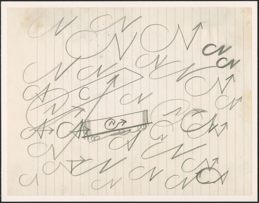
Rough doodles of the CN logo. (MIKAN 6305308)
Another example takes the concept of the rough doodles and progresses to possibly some more clarity, with Fleming asking Valkus, “Any of these interest you?”

Rough doodles of the CN logo. (MIKAN 6316316)
Another example has Valkus writing to Fleming saying that he should “save all this junk”!

Rough doodles of the CN logo. (MIKAN 6316312)
The next set of examples starts to narrow things down to focus on specifics, with Valkus providing some encouragement.

Rough doodles of the CN logo. (MIKAN 6316355)
Rough doodles of the CN logo. (MIKAN 6316325)
There were other people on the team too: Carl Ramirez and Arthur King.
These artists also contributed to what was really a team effort, but there are some unusual (one might say, even hypnotic) tangents that, 60 years on, make one wonder … was anything else helping to influence their creativity?
Here are two dizzying examples:

Draft of CN logo. (MIKAN 6327284)
Draft of CN logo. (MIKAN 6341857)
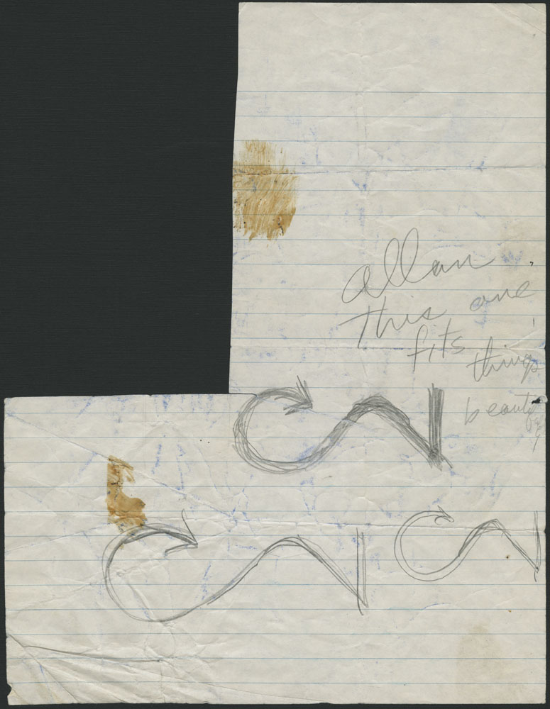
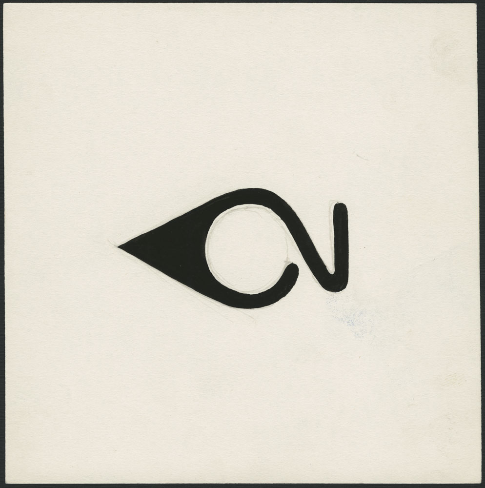
In the near-final iteration, you can sense the excitement in the words Valkus writes on the page: “Allan, Make it thinner and we’ve got it!”

Draft of CN logo. (MIKAN 2887712)
Once the final idea was decided upon, Fleming then had to get buy-in from all levels of the organization, from senior management to regular employees. In a series of presentations, he laid out in clear and simple terms what the logo design meant and what it was supposed to do. He asked a number of pertinent questions:
- Is it easy to reproduce?
- Is it memorable?
- Is it legible?
- Does it communicate quickly?
- Is it able to resist change?
Here is an example of one of his presentation ideas, which he shared with Valkus.

Presentation idea by Allan Fleming. (MIKAN 6341859)
Fleming (and Valkus) also said that the major aims of a new corporate image were to save money through simplified designs, to visually tie together entire divisions of the company and to express the sum of those parts. He broke things down so that one could look at how a new logo would appear on the various components of CN, from signs to small items such as dinnerware to architectural design to interior design to displays to rolling stock.
Once CN management approved the new logo design in late 1960, the design was rolled out gradually, with the public being alerted of the upcoming changes in various newspaper and magazine articles. That included the official publication of CN at the time, Keeping Track, with a following article entitled “A new look for the CNR.”
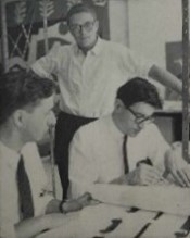
Photo from the Keeping Track article “A new look for the CNR.” (MIKAN 6026153)
One trade publication from 1960–61 notes in a breathless moment of mythmaking (and with a hyperbole that does not do credit to the complex background process) that Fleming produced the logo design with 15 minutes to spare before the deadline imposed by CN!
The collaboration between management, the CN visual design section and the graphic designers led to the creation of a marketing design that was at once innovative and eye-catching but also so simple in its form as to seem ubiquitous. After that year of background effort, the new CN logo arrived in full force in early 1961 and quickly seemed as if it was always there. In 1960, Allan Fleming said, “I think this symbol will last for 50 years at least. I don’t think it will need any revision, simply because it is designed with the future in mind. Its very simplicity guarantees its durability.”
And for over 60 years, it has been used—fully recognizable in Canada and abroad and nicknamed affectionately “the noodle”—by the company as its brand!
Andrew Elliott is an archivist in the Archives Branch at Library and Archives Canada.
