Skip to primary content
Skip to secondary content

Library and Archives Canada Blog

This is the official blog of Library and Archives Canada (LAC).

Library and Archives Canada Blog

Main menu

  • Home
  • About the Blog
  • Français

Tag Archives: CN logo

The CN Logo: Drawing Board to On-Board – Part 2

Posted on January 16, 2025 by Library and Archives Canada Blog
4

Version française

By Andrew Elliott

As mentioned in Part 1 of this blog post, Allan Fleming mostly provided background consultancy work to the Canadian National Railway Company (CN) after its new logo was completed. Once the various designs for railway objects had been identified by the visual redesign team and Valkus had found new ways to incorporate the logo onto these objects, the information was then sent to various advertising firms to be turned into publicity for the company.

McConnell Eastman was responsible for the Canadian advertisement market, Canadian Advertising Agency was responsible for the French language market in Quebec and Maclaren Advertising was responsible for the international market. The three came up with the catchy jingles that would be then printed up for posters and advertisements.

Application of the logo

The logo was applied on a variety of products including locomotives, sides of boxcars, tickets, coasters, doggie bags, bookmarks, envelopes, business cards, letterheads, calendars, advertisements and many more.

11 images of posters, products and advertisements.

Examples of a variety of products that highlighted the new CN logo. (MIKAN 6026153)

Logo standardization: the Signs Manual

The visual redesign team also needed to come up with a set of standards that everyone in the company could follow when it came to using the logo on company materials. They started by creating a bilingual booklet (Seeing is Believing/Voir C’est Croire) that could be handed out easily to anyone both inside and outside the company.

3 images of a booklet including the cover and 2 opened pages.

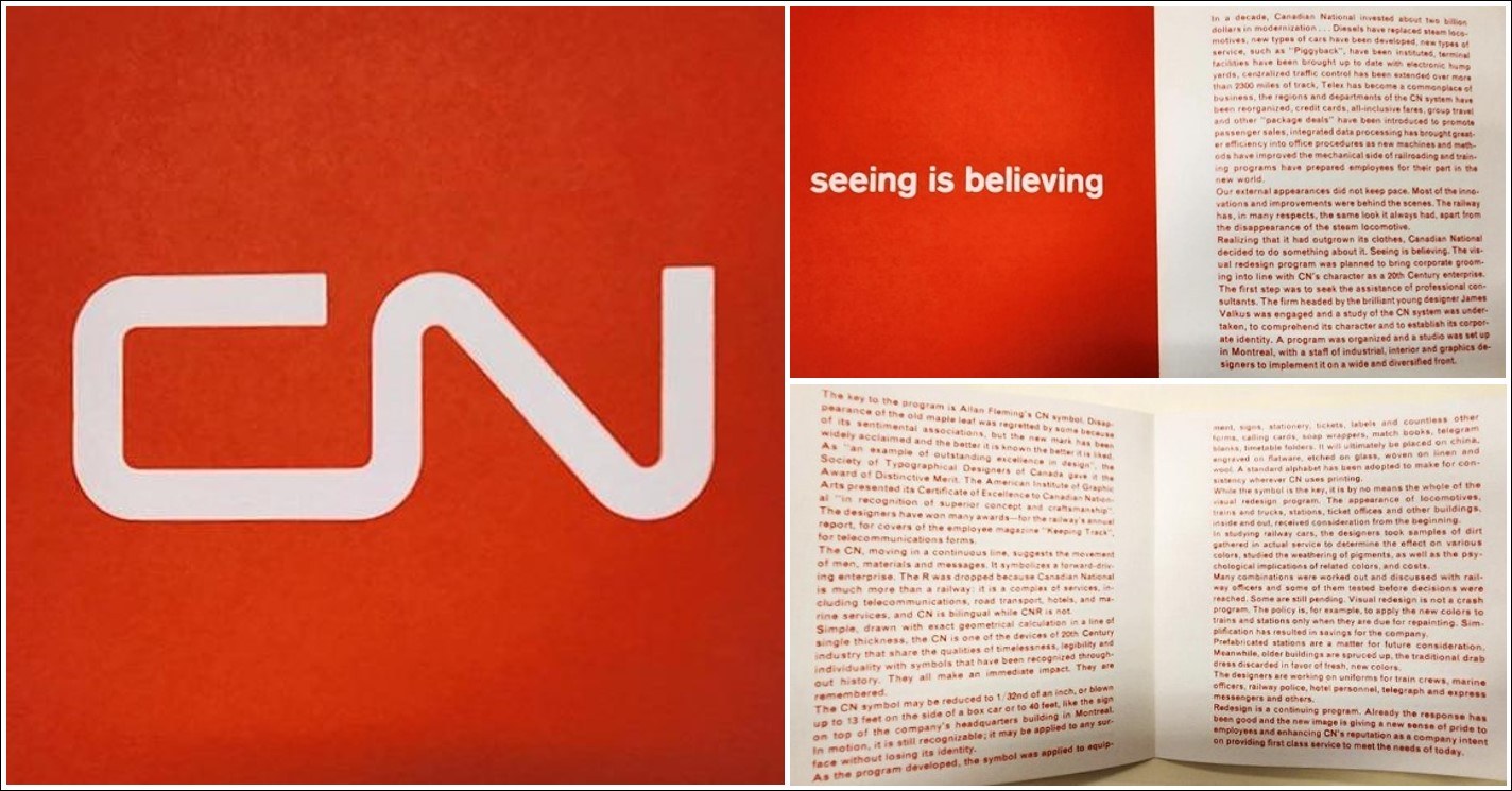
Booklet “Seeing is Believing”. (MIKAN 6026153)

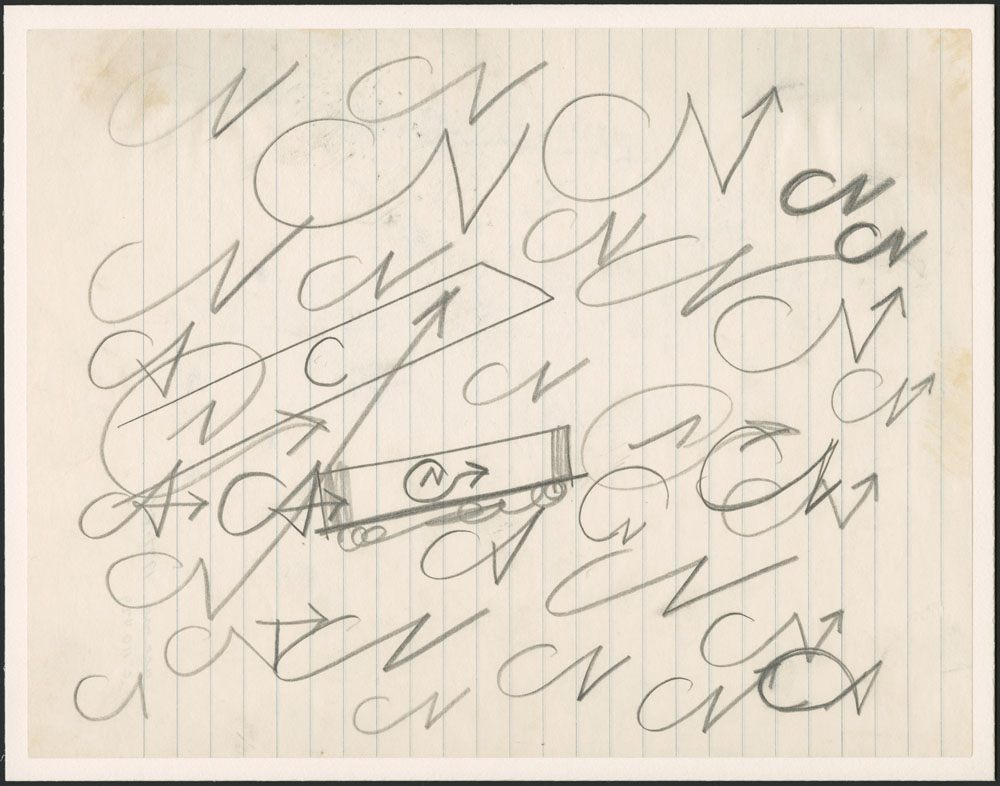
Between 1963 and 1967, CN employed, through Valkus Inc., a talented designer by the name of Jean Morin. Morin was born in Québec on March 2, 1938. He studied advertising art at the École des beaux-arts de Québec from 1956 to 1960. In addition, he was one of the first French-Canadians of his generation to study in the graphic design field that was just beginning to flourish in the early 1960s. He then audited classes at the Kunstgewerbeschule in Zurich, Switzerland during the winter semester of 1960–1961. He was able to visit several Swiss workshops at a time when graphic design was thriving in Europe. Jean Morin’s first job upon returning to Canada in 1961–1962 was with the Canadian Government Exhibition Commission. His later jobs—including with CN—related to corporate identity. In this capacity, Morin created a signage standards manual, a first of its kind in Canada.

This Signs Manual (dating from 1965) can be found within the Jean Morin fonds (MIKAN 189534) at LAC, located in volume 1 of R2725. The manual is set up in an amazingly simple format, with the focus primarily on design aesthetics, particularly in regard to the relationship for colour and typography.

Page with the CN logo in the left corner and “Signs Manual” typed in the right corner. On the upper right corner, the text reads “This manual is issued under the authority of the Executive Vice-President”.

First page of a CN’s Signs Manual. (MIKAN 189541)

The manual notes clearly and succinctly what the visual redesign program is all about at CN and what the manual is for. There is guidance on how to properly create the letters C and N on a grid so that they can be expanded or minimized to still look the same to viewers. The use of standard colours, and in what combinations, are provided; the kind of font to use and the spacing of letters is specified in order to allow for maximum visual effect; and there are various examples of layouts for printing on stationary, offices and building exteriors. There are even codes for employees to use to be able to order specific templates, specific letters and specific colours from the CN Store Department.

5 pages with instructions and logos.

Excerpts from the CN’s Signs Manual. (MIKAN 189541)

A remarkable feature of Morin’s manual is that it translates the aesthetic ideal of corporate identity drafted by the graphic designers into a language that anyone (particularly CN employees) can understand.

In the spring of 1968, Valkus’ firm and CN parted ways after an unresolved dispute over payments for services done in the previous year. CN subsequently hired ARC Corporation, another design firm from Montréal. Luckily, this firm consisted of former employees of the Valkus firm. These employees brought a certain amount of design consistency, and the records within the CN fonds tells of a stable relationship with that company until the late 1970s.

It is worth noting that since the 1960s, no one has dared tinker with either the logo or the standards manual. In fact, in 1996, some years after Lorne Perry had retired, he was asked to arrange for the standards manual to be reviewed: the basics would not be changed, but the identity would be clarified and any extraneous elements would be removed. “I chose consultants who were direct corporate descendants of the creators. Everything was updated, simplified, standardized and enshrined in manual form. The CN symbol itself remained its simple, unadorned, powerful self.”

The updated Basic Elements manual was published in 2001 and can be found online. This manual states that “Colour is a key factor in ensuring rapid recognition of the logo. Like other elements of the design system, colour must be used consistently if it is to serve this purpose. The CN corporate colour is red (Pantone 485). Whenever the application method or the medium itself permits it, the logo should appear red on white, or white on red. If red is not available, the logo may be black on white, or white on black. Contrast must always be sufficient. Special situations may arise where the logo is used in a more commercial context and a background other than a solid colour is permitted. Any such departure from the corporate colours must, however, be justified, and will be decided upon case by case by Public Affairs.”

Evolution of the Visual Redesign Program

Another key factor in the consistency of the Visual Redesign Program was that Lorne Perry, who was around from the beginning, stayed in his position of influence (and as translator-in-chief) for a number of decades. He was the bridge between the designers and the rest of the corporation. In the 1970s, CN renamed the Visual Redesign Program to the Corporate Identification Program.

A few years later in the mid 1970s, CN’s Passenger Services Department had a $70 million annual deficit, and CN was looking for a strategy to have the Government pay the shortfall as a public service. A new identity was needed to dramatize this need, and Corporation Arc was commissioned by CN to take it on. They only presented one logo, one blue-and-yellow colour scheme, and one name: VIA. Lorne Perry remembers “presenting to the Executive Committee of CN, chaired by CEO Robert Bandeen. We were surprised and pleased when he announced at the end that we had chosen the school colours of his old Alma Mater, Duke University; “old gold, and sapphire blue”. The program was an easy sell.”

Today, some 65 years after its initial unveiling, the CN logo continues to be an enduring part of the CN corporate identity.

For further information about the CN logo, please check out the Allan Fleming Project by Martha Fleming:

  • Allan Fleming Project | Martha Fleming
  • The Devil’s Artisan | Previous Issues (devilsartisan.ca)

The following resources also provide some further reading on the subject:

  • CN logo evolution (Canadian National Rail) | Logo Design Love
  • The CN Brand | cn.ca
  • CN Logo Designed by Allan Fleming & CN Brand Guidelines & History (imjustcreative.com)
  • The CN Logo: A Masterpiece in Corporate Design, by Andrew Elliott, Library and Archives Canada Blog
  • The CN Logo: Drawing Board to On-Board – Part 1, by Andrew Elliott, Library and Archives Canada Blog

Andrew Elliott is an archivist in the Archives Branch at Library and Archives Canada.

Share this:

  • Click to share on Facebook (Opens in new window) Facebook
  • Click to share on LinkedIn (Opens in new window) LinkedIn
  • Click to share on X (Opens in new window) X
  • Click to email a link to a friend (Opens in new window) Email
Like Loading...
Posted in Our Collection and Facilities | Tagged Allan Fleming, Canadian National Railways, CN, CN logo, James Valkus, Jean Morin, locomotive, Lorne Perry, McConnell Eastman, Seeing is Believing, The National Way, train | 4 Replies

The CN Logo: Drawing Board to On-Board – Part 1

Posted on January 9, 2025 by Library and Archives Canada Blog
Reply

Version française

By Andrew Elliott

Introduction

For some reason, few people discussed the design process for the Canadian National Railway Company’s (CN) logo that came after the initial creative spurt of doodles that led to the iconic CN “noodle” unveiled in 1960. As we noted in the previous post, Library and Archives Canada has an extensive collection of material relating to the development of the new CN corporate logo.

The company had invented itself in the aftermath of World War I and tried out a number of logos and slogans including the memorable “The National Way,” which appears to have been used within a logo between 1919 and 1921 (as seen in the following image from a 1920 Canadian National Railways Magazine) and more broadly during the 1920s.

Page of the Canadian National Railways Magazine with the slogan “The National Way.”

CN logo and slogan from a January 1920 edition of the Canadian National Railways Magazine. (OCLC 933318325)

Later, the 1959–1969 period was one of corporate reinvention for CN. Much of the reinvention had occurred in the 1950s, with upgrades to rolling stock, increased services to passengers and a phase-out of steam locomotives in favour of diesel. The creation of the new logo in 1960 came with the herculean task of making the reinvention visually attractive to the travelling public, as well as to CN employees. Today’s blog post will look at how the logo became fully incorporated within the company and out to the general public. The long-term impact of this extraordinary visual redesign implementation is quite an interesting story.

Visual redesign in practice: bringing the logo on-board

How do you impose a new logo design on the vast corporate network? One of the first places where the visual redesign team decided to put the CN logo was on the 1960 annual report. This introduction to the logo was quickly followed by the publication of a number of issues of the newly revamped employee magazine (formerly Canadian National Railways Magazine, now Keeping Track) devoted to aspects of the logo and its importance within the field of design.

The visual redesign team also received some awards. Former CN employee Lorne Perry wrote that they were the recipients of a number of prestigious awards from design organizations in Canada, the United States and overseas. At one Design Canada seminar, the head of the organization gave CN public commendation for being one of the first major companies to, as they called it, export big city design to the Canadian hinterlands.

Additionally, a lot of work was done to refresh the look of the company inside out and top to bottom, including upgraded train interiors supported by modern exterior schemes. Anybody could experience the finest in modern interior design and furnishings for price of a train ticket. In other words, the train sets were a mobile design exhibit for all to see. However, upgraded train interiors was just a small fraction of the overall refurbishment.

The visual redesign team worked closely with Valkus Inc. to deal with the enormity of the task. As mentioned previously, James Valkus was one of the hotshot graphic designers from New York who had helped with the initial logo design.

Photograph of a man sitting on a wooden chair.

James Valkus, ca. 1963. (MIKAN 189541)

From 1960 to early 1968, CN retained his design firm’s services to provide overarching design guidance to help with the implementation of various aspects of the CN logo. The legal agreement drawn up between Valkus and CN is worth noting, as it indicates that CN was prepared to pay the firm up to $60,000 in the first six months of work if their design was chosen, and then $120,000 per year after the fact to help implement it. These are substantial sums for that time period. In subsequent years, the yearly fees varied around that figure.

Valkus broke down the various materials relating to the railway into some broad categories: train graphics; train objects; hotel graphics; hotel objects; station graphics; and station objects. He then broke it down further with what specifically needed to be updated. In the contract between CN and Valkus in 1962, the following items were listed:

  • Motive power and car equipment
  • Motor vehicles
  • Maintenance of Way equipment
  • Signs
  • Manuals
  • Forms and miscellaneous printed matter
  • Keeping Track magazine
  • Uniforms
  • Promotional materials
  • Advertising displays

In fact, Valkus and the visual redesign team asked various CN departments for more comprehensive lists of what required change. For example, the following four pages detail the magnitude of change needed to be brought to the CN Sleeping and Dining Car Department:

Four pages with typed text.

Four pages detailing changes to designs on items needed to be made within the CN Sleeping and Dining Car Department. (MIKAN 5891012)

It is worth noting that the visual redesign also extended to CN’s subsidiary companies, so CV (Central Vermont) and GT (Grand Trunk) corporate symbols were redone to mirror the simplicity of the CN noodle. In the late 1960s, even CN Hotels got their own logo, which was a red key.

During this time period, Allan Fleming had less to do with the actual work done at CN, and his services were mostly background consultancy work. Once the various designs for railway objects had been identified by the visual redesign team and Valkus had found new ways to incorporate the logo onto these objects, the information was then sent to a variety of advertising firms to be turned into publicity for the company.

Stay tuned for part 2 of this blog post.

For further information about the CN logo, please read about the Allan Fleming Project by Martha Fleming:

  • Allan Fleming Project | Martha Fleming
  • The Devil’s Artisan | Previous Issues (devilsartisan.ca)

The following resources also provide some further reading on the subject:

  • CN logo evolution (Canadian National Rail) | Logo Design Love
  • The CN Brand | cn.ca
  • CN Logo Designed by Allan Fleming & CN Brand Guidelines & History (imjustcreative.com)
  • The CN Logo: A Masterpiece in Corporate Design, by Andrew Elliott, Library and Archives Canada Blog

Andrew Elliott is an archivist in the Archives Branch at Library and Archives Canada.

Share this:

  • Click to share on Facebook (Opens in new window) Facebook
  • Click to share on LinkedIn (Opens in new window) LinkedIn
  • Click to share on X (Opens in new window) X
  • Click to email a link to a friend (Opens in new window) Email
Like Loading...
Posted in Our Collection and Facilities | Tagged Allan Fleming, Canadian National Railways, CN, CN logo, James Valkus, The National Way | Leave a reply

The CN Logo: A Masterpiece in Corporate Design

Posted on October 24, 2024 by Library and Archives Canada Blog
8

Version française

By Andrew Elliott

“Imagination is our third partner.”
– Cooper & Beatty, Allan Fleming, 1958

Introduction

In the history of corporate logos, one stands out above many others as an example of the intricate relationship between branding, consumer culture, and national pride. That happens to be Canadian National Railway Company’s (CN) corporate logo, the “noodle” that is an instantly recognizable mark on its trains, its buildings and its marketing material. The logo represents both tradition and creative boldness, linking instantaneously to the brand of an international transportation company. Yet it also seems to float apart from its corporate parent and feels like it has always been with us. How did this happen?

Railway logos have played a key role in defining their associated companies and have been visual markers, or reminders, of what they stand for. During the 19th century and well into the 20th century, Canadian railway companies were influenced by British and American design typography, and particular design patterns developed. Some were very traditional, such as the Canadian Pacific Railway logo (beavers and a shield), while others were eye-catching and forward-looking, such as the almost futuristic Canadian Northern Railway logo (letters inside a zigzag pattern).

Round logo with the words Canadian Northern and a zigzag pattern in the circle.

Canadian Northern logo on a pamphlet for the Saskatchewan Valley Route. (MIKAN 5751636)

By the time Canadian National Railways was formed in 1919, it had plenty of options to choose from.

CN logo background

In the beginning, between 1919 and the early 1920s, Canadian National Railways just took the old Canadian Northern Railway design, changed the word “Northern” to “National” and voilà: a new logo mark!

CN logo with zigzag design.

Close-up of the first CN logo, showing the zigzag design, on the front of an observation car, ca. 1920. (MIKAN 3349475)

CN then moved to other, more traditionally styled logo designs from the mid 1920s through to the mid 1950s, as evidenced here:

The words Canadian National Railways are one under the other and are underlined.

Close-up of the Canadian National Railways logo from the 1920s. (MIKAN 5750861)

Green maple leaf with Canadian National Railways written in the middle of the leaf. The words are one under another and are underlined.

Close-up of the Canadian National Railways logo from the 1940s. (MIKAN 5752559)

The visual redesign project: CN’s perspective

Then, in the late 1950s, with the advent of new technology and the move from steam to diesel locomotives, the company was looking to reinvent itself and recapture the imagination of the travelling public. And something remarkable happened! At this stage, top executives decided to do something bold.

This was due to a convergence of many different things. There was flexibility on the part of management to try something new. There were employees in the Public Relations Department who understood the value of having a corporate logo that could be an effective marketing tool. A survey by CN had found that much of the Canadian public thought CN was an old and tired company, even though the company had spent a decade investing in becoming a more modern, efficient organization.

The head of CN public relations (first Dick Wright and then Charles A. Harris) was provided with the daunting task of rebranding the sprawling railway corporation. Lorne Perry—a former CN employee in the Public Relations Department who was involved in the visual redesign effort—writes in Designs for the Times: The Story of the CN Design Program:

People find it hard to change either their face or their personality, and it’s not really easy for a corporation to do so either. But sometimes it’s worth the time, effort and money, when, for example, (A) the nature of the company’s products and services has drastically changed, (B) the company has totally modernized but the customers haven’t noticed, or (C) the company’s identifiers (signature) become inappropriate due to factors beyond its control. In CNR’s case, it was (B).

So, CN hired a consulting firm from the outside: an American design firm led by James Valkus. That design firm turned around and hired a young creative genius from Toronto by the name of Allan Fleming. Both men concluded that CN needed more than just a new trademark—it needed an overhaul of its complete visual identity.

Visual redesign from the outside: Allan Fleming

The designer hired by American James Valkus was a young Canadian graphic designer by the name of Allan Robb Fleming (May 7, 1929—December 31, 1977). At the time, he was the vice president and director of creative services at the typographic firm Cooper & Beatty Ltd., which was based in Toronto. Cooper & Beatty employed people to lay out pages and then sent type to printers.

His work after the CN commission included logo designs for Canadian companies and institutions such as Trent University (1964), Ontario Hydro (1965), National Design Council of the Department of Industry (1965), Toronto Symphony Orchestra (1965), Hudson’s Bay Company (1969), ETVO (now TVOntario, 1970), Gray Coach Lines (1971) and others. Later, in 1973–74, while working with Burton Kramer Associates, he was involved in developing the project that led to rebranding the Canadian Broadcasting Corporation. (It is worth noting that most of the material relating to Fleming’s life and career are now located at the York University Archives in Toronto. You can access both the Allan Robb Fleming fonds and the digitized materials from the fonds online.)

Martha Fleming, Allan Fleming’s daughter, recently noted to this writer that the collaborative partnership between Fleming and Valkus was a complex one. Jim handled the amazing corporate rebranding project for CN in its entirety, while Allan was responsible for the logo as the “jewel in the crown.”

Martha Fleming also stated in a recent online interview (Biblio File, October 24, 2022) that her father was able to conjoin modernity and tradition with his logo designs. He was interested in various time periods connecting people, things and ideas and how letter forms create a fusion between image and object. He had a collection of fine press books and also designed catalogues. The CN logo project fell into his lap while at Cooper & Beatty—and other work cascaded from this; typography for telegraphs, stationary, tickets and even rolling stock (including locomotives). Five people worked on the CN logo project. She noted that it was an incredibly stressful type of work, conceptualizing how a corporation saw itself.

The evolution of a logo: an expression of joint creativity

Library and Archives Canada has a wonderful selection of doodles and other pieces of artwork that represent the expression of creativity that went into the CN logo redesign. They can be found under the series Designs relating to the CN logo within the Canadian National Railways fonds.

While the art files seem to have been reconstructed to create a progression of design, it is very hard to tell exactly what the dates of this progression were and when exactly the final iteration of the logo appeared ready for use.

What the collection of doodles presents is a remarkable organic creative process. We see various iterations of the CN logo, where Valkus, Fleming and other graphic designers on the team riff off each other’s ideas like jazz musicians.

  • Artwork by James Valkus
  • Artwork by Allan Fleming

Without putting too much emphasis on the timeline, we can still piece together something of a progression of the logo design. The following example shows some very rough doodles that try to get to the heart of the feel of the railway company, which is one of movement.

Handwritten CN logos written over and over.

Rough doodles of the CN logo. (MIKAN 6305308)

Another example takes the concept of the rough doodles and progresses to possibly some more clarity, with Fleming asking Valkus, “Any of these interest you?”

CN logos all over a page with a note saying, “Any of these interest you?”

Rough doodles of the CN logo. (MIKAN 6316316)

Another example has Valkus writing to Fleming saying that he should “save all this junk”!

CN logos all over a page with a note saying, “Allan, save all this junk.”

Rough doodles of the CN logo. (MIKAN 6316312)

The next set of examples starts to narrow things down to focus on specifics, with Valkus providing some encouragement.

CN logos all over a page with two handwritten notes.

Rough doodles of the CN logo. (MIKAN 6316355)

CN logos all over a page with a note saying, “Allan, this one fits things beautifully.”

Rough doodles of the CN logo. (MIKAN 6316325)

There were other people on the team too: Carl Ramirez and Arthur King.

  • Artwork by Carl Ramirez
  • Artwork by Arthur King

These artists also contributed to what was really a team effort, but there are some unusual (one might say, even hypnotic) tangents that, 60 years on, make one wonder … was anything else helping to influence their creativity?

Here are two dizzying examples:

One of the suggestions for the CN logo. The letters form a square spiral.

Draft of CN logo. (MIKAN 6327284)

One of the suggestions for the CN logo. The left side of the C is extended to look like the corner of an eye.

Draft of CN logo. (MIKAN 6341857)

In the near-final iteration, you can sense the excitement in the words Valkus writes on the page: “Allan, Make it thinner and we’ve got it!”

The near-final suggestion for the CN logo—which looks very similar to the eventual logo, only with thicker lettering—with a note saying, “Allan, make thinner and we’ve got it.” Signed Jim.

Draft of CN logo. (MIKAN 2887712)

Once the final idea was decided upon, Fleming then had to get buy-in from all levels of the organization, from senior management to regular employees. In a series of presentations, he laid out in clear and simple terms what the logo design meant and what it was supposed to do. He asked a number of pertinent questions:

  • Is it easy to reproduce?
  • Is it memorable?
  • Is it legible?
  • Does it communicate quickly?
  • Is it able to resist change?

Here is an example of one of his presentation ideas, which he shared with Valkus.

Presentation on paper with handwritten notes, drawings and the CN logo.

Presentation idea by Allan Fleming. (MIKAN 6341859)

Fleming (and Valkus) also said that the major aims of a new corporate image were to save money through simplified designs, to visually tie together entire divisions of the company and to express the sum of those parts. He broke things down so that one could look at how a new logo would appear on the various components of CN, from signs to small items such as dinnerware to architectural design to interior design to displays to rolling stock.

Once CN management approved the new logo design in late 1960, the design was rolled out gradually, with the public being alerted of the upcoming changes in various newspaper and magazine articles. That included the official publication of CN at the time, Keeping Track, with a following article entitled “A new look for the CNR.”

Three men drafting something on paper.

Photo from the Keeping Track article “A new look for the CNR.” (MIKAN 6026153)

One trade publication from 1960–61 notes in a breathless moment of mythmaking (and with a hyperbole that does not do credit to the complex background process) that Fleming produced the logo design with 15 minutes to spare before the deadline imposed by CN!

The collaboration between management, the CN visual design section and the graphic designers led to the creation of a marketing design that was at once innovative and eye-catching but also so simple in its form as to seem ubiquitous. After that year of background effort, the new CN logo arrived in full force in early 1961 and quickly seemed as if it was always there. In 1960, Allan Fleming said, “I think this symbol will last for 50 years at least. I don’t think it will need any revision, simply because it is designed with the future in mind. Its very simplicity guarantees its durability.”

And for over 60 years, it has been used—fully recognizable in Canada and abroad and nicknamed affectionately “the noodle”—by the company as its brand!


Andrew Elliott is an archivist in the Archives Branch at Library and Archives Canada.

Share this:

  • Click to share on Facebook (Opens in new window) Facebook
  • Click to share on LinkedIn (Opens in new window) LinkedIn
  • Click to share on X (Opens in new window) X
  • Click to email a link to a friend (Opens in new window) Email
Like Loading...
Posted in Our Collection and Facilities | Tagged branding, Canadian National Railways, Canadian Northern, Canadian railway companies, CN, CN logo, CN logo redesign, CN visual design, corporate design, corporate logos, CPR, railway logos, the noodle, trademark, visual identity | 8 Replies

Official website

  • Library and Archives Canada Website
  • Search all Government of Canada websites

Categories

  • Archived
  • Art
  • Biography and People
  • Census
  • Co-Lab
  • Consultation and Reference Services
  • Digitization
  • Discover/How to
  • Exhibitions
  • Exploration and settlement
  • Film, Video and Sound
  • Flickr
  • Genealogy & Family History
  • Geography
  • Immigration
  • Indigenous Resources
  • Library
  • Literature
  • Maps and Plans
  • Military Heritage
  • Music and Performing Arts
  • National Identity
  • Our Collection and Facilities
  • Photography
  • Podcasts
  • Politics and Government
  • Sports
  • What's New at LAC?

Tags

395 Wellington Aboriginal Amicus ancestors archives Art Black history Canada150 Canadian Expeditionary Force Canadian Expeditionary Forces CEF Census Conservation Databases digitization exhibition Exhibitions Family History First Nations First World War Flickr Genealogy Genealogy and Family History hockey home children images immigrants Immigration Indigenous Initiatives Inuit Military Music Métis photographs Photography podcast Project Naming published material Rare books Second World War Sports VC VC series Victoria Cross Vimy Ridge

Blog at WordPress.com.
  • Subscribe Subscribed
    • Library and Archives Canada Blog
    • Join 2,721 other subscribers
    • Already have a WordPress.com account? Log in now.
    • Library and Archives Canada Blog
    • Subscribe Subscribed
    • Sign up
    • Log in
    • Report this content
    • View site in Reader
    • Manage subscriptions
    • Collapse this bar
 

Loading Comments...
 

    %d