By Forrest Pass
Have you ever been so captivated by a research topic that you start seeing evidence of it everywhere? While doing research for the exhibition Unexpected! Surprising Treasures From Library and Archives Canada, I delved deep into the records of two Eastern Ontario Masonic lodges to reconstruct the history of a magnificent early-nineteenth-century ritual painting known as a “tracing board.” By chance, this search led me down another research rabbit-hole.
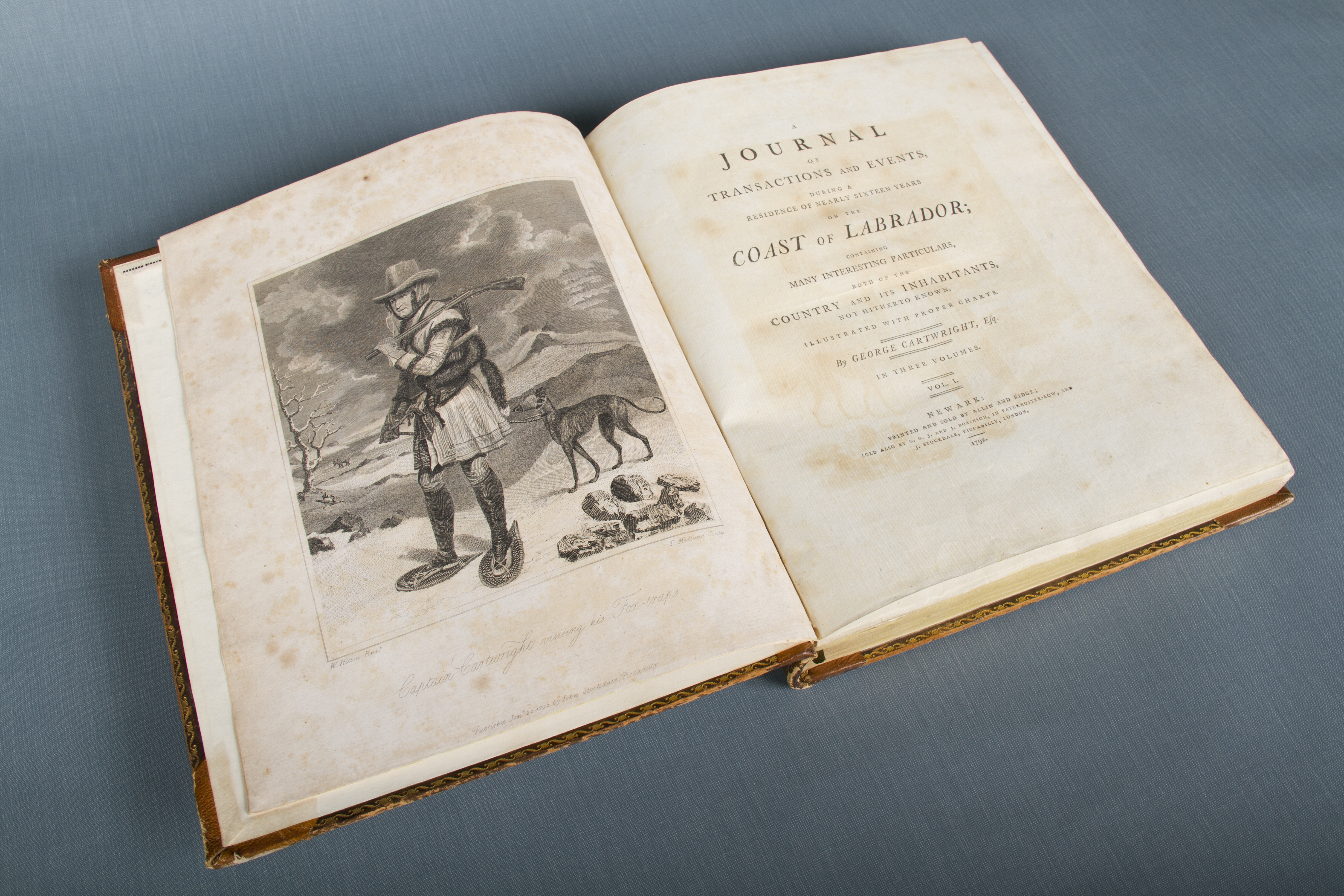
I became intrigued by the retailer’s label on the endpaper of a book containing the bylaws of Kemptville Lodge No. 28, which had inherited the tracing board from an earlier lodge in nearby Burritts Rapids. The label, for Ottawa stationer Henry Horne, features the typical offerings of a stationery shop: ledgers, paper, paintbrushes, pens, and a small seal. However, what caught my eye was the arrangement of a compass and square near the label’s base. Was the similarity to the Masonic emblem purely coincidental, or was this label a discreet advertisement of Horne’s own Masonic membership?

Label of Henry Horne, Manufacturing Stationer, in Bylaws of Kemptville Lodge No. 28, Ancient Free and Accepted Masons, 1848 (e011782492).
As Newspapers.com has digitized several Ottawa newspapers, I ran a few searches for Henry Horne, hoping to find an obituary that might confirm that he was a Freemason. Having no luck, I filed a picture of the label for another day and moved on to other projects.
Months later, however, I came across the “possibly Masonic” label again. This time, it was on the endpaper of a letterbook that had belonged to Sandford Fleming from 1874 to 1876, when he was chief engineer of the Intercolonial Railway. The design of the labels was identical, but the name of the company was different: “J. Hope & Co.” in place of “Henry Horne.”

Label of J. Hope & Co., Manufacturing Stationers, in Sandford Fleming Letterbook, January 1874 – April 1876 (e011782493).
The change in name is easily explained: In 1864, Henry Horne and James Hope became partners in Horne’s stationery business, and Hope took over the company after Horne’s death, in 1865. Updating the shop’s label was easy because it was printed using an ingenious printing block called a “mortised cut.”
Mortised cuts have existed since the earliest days of printing with moveable type. The first examples were “factotums,” decorative printing blocks with a slot into which the typesetter could insert any piece of standard type. Factotums, from the Latin word for a servant having multiple responsibilities, allowed thrifty printers to incorporate decorative initials into their publications without having to buy a full set of twenty-six decorative letters.

Factotum initials on the front page of the May 5, 1791, issue of The Quebec Gazette / La Gazette de Québec. The printer could insert any letter—in this case, “B” and “W”—into the decorative factotum block to create a custom decorative initial (e011782495).
By the 1800s, more elaborate mortised cuts joined factotums in printers’ type cases. Whereas a typical factotum housed a single interchangeable letter, nineteenth-century mortised cuts could accommodate full words, addresses, and messages. A state-of-the-art method called “electrotyping,” which uses an electrical charge, fixes a thin layer of copper to the inside of a typecasting mold. This method made it possible to produce thousands of durable, identical mortised cuts from a single wooden engraving so that printers across North America and around the world could use the same mortised cuts. Think of these printing blocks as the analog ancestor to the twenty-first-century “meme generator”: a recurring image with text that changed according to the requirements of printers and their clients.

Examples of mortised cuts (here with the variant spelling “morticed”) in an 1865 Montréal type-founder’s catalogue. By inserting type into the blank mortised space, printers could create custom labels, business cards, advertisements, and announcements for their clients (e011782494).
Having established that the Henry Horne and Hope and Co. labels were likely printed from the same mortised cut, I set out to find its source. A Google Lens search for the label turned up a blank version of the cut in the database of a stock image service, credited to a New York type manufacturer’s catalogue from 1882. However, none of the digitized versions of that company’s catalogue includes the cut. I feared that I had reached another dead end.
But, then, I caught another lucky break. An Ottawa Citizen advertisement from the time of Henry Horne and James Hope’s brief partnership in 1864–1865 features the same cut, but this time with the signature “Whitney & Jocelyn, N.Y.”

Advertisement for Horne & Hope, Manufacturing Stationers, Ottawa Citizen, August 12, 1865, page 3.
Engravers and electrotypers Elias J. Whitney and Albert Higley Jocelyn were not in business together for long: They became partners in 1853 and separated about 1855. Both continued separately in the engraving and electrotyping business, producing a wide variety of products, including printing plates for book and periodical illustrations, postage stamps, bond certificates, watch papers (the numbers and inscriptions appearing on the faces of pocket watches), and stationers’ labels. Whitney went on to head the Brooklyn Academy of Design, while Jocelyn patented a new method for producing artificial slate blackboards—a lucrative industry as accelerated European settlement and compulsory education laws increased the number of schools in the United States and Canada alike.
In all the biographical details I discovered on these engravers, I found nothing to indicate that either was a Freemason. Yet it appears that a copycat engraver may have interpreted the arrangement of the compass and square as a Masonic allusion.

Advertisement for a Boston publisher and bookseller featuring a similar mortised cut by engraver D.T. Smith. Source: Annual of Scientific Discovery: or, Yearbook of Facts in Science and Art for 1861 (Boston: Gould and Lincoln, 1861), via Internet Archive.
Rival engravers routinely copied and adapted each other’s products, and an uncannily similar cut appeared in the advertising for a Boston bookshop in 1861. Details, such as the placement of the tiny tin labeled “WAFERS,” strongly suggest that this engraver, one “D.T. Smith,” took the Whitney & Jocelyn cut as his inspiration. However, Smith also removed several elements, including the compass and square. Was this simply an engraver tidying and adapting an existing design, or was Smith, too, struck by a possible Masonic reading of the image?
In the end, for all I have found out about factotums and mortised cuts, the mystery of the Masonic image remains—a small gap, or perhaps a “mortise,” waiting patiently to be filled.
Additional Resources
- Printers’ Ornaments: Documenting the Anonymous, a blog post on eighteenth-century printers’ ornaments, including factotums, by Patrick Parratt, Victoria & Albert Museum, London, UK.
- Treasures Revealed Episode 9 – Masonic Mystery, Library and Archives Canada podcast.
- Specimens of Printing Types, Plain & Ornamental, Rules, Borders, Cuts, &c., from the Montreal Type Foundry, 1865, digitized by the Bibliothèque et Archives nationales du Québec.
Forrest Pass is a curator with the Exhibitions team at Library and Archives Canada.