Christmas in the Archives

By Jennifer Anderson

In December, many of our clients, donors and readers are preparing for Christmas. So many Christmas traditions are linked to anticipation—preparing surprises for loved ones, dreaming up projects for the New Year, offering comfort and warmth to family, friends and strangers.

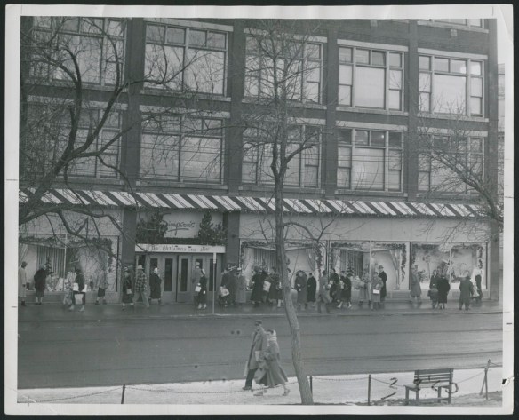
Simpson’s, the Christmas Tree Store, around 1955 (e011172111)

That feeling of anticipation is not unlike what it is to work as an archivist. In some ways, it feels like Christmas all year round in the archives: opening boxes, making discoveries, and anticipating the interest that the public will find in our collections. The work of a reference archivist is like customer service: it gives us great satisfaction to be able to assist researchers. Archival work also inspires a sense of gratitude to colleagues who work together to make good things happen.

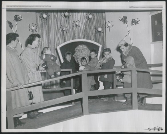
Black-and-white photograph showing children lined up to see Santa Claus, together with three adult women. Everyone is smiling, although some of the children look nervous.

“Secrets to Santa,” 1952 (e011172113)

A case in point: working with the Sears Canada fonds has been the source of much enjoyment for me, and for my colleagues. The collection includes material relating to Sears stores across the country, as well as Sears Canada’s parent companies, all of which are household names in Canada: Simpson’s, Simpsons-Sears and Sears-Roebuck. The fonds consists of textual documents, photographs, scrapbooks, audiovisuals, drawings and architectural blueprints. Included in the acquisition were 200 boxes of published catalogues, which will supplement the already substantial and frequently consulted catalogue collection in Library and Archives Canada’s holdings.

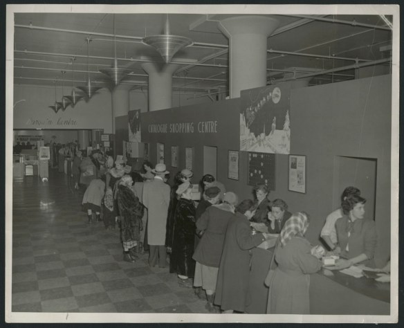
Black-and-white photograph showing shoppers, mostly women, wearing winter coats and hats, studying catalogues at a counter, as well as the store staff behind the counter. There is a sign on the wall reading “Catalogue Shopping Centre,” together with Christmas decorations.

Catalogue Shopping Centre at Christmastime, around 1955 (e011172120)

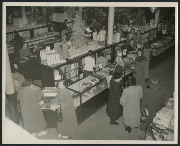
One very pleasant surprise in the fonds: thousands upon thousands of archival photographs, which are of exceptional quality and interest. Documenting the leisure pursuit of shopping, but also the practical elements of the retail economy and the working lives of store personnel, the photographs are sure to interest the public. And they are fun! These photos also include glimpses of company-sponsored social and cultural extracurricular events like curling, bowling, dance parties and concerts.

Christmas shopping, Regina, Saskatchewan, around 1950 (e011172152)

Thanks to colleagues across Library and Archives Canada, as well as outside this institution, who were involved in the acquisition, organization, description and digitization work, all geared toward making the Sears Canada fonds discoverable.

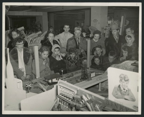
Black-and-white photograph showing a large group of men, women and children watching an electric train in a store.

Crowd watching an electric train, Regina, around 1950 (e011172147)

Over the coming years, we look forward to seeing this material being used to generate new research findings. Please reach out to us if we can assist you in getting started on your own research.

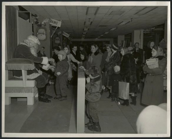
Black-and-white photograph showing a little boy talking with Santa Claus, while other children and many parents, dressed for winter, are lined up nearby. In the background are two signs that read “Trains” and “Meccano.”

Visiting Santa Claus, around 1955 (e011172112)


Jennifer Anderson was an archivist in the Public Services Branch, and she previously worked in the Science, Environment and Economy section of the Archives Branch, at Library and Archives Canada.

Canada in Colour

By Samantha Shields

Early colour photography

Colour photography has existed in some form since the 19th century, but it was not until around 1935 that the technology had advanced enough to be considered practical for amateurs. The mass production of single-shot colour film transparencies, such as the colour reversal film Kodachrome, made it possible to easily create impressive, vibrant colour images. Despite requiring a light source or a projector to view them, colour transparencies grew quickly in popularity, whereas printing in colour remained elusive for the average hobbyist.

The colour printing processes of the mid-20th century were expensive, time-consuming, and complex, requiring greater technical precision and greater knowledge of chemistry than the production of either black-and-white prints or colour transparencies. However, for all the effort necessary to create them, these early prints were frequently a disappointment to their creators. With bright clashing colours and a narrow tonal range, colour prints were frequently described by critics as unrealistic and “garish.” As a result, the early adoption of colour prints was slow, generally left to wealthier amateurs and basement scientists, or to those printing magazines, advertisements, and materials for commercial distribution.

A member of the RCMP poses in front of the Parliament buildings for tourists taking snapshots. Ottawa, Ontario, 1949. Photo credit: Chris Lund (e010955585)

A man in a shirt and tie sitting with a young girl in a plaid dress, smiling and looking at a photograph. The brand name “Kodak” appears in the top left-hand corner.

Kodak advertising proof, 1946. Photo credit: Yousuf Karsh-Kodak (a215007k)

The colour printing process

During the rise of colour photography, manufacturers around the globe were working hard to develop products that would simplify and improve the colour printing process. One of the cornerstone methods during this era of innovation was printing from colour separation negatives.

Simplified, the printing process required the separation of a colour image, from either life or a colour transparency, into three negatives—each filtered for one colour: red, green, or blue. Typically, the photographer would either: create these negatives in succession, an action that risked the subject or camera shifting between exposures; or use a one-shot camera that split the image to expose multiple plates simultaneously. The negatives were used to create relief positives (matrices) to hold corresponding photo dyes (cyan, magenta, and yellow). The dyed matrices were pressed or rolled successively onto the photo-paper in perfect alignment (registration) to create a single full-colour print.

Colour photograph of a carrying case and three identical negatives, each in a different colour: magenta, cyan, and yellow.

[Carrying case advertisement: three colour matrices and final print]. Photo credit: Brodie Macpherson (e011310465–e011310468)

By the early 1940s, more colour print options were available to photographers, including the three-colour pigment process, bromoil printing, and the bleach-out process. Among these, the imbibition printing process—first commercially introduced by the Eastman Kodak Company as the Wash-Off Relief process in the mid-1930s—quickly gained attention. This process was later replaced by the Dye Transfer process (1946), in which the assembly of colour prints was most akin to the lithographic colour printmaking processes, making it more practical to run duplicates and batch print orders than with earlier colour printing methods. It also allowed for greater manipulation at various stages in the printing process, and the materials involved were less sensitive to temperature and humidity.

Technical and logistical challenges

From the 1930s to the 1960s, the printing of colour photographs in Canada faced a host of geographic, economic, and chemical challenges.

Black-and-white photograph of a camera from 1943.

[Example of an] automatic colour camera. Photo credit: Department of National Defence (a064809)

Black-and-white photograph of a camera from 1943.

Macpherson’s Devin-style one-shot colour separation camera. (e011312590)

Canadians were in-touch, but out of stock. While Canada was typically among the first countries to receive new photographic processes, access to materials was not reliable because colour-printing supplies were largely manufactured internationally and shipping was unreliable and slow. This forced many photographers and printers to find innovative solutions and to work together.

Eastman Kodak Co. was a pioneer in imbibition printing photography supplies and services. However, given that the company’s main office and manufacturing plant were located in Rochester, N.Y., the reach of Kodak’s Canadian distribution was limited. Central Canada benefitted the most from having a distribution centre and manufacturing operation based in Toronto (Canadian Kodak Co., established in 1899; later, Kodak Canada Inc.), but its Canadian operations did not stock everything, nor did they produce colour supplies until the late 1960s. While outside central Ontario, photographers did not see another Kodak installation until 1961, when a Kodak colour-film-processing lab first appeared in North Vancouver to service all of western Canada. As a result, most Canadians hoping to purchase Kodak colour goods relied heavily upon their local suppliers.

Purchasing or ordering supplies through the “local guy,” whose goods came from international manufacturers or from distribution centres, meant the following:

  • Delays—deliveries could take five weeks or longer.
  • Dependency—the availability of products and irregular shipments spanning weeks disrupted the ability of colour-print labs to complete or accept new or large orders.
  • Travel—supply orders placed and received in the United States often arrived much quicker (in about five days).
  • Collaboration—colour printers frequently loaned or exchanged supplies when facing deadlines amid delivery delays.
Page with five duplicate photographs advertising a tiny blue piano and bench inside a red and yellow box covered with music notes. There is also print that reads “200 Direct Color photographs cost less than quadri-color engravings!”

[Advertisement for Brodie Macpherson’s services, with price sheet] Photo credit: Brodie Macpherson (e011310469)

Economic challenges

Colour photo printing was a much larger financial investment than black-and-white printing, for both the printer and the client. Given the considerable expense and the perceived likelihood of the final images being undesirable as a result of “unnatural” colouring, clients and companies were hesitant to invest. Consequently, colour printers were motivated to produce pleasing high-quality prints for the lowest reasonable price. Many early printers made colour feasible by

  • limiting small print orders, which were labour-intensive and costly to produce, as any open, unused chemicals could expire between orders;
  • engaging in larger print runs, thus distributing the high cost associated with making the perfect initial print over many duplicates. Subsequent prints were much cheaper to produce, as they required only time, repetition, and consistency, and could be re-ordered even years later;
  • targeting advertising and commercial businesses, since they benefitted from the vibrant attention-grabbing colours and could place the necessary bulk orders, and would re-order old prints;
  • working together, via camera clubs and photography newsletters, to recommend “dupes” for the more expensive prepared chemicals, as well as to share insights on how to improve print quality and processes;
  • importing privately. Supplies were often more expensive to purchase in Canada, even factoring in the added cost of importing. Those lucky enough to live near the Canada–U.S. border could get faster delivery by placing an order with a U.S. supplier and cross the border to purchase cheaper, fresher colour-printing supplies.

Colour print of eight different types of cookies and biscuits in clear packaging, as sold by Purity Factories Ltd.

Purity Factories Ltd. biscuits and cookies [advertisement]. Photo credit: Brodie Macpherson (e011312592)

Since small, inconsistent orders made colour printing impractical for most businesses of the time, many portrait studios did not offer colour photography. Those that did, rather than convert their darkrooms, would often photograph in colour and hire out to colour labs to do the processing and printing. The high cost of small print runs was then passed onto the client. For these reasons, black-and-white prints for portraits persisted despite the advancements in colour. Some notable exceptions were wedding and group portraits and holiday cards, for which clients needed additional copies and the cost of ordering colour prints was less prohibitive as a result.

Colour portrait of a woman in a floral dress, front lit, seated in a wooden armchair.

C309 – [Unidentified woman]. Photo credit: Brodie Macpherson (e011310460)

Three black-and-white detail shots of the previous image, identical apart from the density of the exposure relative to the colour filtered: A = red, B = green, C = blue.

Test prints of the separation negatives for C309 – [Unidentified woman] (e011310461- e011310463)

As colour printing improved and colour advertising increased in popularity, colour printers would sometimes receive multiple large orders from different clients. Given the demand on resources, rather than push out a poor-quality product or delay delivery, some colour printers worked in small, trusted networks to refer work to each other when necessary.

There was also a significant expense associated with developing a darkroom for colour processing, as well as learning, largely via trial-and-error, how to make quality colour prints. The high cost and the difficulty of producing colour prints were enough to dissuade the mildly curious, while others, rather than convert their own darkrooms for colour, turned instead to their local camera clubs to learn and experiment with the medium.

Chemical challenges

Early colour printing, like all photography, was a science as much as an art. Practitioners were often challenged by the exactitude required by the process, having to control all associated variables to maintain quality and ensure consistent printing (e.g., times, temperature, voltage, water treatment).

There were also limitations posed by the chemicals themselves. They expired, and they did so more rapidly once opened. Expired chemicals performed inconsistently and were less effective, making quality printing frustrating and impossible to maintain over a print run. As well, the shelf life of supplies was already shorter in Canada when shipping times were taken into account. This made the stockpiling of supplies risky. Once more, bulk orders and batch printing practices were encouraged in order to maximize the value of the pricey chemicals.

Twelve-colour grids, four across and three down.

[Colour matrix]. Photo credit: Brodie Macpherson (e011310470)

Manufacturers issued recommended times, measurements, and additives for using their products. These were generally serviceable, but were rarely perfect for everyone. The difficulties and solution(s) with respect to controlling the different variables were largely dependent on the location of the printer (city or town, hot or cold temperature, stable or variable climate, etc.).

Water

  • Variations in water sources and treatments over time and between regions meant that not all water was chemically equal. For example, with the Tricolour Pigment Process, printers needed to account for the presence of any lime or hardening salts in their water because these would react with the bromide silver.

Temperature

  • Fluctuations in temperature during the multi-week transport to Canada negatively affected the integrity of some coated paper.
  • Operating in a climate with a wide temperature variation meant Canadian printers had to find innovative ways to maintain consistent darkroom temperatures throughout the year. An asbestos-insulated heating element placed under an out-of-phase rocking tray was the solution for warming a developer presented by colour printer Brodie Macpherson of Toronto.

Young boy sitting in a large winter sleigh. Photo Credit: Rosemary Gilliat Eaton (e010980928)

Voltage

  • A difference of even a few volts can cause variations in the light intensity of enlargers. These inconsistent exposures result in an imbalance in the density of the separation negatives and, by extension, in the appearance of the colour print. Using a regulator and monitoring the voltage was standard procedure.
  • Some printers also sought out the U.S.-made “cold lamp,” a cold cathode fluorescent tube bent into a “U” shape that eliminated “hot spots” in printing, for their photo enlargers. This allowed for larger prints, a longer life for supplies, and reduced dependence on variations in voltage. However, since importing these lamps to Canada was prohibited, motivated printers commissioned parts and built their own!
Black-and-white photo of a woman in military uniform using an enlarger.

Enlarger, general view. Photo credit: Unknown/Department of National Defence (a064866)

Black-and-white photo of a man leaning on a desk next to an enlarger.

Jack Marsters with horizontal enlarger in Montreal Gazette darkroom. Photo credit: Richard Arless (a114447)

In the end, experimentation with the variables in order for printers to determine the optimal printing conditions for their specific environment and their print preferences was critical to the success of the medium. Through both success and failure, camera clubs and photography publications (e.g., Canadian Photography, Photographic Canadiana) were regular avenues for photographers to seek advice, share their research, and make recommendations.

Black-and-white photographers belonging to Toronto’s Camera Club posing outdoors with their camera equipment.

“A few workers of the Toronto Camera Club.” Photo credit: T. Cannon (a132365)

The final picture

Despite the difficulties involved, colour printing in Canada persisted in the years following the Second World War. This perseverance and the commercial success that this process subsequently earned are due in large part to the early enthusiasm of colour printers. They regularly collaborated to troubleshoot their printing woes, shared insights and theories via camera clubs, lecture series, and international conferences, and published in national and international photography magazines and club newsletters. This dedication—their drive to experiment, perfect, and promote colour prints as a viable medium—laid the groundwork for colour printing’s later success.

Colour photograph of the long lineup for the Kodak pavilion at Expo 67.

Kodak pavilion at Expo 67, in Montréal [exterior with crowds]. Photo credit: Unknown/LAC (e011199279)

Kodak representative posing outside the Kodak Pavilion at Expo 67.

Kodak pavilion [exterior detail with representative] at Expo 67, in Montréal. Photo credit: Unknown/LAC (e011199282)

In the background is a grid of backlit colour transparencies of aerial shots. In the foreground are a Kodak representative and a male figure.

[inside] Kodak pavilion at Expo 67, in Montréal. Photo credit: Unknown/LAC (e011199283)

Also see: Brodie Macpherson: Early photo printer, a blog about a prominent colour printer based in Toronto. A clever and opinionated individual, Macpherson frequently wrote and lectured on colour printing and photography. His work and contributions to the local industry earned him a place among the best colour printers of his day.


Samantha Shields is a Photographic Archivist within Private Specialized Media at Library and Archives Canada.

Portraiture and the H. Sarah Howard Album (1874)

By Hilary Dow

In the past, photographic albums were used not only as mementos of loved ones and treasured events. They also declared the social identity and status of their owners, and they were forms of artistic expression. Sarah Howard’s 42-page album includes 123 photographs and was created in 1874. The H. Sarah Howard Album is an example of how women in that era used photocollage to express and represent their personal and social identities. An album does not deliver a conventional portrait, but this one reveals much about Howard and her life. It communicates dimensions of her personality and identity that could not be captured through traditional painted or photographic portraits.

An album page with photographs of three men and a woman, surrounded by coloured maple leaves

A page from the H. Sarah Howard Album, 1874 (e011201205)

Sarah Howard (1843–1911)

The words “H. Sarah Howard” are imprinted in gold embossing on the cover of the brown leather volume. This inscription refers to Hannah Sarah Howard, a Canadian woman born in Buffalo, New York, on December 25, 1843, to parents Marianne (née Wallbridge) and Hiram E. Howard. In 1861, Sarah Howard began studying science at the Buffalo Female Academy. Later, in Canada, she was involved with the Ottawa Agricultural Society and The Canadian Horticulturist, publishing articles and giving lectures on floriculture. In addition to her scientific pursuits, Howard was involved in the arts. She was trained as an amateur pianist and performed during the years that she lived in Buffalo. Howard also wrote and published poetry throughout her life, and she was regarded as a talented “sketcher” in Ottawa newspaper reports from the period.

Despite these accomplishments, Howard’s primary duty was to her family and domestic life, during a period when the social mobility of women was restricted. Following the death of her parents, Howard and her younger siblings Frances, Caroline, Henrica and Lewis immigrated to Belleville, Ontario, in 1868. They resided in the “Wallbridge White House” with their uncle Lewis Wallbridge, who was the last Speaker of the Legislative Assembly of the Province of Canada. In her early years in Canada under her uncle’s influence, Howard had access to elite social circles. She regularly attended upper-class functions and balls in Ottawa, such as Governor General Lord Dufferin’s Fancy Dress Ball of 1876. Three years after moving to Canada, Sarah purchased a home on John Street in Belleville for herself and her siblings; as the eldest of the Howard children, she was their legal guardian. During the time she lived there, from 1871 to 1878, she was the sole head of the household and acted as such. As an extension of her domestic duties at this time, she produced two decorative photo albums documenting her family life and social connections.

The H. Sarah Howard Album (1874)

Album-making was a common activity for upper-class and upper-middle-class women of the period. The craft was seen as an extension of domestic duty and reaffirmed women’s dominion over the family realm. Like other Victorian albums, the pages of Howard’s scrapbook contain photographic prints of the owner’s family and friends, which are surrounded by colourful paintings and drawings. The types of imagery used in the photocollages in Howard’s album include designs of flowers, animals and plant life, copies of European artworks, and comedic caricatures. The use of photocollage, a technique that creates a composite picture by assembling fragments of photographs in combination with other artistic and natural materials, results in compositions that are comical and imaginative. One page, for example, features caricatures holding picture frames, likely drawn from comedic stock characters illustrated in the British periodical Punch.

An album page of coloured images that include a man beating a drum, a man holding a poster, a man sitting in a chair reading a newspaper and a man blowing a horn with a banner attached. There are four photographs, embedded in the drum, poster, newspaper and banner.

A page from the H. Sarah Howard Album, 1874 (e011201205)

An album page with a large photograph of a man in the centre, surrounded by six smaller photographs of women and men. There are also coloured drawings of flowers, birds and a squirrel.

A page from the H. Sarah Howard Album, 1874 (e011201205)

Photocollage albums, which are often referred to as “scrap albums” by photo historians, initially became popular in Europe with the invention of the carte-de-visite by the French photographer André-Adolphe-Eugène Disdéri in 1854. Sometimes referred to as cabinet cards, these types of photographs were small 54-mm by 89-mm paper prints mounted on cabinet card backings and easily reproduced, shared and collected. Cartes-de-visite were sold in Canadian photographic studios by photographers such as William Notman and William James Topley. Howard had her portrait taken by Topley on numerous occasions, and several of his works appear in her albums. Most of the photographs in the album are portraits of Howard’s siblings, parents, schoolteachers, fellow students, cousins and friends. The photographs are sourced from Buffalo and Belleville. Photographs of her husband and children do not appear in it, so the album represents her life as a young woman until 1874, prior to her marriage to the Honourable Octavius Lambart in 1878.

Howard’s album can be interpreted as a portrait that shows her family life and how she wanted to be seen in society. Given her interest in maintaining her public appearance, it is likely that Howard used her album to uphold her public image and class status, factors central to her identity. It was standard practice for albums to be displayed in the parlour room of homes; they functioned as tools of social performance that told outsiders who the owner was and what he or she represented. Several pages in the album feature Howard’s portrait prominently.

An album page with a photograph of the album’s owner, Sarah Howard, in the centre of the photocollage. Her image is surrounded by paintings of morning glory flowers, and an individual and two group portraits of people who are likely Howard’s family and friends.

A page from the H. Sarah Howard Album, 1874 (e011201205)

Howard is typically pictured in profile view with a stern expression, and her clothing and jewellery are emphasized. These are features of the solemn Victorian portrait that was believed to represent one’s virtue, status and moral character. While Howard’s album, on one hand, shows her public image, it also conceals her private sentiments and feelings about specific moments in her life. A good example of this is a memorial page dedicated to Sarah’s parents. In the collage, the portraits of Hiram and Marianne Howard are placed inside a forget-me-not plant.

An album page with photographs of a man and a woman in the middle of two green leaves and surrounded by purple flowers.

A page from the H. Sarah Howard Album, 1874: a memorial page to Sarah’s parents, Hiram and Marianne Howard (e011201205)

Flowers had distinctive symbolic meanings in the Victorian era. Throughout the album, paintings of flora are used to visually communicate emotions and experiences attached to specific individuals and photographs. The album, though not a typical portrait, thereby expresses public, intimate and personal aspects of Sarah Howard’s identity.

 Collaborative albums: portraits of women by women

The H. Sarah Howard Album not only functions as a self-portrait, but also serves as a portrait of Sarah Howard by a professional woman artist. It may appear at first glance that Howard is the sole creator of her album; however, the Howard album bears a remarkable resemblance to the C.W. Bell Album, illustrated by Caroline Walker in 1875 and now in the Art Gallery of Ontario’s collection. Select pages of both albums have exactly the same photographs of sitters (Howard and Bell were relatives), and the same design templates and styles of paintings are used.

An album page with photographs of eight men and women in the middle of green leaves and surrounded by white flowers.

A page from the H. Sarah Howard Album, 1874 (e011201205)

Caroline Walker (1827–1904) was a professional artist who exhibited watercolours and ink sketches at the Upper Canada provincial exhibitions between 1859 and 1865. Walker made albums for other influential settler families in Ontario during this time, including the lawyer Charles W. Bell, Sarah Howard’s cousin.

It may seem peculiar to contemporary viewers that something as mundane as a family photo album could have been a commissioned work produced by an artist. However, albums represent cultural values and signifiers, as do conventional portraits. A portrait’s ability to represent power, status and social class is central to how art historians have defined this genre of art. Owning a family album in the 1870s was a marker of one’s social status, just as having one’s portrait made indicated one’s social importance. With the advent of photography in Europe and North America, gone were the days when portraits were confined to the medium of painting. While the development of the cartes-de-visite enabled the mass circulation of photographs, with lower prices and greater accessibility for the middle class, handmade albums containing hundreds of photographs were expensive and signified elevated individual and familial social rank.

Despite the album’s similarity to the artistic style of Caroline Walker, the album is mostly likely a product of collaboration between Howard and Walker. The album includes two distinct painting styles, and the photographs selected were evidently selections from Howard’s photograph collection. Regardless of the album’s attribution, the H. Sarah Howard Album represents biographical elements of Howard’s life and displays characteristics of portraiture such as identity, social status and self-representation.

The H. Sarah Howard Album is a Victorian photocollage album created in Belleville, Ontario, in 1874. The album comprises 42 pages and contains 123 photographs in total. It is in Library and Archives Canada’s holdings as part of the Lambart family collection.

© Hilary Dow


Hilary Dow is a young professional and emerging scholar and curator based in Ottawa. She recently graduated with an MA in Art History and a Graduate Diploma in Curatorial Studies from Carleton University.

D-Day and the Normandy Campaign, June 6 to August 30, 1944

By Alex Comber

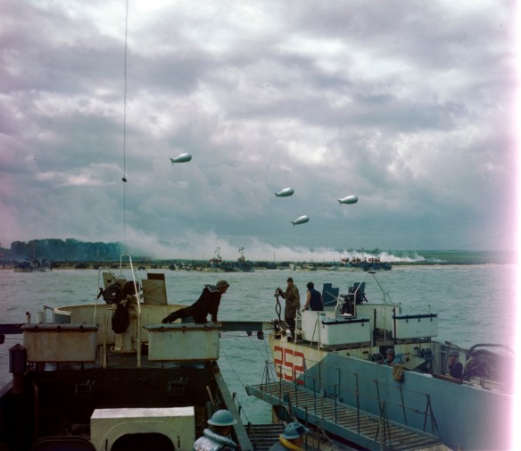
A colour photograph showing a landing craft approaching the beach, with smoke coming from a village and barrage balloons overhead.

Infantry landing craft at D-Day, June 6, 1944. (e010777287)

On this day 75 years ago, Canadian soldiers, sailors, pilots and aircrew were fighting in France in one of the largest military operations in history. Operation Neptune, or “D-Day,” was the first phase in the overall ground operations in Normandy, code-named “Operation Overlord.” Soldiers of the 3rd Canadian Infantry Division conducted an assault landing on a stretch of French coast, in the massive Allied effort to establish a new theatre of operations in Western Europe. Canadian units were tasked with creating a beachhead on a section of coast code-named Juno Beach. The assignment for Canadian forces was considered an honour, as the other four beaches, code-named “Utah,” “Omaha,” “Gold,” and “Sword,” were earmarked for landings by units of the powerful Allied members of the United States and Great Britain.

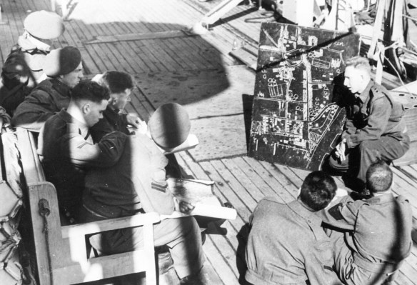
A black-and-white photograph of an officer briefing a small group of non-commissioned officers with a map of a village.

Lieutenant R.R. Smith briefing the non-commissioned officers of the Regina Rifles with a sketch of their objective, Courseulles-sur-Mer, France. (e011084119)

Senior Allied commanders and military planners at Supreme Headquarters Allied Expeditionary Force had learned from previous operations, such as the failure at Dieppe two years before, and the successful landings in Sicily in July 1943. This effort to open a new front in the war would benefit from a coordinated approach between land, sea, and air forces, along with comprehensive planning, attention to logistics, a massive build-up of equipment and personnel, feints and decoys to keep the enemy guessing, and a steady flow of accurate intelligence about enemy strengths and dispositions.

An armada of naval vessels escorted the invasion forces across the English Channel, while the airspace was controlled by squadrons of Allied aircraft. A vast array of specialized landing craft transported personnel, tanks, and artillery. In the Canadian sector, craft deposited men and equipment near the villages of Courseulles-sur-Mer, Bernières-sur-Mer, and Saint-Aubin-sur-Mer.

A colour photograph showing soldiers, laden with arms and equipment, walking in shallow water towards a French village.

Canadian infantry going ashore at Bernières-sur-Mer in Normandy, France. (e010750646)

Tanks of the 2nd Canadian Armoured Brigade struggled ashore and began supporting the advancing infantry soldiers by firing on reinforced enemy positions, while some units of the Royal Canadian Artillery had already been bombarding enemy positions from their landing craft on the final approach. Hours earlier, paratroopers of the 1st Canadian Parachute Battalion had been dropped deep behind enemy lines as part of Operation Tonga, the airborne landings by the British 6th Airborne Division. Their mission was to destroy bridges, secure strongpoints, support a nearby attack by British paratroopers, and generally create chaos and hamper enemy efforts to counter-attack.

A black-and-white photograph showing a soldier in a paratrooper jump smock, holding a Sten sub-machine gun, sitting on a bicycle in a field.

Private Tom J. Phelan, 1st Canadian Parachute Battalion, who was wounded at Le Mesnil on June 16, 1944, rides his airborne folding bicycle at the battalion’s reinforcement camp, England, 1944. (a204971)

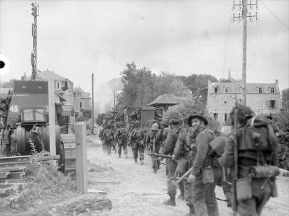
A black-and-white photograph showing a column of soldiers marching up a street in a damaged village.

Infantrymen of Le Régiment de la Chaudière moving through Bernières-sur-Mer, France, June 6, 1944. (a131436)

The fighting on the ground was accompanied by more involvement from Canadians serving in other forces. Pilots and aircrew flying with many Royal Canadian Air Force and Royal Air Force squadrons provided air cover for the naval operation and ground fighting, patrolled the coasts, attacked enemy troops and armour, provided photo-reconnaissance, and served on bombing missions to support the landings.

A black-and-white photograph showing a group of RCAF personnel posing beside and on top of a fighter-bomber aircraft, fitted with a large bomb.

RCAF 440 Squadron members pose with a Hawker Typhoon in Normandy, France. (e010775786)

On D-Day, Royal Canadian Navy personnel served in more than 70 naval vessels (landing craft, destroyers bombarding the coast, and minesweepers clearing the way for the invasion forces). In early July, a naval Beach Commando unit went ashore to direct forces and maintain order on the invasion beaches.

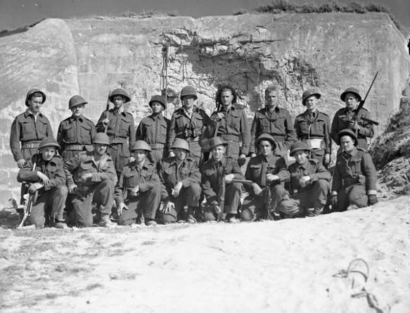
A black-and-white photograph showing two rows of sailors in battle dress, front row crouching, with a damaged fortified concrete structure behind them.

Personnel of W-2 Party, Royal Canadian Navy Beach Commando “W” outside a German fortification in the Juno sector of the Normandy beachhead, France, July 20, 1944. (a180831)

The first Canadian boots on the ground in France would be joined by an entire army in mid-July. The First Canadian Army would become the largest formation of men and women in uniform in Canadian history. Bitter fighting continued as the Allied ground forces resisted counter-attacks and pushed inland. Canadian army units would gain objectives in operations at Carpiquet, around Caen, and advancing towards Falaise, but at great human cost.

Approximately 350 Canadian military personnel were killed during the D-Day landings. By the end of August, Canadian land, sea, and air forces had suffered about 5,000 fatalities as a result of operations in France, while many more were wounded. Operation Overlord closed in late August, as opposition crumbled in Normandy and surviving German units withdrew to regroup.

A black-and-white photograph showing a long column of German soldiers being directed by Allied soldiers along a beach, with vehicles, a sea wall, and a prominent house in the background.

German personnel captured on D-Day embarking for England. (a132474)

Check back on July 4th to read Part two of LAC’s 75th Anniversary of D-day series, which will explore some of the unique collections LAC holds about these events.


Alex Comber is a Military Archivist in the Government Archives Division at Library and Archives Canada.

The Children of Topley – Pint-sized portraits from the William Topley collection

The William Topley collection at Library and Archives Canada is an invaluable resource for those interested in nineteenth-century Canadian photographic portraiture. Comprised of over 150,000 glass plate negatives as well as studio proofs and counter books, the Topley collection dates from 1868 to 1923, and illustrates the prolific career of Topley, a Montreal-area native, who began his solo career by opening a branch of the William Notman studio on Ottawa’s Wellington Street. While Topley did photograph subject matter other than people, portraits were his chosen specialty and the collection is a wonderful example of early Canadian studio work.

By the early 1870s Topley had purchased the studio he had been managing for William Notman, and was attracting upwards of 2,300 sitters per year. Topley’s prestigious downtown Ottawa location—he moved multiple times over the years, but always within walking distance to parliament—meant he attracted much of the city’s elite, including politicians and other important figures, who made their way to the photographer’s studio to have their portraits taken.

Children were often the subject of these portraits, posing alone or with siblings. In looking through these images we notice not only recognizable names, identifying some of these children as the offspring of the capital city’s movers and shakers, but something unchanged despite the time period. We see beyond the formality, the constricting clothing and stiff poses, and recognize that these portraits are not too different from those we might take today. We recognize children dressed up for a photo, attempting to sit still, looking either overly eager or slightly bored.

Black-and-white photograph of a young girl in a white dress.

Missie McLaren, 1873 (MIKAN 3461050)

Studio photographers of this era often had clients pose with props, and Topley was no different. In his portraits of children we notice items like books, skipping ropes, dolls or pets clutched in the hands of the small sitters. Some children stand or sit up very straight with serious, concentrated expressions on their faces, while others lounge tiredly in chairs. In these ones especially, we can imagine how tedious the long exposures must have felt to a child, how many plates the photographer might have had to take to get a proper, non-blurry image.

Black-and-white photograph of a young girl with her chin resting on her hands, a book beside her.

Missie Cambie, 1877 (MIKAN 3435180)

Also interesting are the portraits of babies with hidden, or barely-in-the-frame mothers. It was quite common at the time for babies to sit on their mothers’ laps for a portrait, while a blanket or other fabric was thrown over the mother so that only the baby would be the focus. In several of Topley’s portraits of babies, we see a more subtle approach, with the mother encouraging the child from the edge of the frame. The photographer would later crop the mother out for the final print.

Black-and-white photograph of a young child with the mother to the right, partially blacked out.

Missie Ruttan, 1876 (MIKAN 3434482)

These wonderful portraits provide an alternative perspective on the face of Canada’s capital in the nineteenth century, and seem to offer a bridge from past to present, where some things never change.

Black-and-white photograph of two young boys in black jackets, one seated and one standing on a chair.

Two boys posing—Master Borthwick, 1882 (MIKAN 3418410)

Black-and-white photograph of a young girl dressed in winter clothing.

Missie Helena Topley, 1882 (MIKAN 3418246)

Related resources: