Proud to be peculiar: The little-known story of the Archives Museum

By Geneviève Morin

One ordinary June day in 2011, an unordinary mystery landed on the desks of Library and Archives Canada’s (LAC) documentary art archivists. A small bronze statuette of James Wolfe by sculptor Vernon March had just been found at the Lord Elgin Hotel in Ottawa, carefully wrapped and secretly left unattended. The only clue was a note in which the anonymous author expressed regret at having stolen the statuette “in an act of foolishness” while visiting the Archives in the 1950s. Now in the twilight of his life, he was endeavouring to make amends…

The archivists familiar with the history of LAC’s non-textual collections immediately got to work: research was undertaken, paperwork was retrieved, and provenance was confirmed. The bronze likeness of General Wolfe had indeed been added to the Archives’ holdings in 1914! The statuette was gratefully retrieved and eventually transferred to its new current home, the Canadian Museum of History.

However, the question remains… Why would archives ever have collected that sort of sculpture in the first place? Do archives not typically stick to two-dimensional material like textual documents, photographs, maps and drawings? To be sure, even though many Canadians are aware that LAC and its predecessor institutions (the National Archives of Canada, the National Library of Canada and the Public Archives of Canada) have acquired non-textual material for over 130 years, few are familiar with the reason why our holdings were—and, in some cases, still are—so eclectic.

The bold ambition of Arthur Doughty

Simply put, the diversity of our past and present holdings is in large part owed to Canada’s second Dominion Archivist, Arthur Doughty. His ambition, as he explained in the Archives’ 1925 Catalogue of Pictures, was nothing short of making the institution “… a national department of history, where are preserved sources of every kind having value for the study of the history of Canada.” This was a substantial mandate, to say the least…

Black-and-white photograph of a man with a mustache wearing a dark suit and boots. He is sitting in a wood chair and reading a book beside a wood desk covered in papers. There are large plants, a wall with many framed images and a fireplace mantel in the background. General Wolfe’s leather campaign chair leans against the wall to the man’s right.

Dr. Arthur G. Doughty, Dominion Archivist, c. 1920, Pittaway Studio. (c051653)

Doughty’s vision caused a considerable increase in the types of material acquired by the Archives after his appointment, in 1904. The gargantuan Duberger model of Québec, pictured below, transferred from the British War Office in 1908, is one of the most striking examples of this change in acquisition practices.

Black-and-white photograph of a large room with display tables running along the sides and lights hanging from the ceiling. In the background, there is a large model of a city.

Grey Room, Public Archives of Canada, Sussex Street, after 1926. (a066642) (The model was built at Québec by draftsman Jean-Baptiste Duberger and Royal Engineer John By between 1806 and 1808. Today, the model is in the custody of Parks Canada.)

Over the years, the Archives became responsible for taking in thousands of diverse items, which included artefacts such as:

  • the red tunic worn by Isaac Brock at the time of his death during the Battle of Queenston Heights;
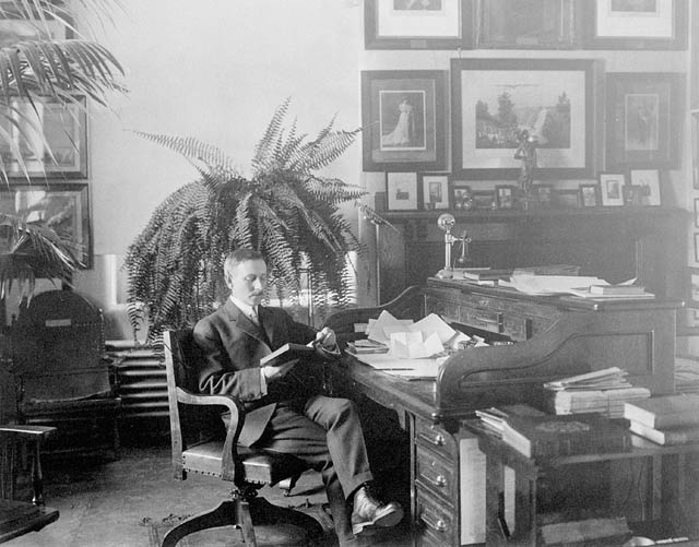
  • James Wolfe’s leather campaign chair (pictured above in Doughty’s office, left-hand side);
  • a war club said to have been used in the War of 1812 and several other weapons;
  • Indigenous eyewear, weapons and clothing;
  • mirrors, chandeliers and various pieces of furniture;
  • the nation’s most extensive collections of coins, tokens, paper money, medals and decorations;
  • and quirkier curiosities, such as a wooden potato pounder believed to have been used in the kitchen of Sir John Johnson, and an elaborate set of brass sleigh-bells having once belonged to Princess Louise and the Marquis of Lorne.

In short, nothing seemed to be off limits for the Archives, as long as it could teach Canadians something about their history.

Black-and-white photograph of a wood cabinet with a mirror. On top of the cabinet is an elaborately decorated mantel clock. There are two candelabras in the shape of cranes standing on turtles’ backs on either side of the cabinet.

Raingo Frères mantel clock on display at the Public Archives building, date unknown. (a066643)

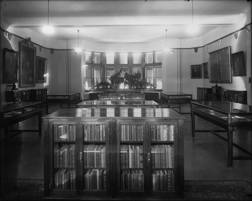
A must-see for locals and visitors alike

Deemed “A Treasure-House for the Canadian Historian” by Saturday Night Magazine in 1910, the Archives came to develop a hugely successful museum program providing space for Canadians to immerse themselves in displays that combined publications, textual records, and varying forms of specialized media, such as maps, photographs, paintings, engravings, and three-dimensional artefacts. Coincidentally, the infamous Wolfe statuette can be seen in just such a display in the photograph below, taken around 1926, co-starring with Benjamin West’s painting The Death of General Wolfe in the Archives’ Northcliffe Room.

Black-and-white photo of a room with book cases and display cabinets. In the background, there are windows and plants.

The Northcliffe Room in the Public Archives Building, Sussex Street. Ottawa, Ont., ca. 1926-1930. (a137713). The Vernon March statuette of Wolfe can be seen on top of the display case below the large painting on the right wall.

Housed in various spaces that included three custom-built rooms on the ground floor of the Archives building at 330 Sussex Street, the permanent exhibits were regularly supplemented by special displays marking commemorative events, the intake of significant acquisitions, or the visit of important guests. Space was tight, but under the guidance of Doughty and curators Mr. Weber and A.E.H. Petrie, nearly every usable surface was considered an opportunity to showcase the collection—even hallways and Doughty’s own office.

Black-and-white photograph of a large room with display cabinets, a statue, flags, plants, framed images, chairs and a throne.

Minto Room, Public Archives of Canada, arranged for a reception for delegates attending the Imperial Conference – Ottawa, August 1932. (c000029) The sovereign’s throne [centre-right] was housed at the Archives Museum when not in use at the Senate of Canada.

Black-and-white photograph of a long narrow room. There are two hanging lights in the middle of the room, and posters are plastered on each wall.

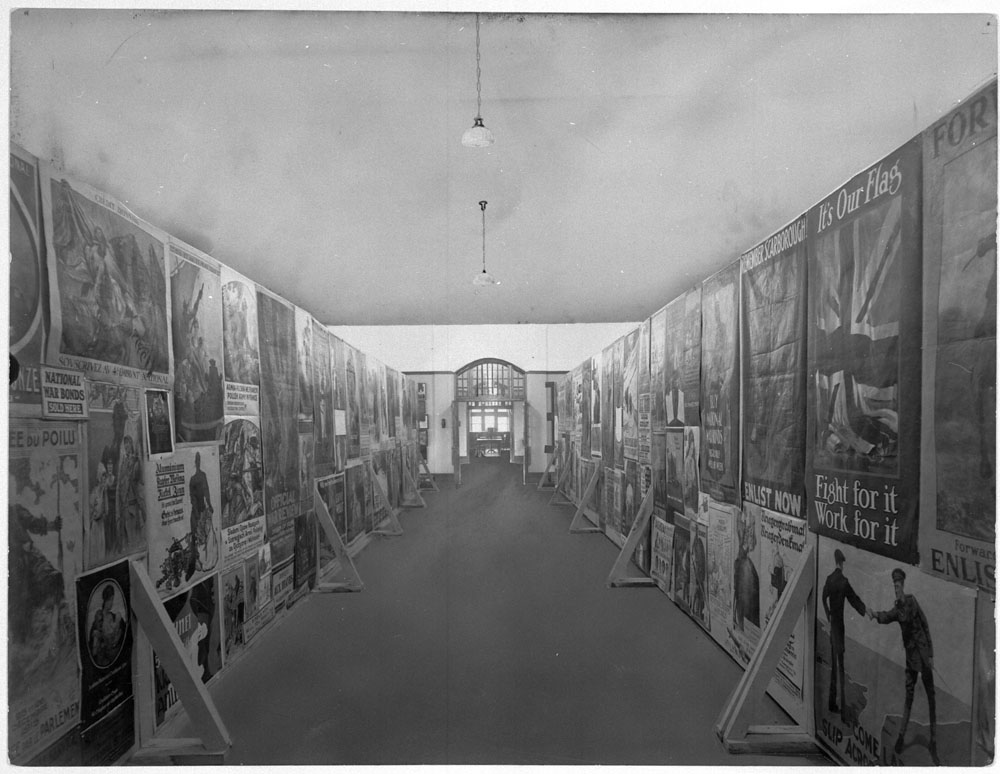
War Posters Room, Public Archives Building, Sussex Street, c. 1944 (a066638). We still find thumbtack holes in some of the war posters in LAC’s collections. Conservation and exhibition practices have greatly evolved since the days of the War Posters Room!

As a result, the Archives Museum hosted countless groups of schoolchildren, scholars, history enthusiasts and visiting dignitaries. The popular attraction was even graced by Princess Elizabeth and the Duke of Edinburgh in 1951. The royal couple enjoyed the experience so much that, as Archives officials proudly reported, “[by] the time the party had signed the visitor’s book and left for Government House, a much longer period had elapsed than had been arranged for in the official programme.”

Black-and-white photograph of four men and one woman looking at items in a glass display cabinet. One man is pointing at a document in the cabinet.

“Their Royal Highnesses the Princess Elizabeth and the Duke of Edinburg in the Public Archives, accompanied by the Hon. F. Gordon Bradley, Secretary of State (left).” Report of the Public Archives for the year 1951.

By the mid-1960s, the Museum’s popularity was growing by leaps and bounds. Unfortunately, as Mr. Petrie observed in 1960, this level of success did have its adverse effects: “One guard seems to be insufficient for the three rooms [as there have been] petty thefts and minor vandalism to collection items.” Security was struggling to keep up with growing crowds; perhaps these were the conditions in which the Wolfe statuette came to its unfortunate disappearance?

The unavoidable unsustainability

Ultimately, Doughty’s well-intentioned ambition could not keep going in this manner. After nearly 60 years of existence, the Museum had accumulated such a large three-dimensional collection that the Archives building was bursting at the seams. Space had become so tight that, in 1965, the exhibition spaces occupying the Sussex building had to be moved to temporary lodgings at the Daly Building, near the Château Laurier; so did the surplus artifacts that had until then been stored at the Loeb Building, on Besserer Street.

Black-and-white photograph of two buildings. On the left side of the image, there are blurry people and cars. In the foreground, power lines can be seen.

G.T.R. Hotel [Chateau Laurier] and Ria [Daly] Building. William James Topley, after 1911. (a009116) The federal government bought and began occupying the Daly Building, a commercial building, in 1921.

Appraisal of the Museum’s conundrum by both the Massey Commission of 1951 and the Glassco Commission of 1963 provided the necessary weight to the argument for downsizing. While the Archives had gone beyond their traditional role at a time when “no alternative was available,” it was obvious that being the national archives and a museum all at once was impossible and no longer necessary. The time had come to share the burden of responsibility with other existing institutions.

New building, reduced holdings

In 1967, the National Library and National Archives of Canada moved to new quarters, at 395 Wellington Street in Ottawa. While this modern, custom-designed building did include exhibition spaces, the displays of days past would not be replicated there; rather, focus would be dedicated to the wealth of resources found in the library and archives holdings.

The years surrounding the move were therefore occupied with the redistribution of the Museum’s collection. Most of the three-dimensional artefacts were transferred to the upcoming Museum of Man (now known as the Canadian Museum of History), while war trophies and military artefacts remained behind at the Sussex location to continue on as part of Canada’s War Museum. Approximately 16,000 coins and other monetary items were sent to the Bank of Canada, and the Archives’ philatelic holdings were taken in by the Post Office Department. The Archives retained its holdings of some 6,000 military, commemorative and ecclesiastical medals and tokens; these, along with the extensive collection of paintings, remained part of the Public Archives holdings of documentary art and objects. Mr. Petrie stayed on as Curator of Museum and Numismatics, showing groups around exhibits and paintings on display and conducting tours of the new building’s impressive decorative and architectural features.

A continuing legacy

As Library and Archives Canada evolves into the 21st century, the spirit of Doughty’s ambition and the legacy of the Archives Museum live on through a distinctly Canadian approach to archives. Bred out of collecting and caring for over 100 years’ worth of government records, private papers and non-textual “sources of every kind,” this approach has generated the eclectic array of expertise that remains with LAC’s professionals to this day. Most importantly, it has ensured that a diverse trove of documentary heritage continues to intrigue, inform and impress Canadians and visitors alike, even though security and access conditions have become just a bit tighter since the days of the Wolfe statuette affair.


Geneviève Morin is a Senior Archivist for Documentary Art, Objects and Photography, Government Archives Division.

Five Myths about the Arms of Canada

This article contains historical language and content that some may consider offensive, such as language used to refer to racial, ethnic or cultural groups. Please see our historical language advisory for more information.

By Forrest Pass

The Coat of Arms of Canada (also known as the Arms of Canada, the Canada Coat of Arms and the Royal Coat of Arms of Canada) turns 100 on November 21, 2021. An official emblem of the Government of Canada, the coat of arms appears on Canadian passports, banknotes, military badges, and public buildings. Elements of the coat of arms have influenced the design of other emblems, notably the National Flag of Canada, adopted in 1964.

A colour painting of a coat of arms. The shield at the centre is divided into five sections. The first section is red with three gold lions. The second section is gold with a red lion within a red fleur-de-lis border. The third section is blue with a gold harp. The fourth section has three gold fleurs-de-lis. The bottom (fifth) section is silver with a sprig of three green maple leaves. Above the shield is a crest consisting of a crowned gold lion holding a red maple leaf in its right paw. The lion stands on a twisted wreath of red-and-white silk atop a gold royal helmet. The motto “A mari usque ad mare” is written on a blue scroll below the shield, which rests on roses, thistles, shamrocks and lilies. The shield is supported by a lion and a unicorn. The lion holds a lance to which a British flag is attached. The unicorn holds a lance with a blue flag charged with three gold fleurs-de-lis, the banner of pre-Revolutionary France.

The final design for the Coat of Arms of Canada, 1921. Illustration by Alexander Scott Carter. (e008319450) The signatures of the committee members, including Dominion Archivist Arthur Doughty, appear in the bottom right-hand corner.

Library and Archives Canada preserves the records of the committee that designed the coat of arms. This committee, struck by the federal cabinet in 1919, included Dominion Archivist Arthur Doughty. Unlike the flag debate some four decades later, the coat of arms question never prompted a parliamentary debate or widespread public discussion. As a result, few Canadians know much about the deliberations that led to the adoption of the coat of arms, and popular myths about the emblem’s history and meanings have filled the gap. Here are five misconceptions, debunked by primary sources.

Myth # 1: The three maple leaves on a single stem were chosen to represent Canadian multiculturalism.

The three maple leaves on the shield are the Arms’ most distinctively Canadian feature. Since the 1960s, some commentators have suggested that this arrangement of leaves represents the unity of Canadians of different backgrounds. In her twangy ballad Three Red Leaves, written during the Great Flag Debate of 1964, country-and-western singer Diane Leigh praised the “Three red leaves all tied together / [that] Bind three nationalities in unity / English, French, and new Canadians / Living in this land of opportunity.” Until very recently, some official publications also described the leaves as symbolizing Canadians of all origins, including First Nations, Inuit, and the Métis Nation, who were conspicuously absent from Leigh’s lyrics.

An emblem’s meaning evolves with the country it represents, so the symbolism of “unity in diversity” is attractive today. However, there is no evidence that the committee intended the leaves to represent this Canadian ideal. Rather, a sprig of three maple leaves was already a popular emblem by 1921. It first appeared as decoration on a Saint-Jean-Baptiste Day poster in 1850. The three-leaf motif also appears on the provincial arms of Quebec and Ontario, which the heralds of the College of Arms in London designed in 1868. In 1868, as in 1921, the choice of three leaves was probably aesthetic rather than symbolic: three leaves fill the triangular base of a heraldic shield better than one.

A typed page with the heading “Association Saint Jean-Baptiste” featuring a sprig of three maple leaves. Components of a parade, including “Drapeau britannique,” “les pompiers canadiens,” “la Société mercantile d’économie,” “la Societé de tempérance” and “Bannière du commerce,” are listed below the heading in a variety of typefaces.

A poster advertising the annual procession of the Association Saint-Jean-Baptiste, Montréal, June 24, 1850. (OCLC 1007829742) This is perhaps the earliest use of three maple leaves on a single stem.

Myth # 2: King George V chose red and white to be the national colours of Canada.

Beginning in the 1940s, Colonel Archer Fortescue Duguid, a military historian and heraldry enthusiast, suggested that King George V had chosen red and white to be Canada’s national colours because these were the colours of the wreath and mantling—the flowing cloth around the helmet—of the Arms of Canada. Therefore, Duguid argued, a new Canadian flag must also be red and white.

The idea that the Arms design would determine Canada’s national colours originated in 1918 with Eugène Fiset, the Deputy Minister of Defence. To Fiset, red suggested Britishness, military sacrifice, and autumn splendour. White evoked chilly Canadian winters. The coat of arms committee’s first design incorporated Fiset’s proposed red maple leaves on a white background, as well as a red-and-white wreath on top of the shield.

A colour painting of a coat of arms. The shield at the centre is divided into five sections. The first section is white with a sprig of three red maple leaves. The second section is red with three gold lions. The third section is gold with a red lion within a fleur-de-lis border. The fourth section is blue with a gold harp. The fifth section is blue with three gold fleurs-de-lis. On top of the shield is a crest consisting of a crowned gold lion holding a maple leaf in its right paw and standing on a patch of green grass, the whole resting on a twisted wreath of red-and-white silk. Under the wreath is a shield. Below the shield, the motto “A mare usque ad mare” is written in a grey scroll. The shield is supported by a lion and a unicorn.

The committee’s first proposal, illustrated by Alexander Scott Carter, 1920. (e011313790) Green maple leaves replaced the red in the final version, but the red-and-white wreath, and eventually red-and-white mantling, remained.

However, not everyone was a fan. Sir Joseph Pope, Undersecretary of State for External Affairs, preferred green maple leaves to red ones, which to him suggested death and decay. In the end, Pope prevailed, but the red-and-white mantling remained, probably by accident.

No one, least of all the King, cared much about the mantling in 1921. When a concerned citizen complained in 1922 that the mantling should be red and gold—the main colours of the shield—committee members shrugged and replied that it was too late to make changes. Neither the royal proclamation nor an official pamphlet issued in 1922 to explain the Arms’ symbolism mentions national colours. In 1946, during parliamentary hearings on a new Canadian flag, heraldry buff Hugh Savage rebutted Duguid: a national flag, not a coat of arms, typically gave a country its “national colours.”

Nevertheless, Duguid’s theory convinced many people and contributed to the choice of red and white for the Canadian flag in 1964.

Myth # 3: The chained unicorn commemorates the British conquest of New France.

The supporters in the form of a lion and a unicorn are borrowed from the Royal Arms of the United Kingdom, reflecting the Imperial loyalties of the committee. The unicorn originally represented Scotland. Its chain perhaps recalls medieval legends about how difficult it is to tame these mythical beasts.

Because the Canadian chained unicorn also holds a royal French banner, some have interpreted this depiction as symbolizing British dominance over French Canada. There is no evidence that the committee intended, or even considered, this possible interpretation.

However, the committee’s inclusion of three gold fleurs-de-lis on the shield did concern the King’s heraldic advisors. The College of Arms worried that the fleurs-de-lis, intended to honour French Canadians, might imply that Canada claimed sovereignty over France! Canada’s Commissioner-General in Paris discreetly confirmed with French officials that the design would not spark a diplomatic spat.

A colour painting of a coat of arms. The shield at the centre is divided into seven sections. The first and fourth sections are red with three gold lions. The second section is gold with a red lion within a fleur-de-lis border. The third section is blue with a gold harp. The fifth and seventh sections are white, and each has a single green maple leaf. The sixth section is blue with three gold fleurs-de-lis. Above the shield is a crest consisting of a crowned gold lion holding a red maple leaf in its right paw. The lion stands on a twisted wreath of red-and-white silk. Below the shield, the motto “A mari usque ad mare” is written on a blue banner. The shield is supported by a lion and a unicorn. The lion holds a lance to which a British flag is attached. The unicorn holds a lance with a blue flag charged with three gold fleurs-de-lis, the banner of pre-Revolutionary France.

Counter-proposal from the College of Arms, London, September 1921. (e011313801) The English College of Arms suggested a new placement of the fleurs-de-lis so as not to imply that Canada ruled France. The Canadians rejected this idea.

Myth # 4: The committee that designed the coat of arms did not consider including Indigenous symbols in the design.

The symbols of two colonizing powers, Great Britain and France, dominate the Arms of Canada; there is no reference to Indigenous peoples. Yet one proposed design did spark a discussion with respect to featuring First Nations figures as supporters. It was a submission from Edward Marion Chadwick, a Toronto lawyer interested in both heraldry and First Nations cultures.

A black-and-white drawing of a coat of arms. The shield at the centre features a lion between two maple leaves at the top and a fleur-de-lis at the bottom. On top of the shield is a crest, consisting of a moose with its right hoof raised, standing on a twisted wreath and flowing cloth mantling; the crest sits on top of an esquire’s helmet marked with a cross. Below the shield, there is a scroll that reads “Dieu Protege Le Roy.” Two First Nations men support =the shield. They are wearing feathered headdresses and fringed buckskin clothing. One holds a tomahawk; the other holds a calumet, or ceremonial pipe.

Proposed Canadian Coat of Arms, by Edward Marion Chadwick, 1917. (e011313794) The supporters featured in Chadwick’s version were intended to represent First Nations from Eastern and Western Canada.

Including Indigenous figures and emblems in colonial heraldry was not unprecedented. The centuries-old arms of Nova Scotia and Newfoundland and Labrador both have First Nations figures as supporters, and the pre-Confederation seal of Upper Canada included a calumet, or ceremonial pipe, to commemorate treaties and alliances. However, to Sir Joseph Pope, who often spoke for the coat of arms committee, Indigenous peoples were a forgettable part of the past. “I myself do not see any necessity for commemorating the Indians at all,” wrote Pope in dismissing Chadwick’s proposal.

Pope’s response was racist, and reflected the opinion of many white Canadians of the time. Few people today would approve of Chadwick’s design either, but for very different reasons. Chadwick did strive to depict clothing and regalia accurately. However, to modern eyes, his proposal smacks of stereotyping and cultural appropriation. His supporters are “noble savages,” romantic fantasies of what First Nations individuals look like. They represent regions of the country rather than constitute meaningful inclusion of Indigenous people, who were not consulted about the coat of arms project. Today, many Indigenous individuals rightfully object to the way that they have appeared in heraldry. As a result, the provincial government of Newfoundland and Labrador, for example, is now reconsidering how First Nations individuals are depicted on its coat of arms, designed in 1635. Canada would undoubtedly be doing the same if Chadwick’s design had prevailed.

Myth # 5: The Arms of Canada can never be changed.

Could the Canadian government change the Arms of Canada to make them more representative of a diverse country? Coats of arms have an air of ancient permanence, but even very old emblems can evolve. For example, the Royal Arms of the United Kingdom—the model for Canada’s Arms—have changed half a dozen times since the union of the English and Scottish crowns, in 1603, most recently  in 1837). Since 1921, artists have twice reinterpreted the official version of the Arms of Canada, in 1957 and 1994, to update its “look and feel” without changing the formal elements.

If, one day, the Government of Canada wants to change the Arms design, it will require the collaboration of the Canadian Heraldic Authority, the division of the Office of the Secretary to the Governor General responsible for granting and registering coats of arms in Canada. The next time a major change occurs, there will be no need to consult British heraldic authorities, though the Queen (or King) will still have to approve the final design.

Whether it resulted in modifications to the current arms or in a completely new design, the process today would undoubtedly be more participatory—and more transparent—than it was a century ago.


Forrest Pass is a curator with the Exhibitions team at Library and Archives Canada.