A Sweet Proposal… for a New Canadian Flag

Version française

By Forrest Pass

February 15, 2025, is the sixtieth birthday of the National Flag of Canada. The media and heritage institutions—including Library and Archives Canada—often mark the flag’s anniversary by sharing some of the “also-rans,” a selection of Canadians’ design submissions in the months and years leading up to the flag’s adoption.

It’s fun to speculate about alternative designs: for example, what would the Canadian Olympic teams’ uniforms look like if we had selected a flag other than the now-iconic red-and-white maple leaf design? What’s more, these rejected designs tell us something about their creators’ values and their ideas about the country’s past, present and future.

Flag enthusiasts often have our favourite “also-rans.”  The story of my favourite runner-up brings together two mid-February fixtures: flags and chocolates.

In 2013, while working as a historian at the Canadian Museum of History, I found a set of ten small fabric flags for sale on eBay that appeared to date from the Great Flag Debate. The seller, sadly, knew nothing about their origins, having bought them as part of a trunk load of miscellaneous bric-a-brac at an estate sale. However, these little flags were noteworthy to me because so few proposed designs made it off the drawing board; it took a rare confidence in one’s own design—and a little bit of disposable income—to produce fabric examples for distribution.

Small white flag with blue and red crosses and a green maple leaf in the middle.

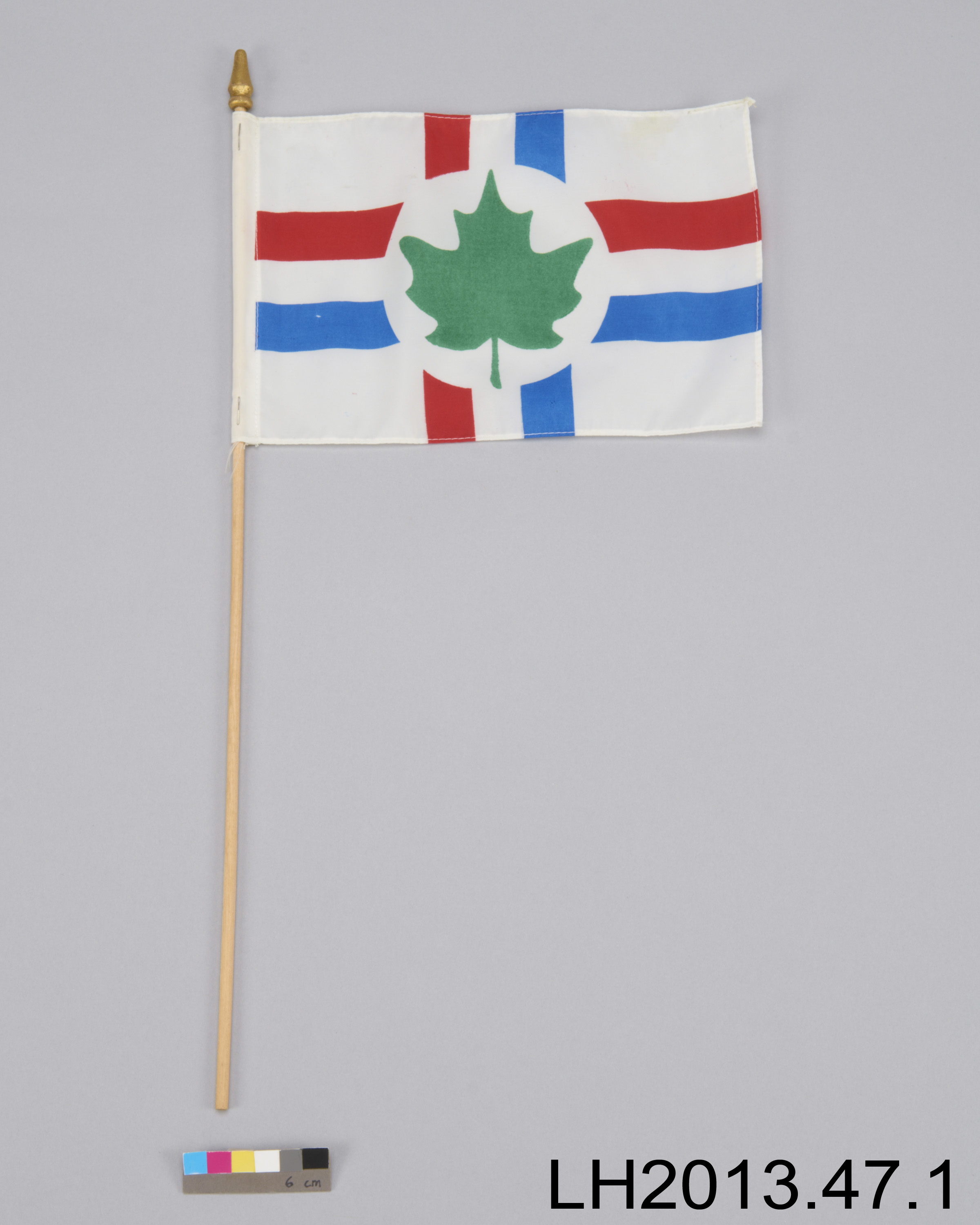
A mysterious Canadian flag proposal. (Canadian Museum of History, 2013.47.1)

I could confirm that the proposal had been submitted to the House of Commons flag committee because it hangs, alongside many others, on the wall of the committee’s meeting room in a 1964 press photo. This was enough to justify the flags’ acquisition for the museum’s collection, but I still hoped to identify the designer and the flags’ intended symbolism.

Black and white photo of seventeen men and one woman sitting or standing around a table surrounded by flag designs.

Members of the House of Commons Flag Committee surrounded by 1200 designs for a new Canadian flag, October 7, 1964. The mystery flag is circled in red. (Library and Archives Canada, a213164)

As luck would have it, a colleague came across a reference to this very flag four years later in the Hansard record of the Great Flag Debate. In a speech on August 26, 1964, Clément Vincent—MP for Nicolet-Yamaska, Quebec—had described both the flag and its symbolism to his fellow parliamentarians. A little more digging in Hansard, and I had the name of the designer: Jean Dubuc. And after some Internet sleuthing, I uncovered a letter to a newspaper, an obituary and a Facebook profile. I was soon corresponding with the designer’s son, Daniel Dubuc, who told me more of his father’s story.

Jean Dubuc (1920–1965) was born in Chandler, Quebec, and grew up in Chicoutimi, where his grandfather was a pulp-and-paper and hydroelectricity magnate. He joined the Quebec public service in 1951 and settled in the Québec City suburb of Sainte-Foy. A lifelong heraldry enthusiast, he conceived his proposed Canadian flag in the late 1950s. In 1959, he sent a copy of it to every senator and member of the House of Commons. He included a printed bilingual cover letter, and his son generously donated a copy to the museum.

Among the thousands of designs submitted before and during the Great Flag Debate, Dubuc’s stands out. For one, he cleverly intertwined the red cross of St. George on a white background, the traditional flag of England, with the pre-revolutionary French merchant ensign, a white cross on a blue background. Thus, the Dubuc flag evoked gave equal status to the two principal settler communities without using the more familiar—and sometimes controversial—Union Jack and fleur-de-lys.

A second intriguing feature was Dubuc’s inclusion of Indigenous people in his flag design, at a time when most designs, including the one finally selected, included no such reference. The white field of the flag, wrote Dubuc, represented “the first occupants of the land,” the First Nations and Inuit, “still in possession of vast expanses of snow and ice of this country.” This comment put Dubuc ahead of his time: even the few mid-century amateur designers who did include Indigenous symbolism rarely acknowledged that Indigenous people were still around, much less that they still owned and occupied these lands. (Dubuc did not mention the third constitutionally recognized Indigenous group in Canada today, the Métis Nation, whose history and continued existence were less well known in the 1950s, particularly in eastern Canada.)

During our conversations, Daniel Dubuc also told me a tantalizing tidbit: his father had produced another piece of ephemera to promote his flag design. It was a foldable model that explained the components of the design and showed how they fit together. Unfortunately, the family did not have a copy, at least not at hand. I made a mental note to keep an eye open for one.

Then in 2022, I found it. I was going through the papers of Guy Marcoux, a Ralliement des créditistes (Social Credit) MP for Québec-Montmorency, not far from Dubuc’s home in Sainte-Foy. In Marcoux’s substantial reference file on the flag question, the Dubuc model stood out among dozens among letters, leaflets and collage flag mock-ups.

Three images of a pamphlet titled “l’Histoire du drapeau” (English translation: The history of the flag). Printed paper model of a flag with blue and red crosses and a green maple leaf in the middle. The model also includes instructions on how to layer the symbols and the meaning of each symbol.

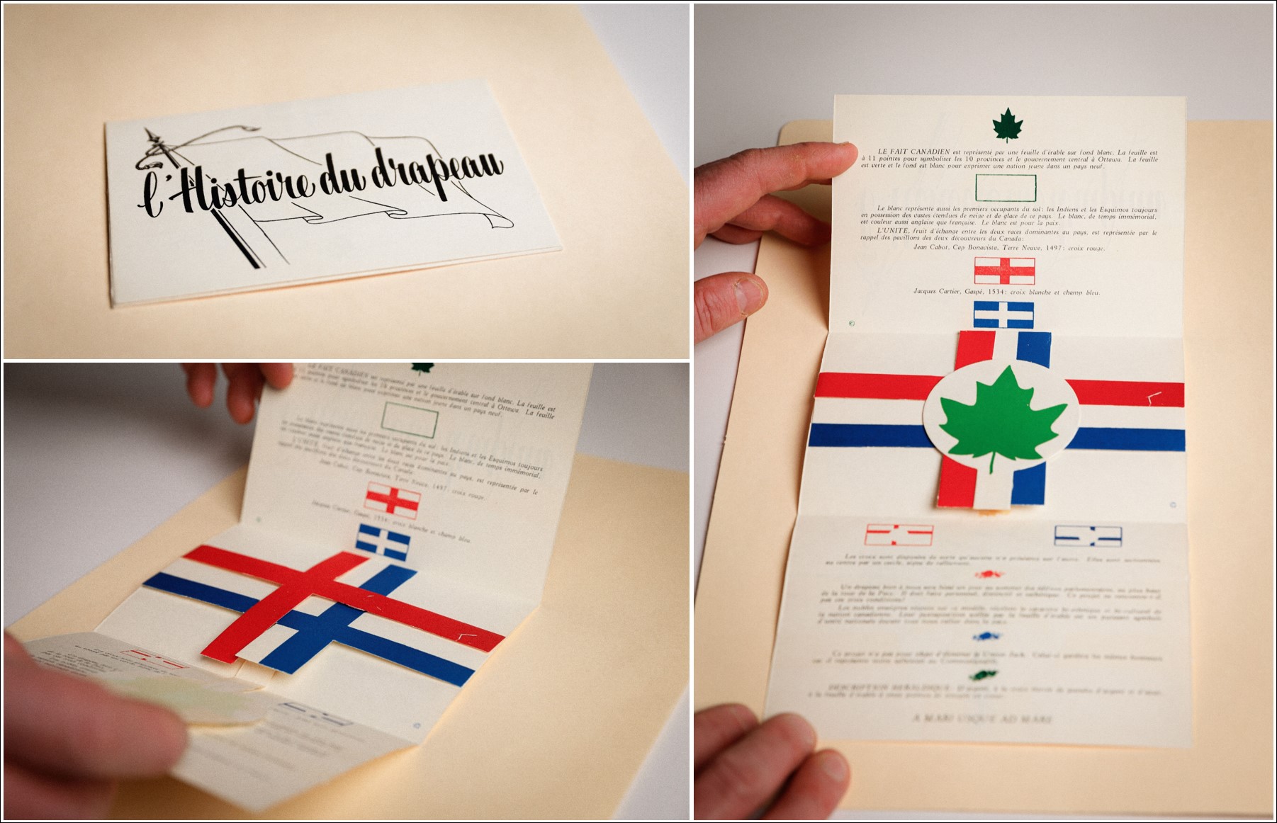
Jean Dubuc’s folding flag model. (Library and Archives Canada, Fonds Guy Marcoux, MIKAN 110969)

As I had suspected from Daniel Dubuc’s description, Jean Dubuc’s flag model was inspired by a similar model depicting the history of the Union Jack, distributed by Laura Secord as a promotional favour in the 1930s. Like Dubuc’s model, the Laura Secord version illustrated the layers of crosses, colours, and meaning that made up the Union Jack, Canada’s official national flag for domestic purposes until 1946. The concept was popular: Laura Secord adapted its insert to support the war effort, and American sister company, Fanny Farmer Candy Shops, distributed a similar favour explaining the history of the Stars and Stripes.

Three images of a paper model illustrating the history of the Union Jack. Folding flaps representing the crosses of St. Andrew, St. George, and St. Patrick show how the flag is constructed and how it has evolved.

Folding model of the Union Jack produced by Laura Secord Candy Shops to mark the coronation of King George VI, 1937. (Library and Archives Canada. National Archives of Canada Postcard Collection. MIKAN 15178)

In his personal campaign for a distinctive flag, Jean Dubuc adapted a format—the folding paper model—that would have been familiar to decision-makers and ordinary Canadians, especially if they were chocolate lovers. His simple, striking design lent itself to this elegant promotional form. My rediscovery of Dubuc’s flag model reminds us also that although the records of the flag committee have been well publicized, there are other collections at Library and Archives Canada that continue to yield surprising details of the Great Flag Debate sixty years later. When you open an archival box, as when you open a box of chocolates, you never know what you’re going to get.


Forrest Pass is a curator with the Exhibitions team at Library and Archives Canada.

Five Myths about the Arms of Canada

This article contains historical language and content that some may consider offensive, such as language used to refer to racial, ethnic or cultural groups. Please see our historical language advisory for more information.

By Forrest Pass

The Coat of Arms of Canada (also known as the Arms of Canada, the Canada Coat of Arms and the Royal Coat of Arms of Canada) turns 100 on November 21, 2021. An official emblem of the Government of Canada, the coat of arms appears on Canadian passports, banknotes, military badges, and public buildings. Elements of the coat of arms have influenced the design of other emblems, notably the National Flag of Canada, adopted in 1964.

A colour painting of a coat of arms. The shield at the centre is divided into five sections. The first section is red with three gold lions. The second section is gold with a red lion within a red fleur-de-lis border. The third section is blue with a gold harp. The fourth section has three gold fleurs-de-lis. The bottom (fifth) section is silver with a sprig of three green maple leaves. Above the shield is a crest consisting of a crowned gold lion holding a red maple leaf in its right paw. The lion stands on a twisted wreath of red-and-white silk atop a gold royal helmet. The motto “A mari usque ad mare” is written on a blue scroll below the shield, which rests on roses, thistles, shamrocks and lilies. The shield is supported by a lion and a unicorn. The lion holds a lance to which a British flag is attached. The unicorn holds a lance with a blue flag charged with three gold fleurs-de-lis, the banner of pre-Revolutionary France.

The final design for the Coat of Arms of Canada, 1921. Illustration by Alexander Scott Carter. (e008319450) The signatures of the committee members, including Dominion Archivist Arthur Doughty, appear in the bottom right-hand corner.

Library and Archives Canada preserves the records of the committee that designed the coat of arms. This committee, struck by the federal cabinet in 1919, included Dominion Archivist Arthur Doughty. Unlike the flag debate some four decades later, the coat of arms question never prompted a parliamentary debate or widespread public discussion. As a result, few Canadians know much about the deliberations that led to the adoption of the coat of arms, and popular myths about the emblem’s history and meanings have filled the gap. Here are five misconceptions, debunked by primary sources.

Myth # 1: The three maple leaves on a single stem were chosen to represent Canadian multiculturalism.

The three maple leaves on the shield are the Arms’ most distinctively Canadian feature. Since the 1960s, some commentators have suggested that this arrangement of leaves represents the unity of Canadians of different backgrounds. In her twangy ballad Three Red Leaves, written during the Great Flag Debate of 1964, country-and-western singer Diane Leigh praised the “Three red leaves all tied together / [that] Bind three nationalities in unity / English, French, and new Canadians / Living in this land of opportunity.” Until very recently, some official publications also described the leaves as symbolizing Canadians of all origins, including First Nations, Inuit, and the Métis Nation, who were conspicuously absent from Leigh’s lyrics.

An emblem’s meaning evolves with the country it represents, so the symbolism of “unity in diversity” is attractive today. However, there is no evidence that the committee intended the leaves to represent this Canadian ideal. Rather, a sprig of three maple leaves was already a popular emblem by 1921. It first appeared as decoration on a Saint-Jean-Baptiste Day poster in 1850. The three-leaf motif also appears on the provincial arms of Quebec and Ontario, which the heralds of the College of Arms in London designed in 1868. In 1868, as in 1921, the choice of three leaves was probably aesthetic rather than symbolic: three leaves fill the triangular base of a heraldic shield better than one.

A typed page with the heading “Association Saint Jean-Baptiste” featuring a sprig of three maple leaves. Components of a parade, including “Drapeau britannique,” “les pompiers canadiens,” “la Société mercantile d’économie,” “la Societé de tempérance” and “Bannière du commerce,” are listed below the heading in a variety of typefaces.

A poster advertising the annual procession of the Association Saint-Jean-Baptiste, Montréal, June 24, 1850. (OCLC 1007829742) This is perhaps the earliest use of three maple leaves on a single stem.

Myth # 2: King George V chose red and white to be the national colours of Canada.

Beginning in the 1940s, Colonel Archer Fortescue Duguid, a military historian and heraldry enthusiast, suggested that King George V had chosen red and white to be Canada’s national colours because these were the colours of the wreath and mantling—the flowing cloth around the helmet—of the Arms of Canada. Therefore, Duguid argued, a new Canadian flag must also be red and white.

The idea that the Arms design would determine Canada’s national colours originated in 1918 with Eugène Fiset, the Deputy Minister of Defence. To Fiset, red suggested Britishness, military sacrifice, and autumn splendour. White evoked chilly Canadian winters. The coat of arms committee’s first design incorporated Fiset’s proposed red maple leaves on a white background, as well as a red-and-white wreath on top of the shield.

A colour painting of a coat of arms. The shield at the centre is divided into five sections. The first section is white with a sprig of three red maple leaves. The second section is red with three gold lions. The third section is gold with a red lion within a fleur-de-lis border. The fourth section is blue with a gold harp. The fifth section is blue with three gold fleurs-de-lis. On top of the shield is a crest consisting of a crowned gold lion holding a maple leaf in its right paw and standing on a patch of green grass, the whole resting on a twisted wreath of red-and-white silk. Under the wreath is a shield. Below the shield, the motto “A mare usque ad mare” is written in a grey scroll. The shield is supported by a lion and a unicorn.

The committee’s first proposal, illustrated by Alexander Scott Carter, 1920. (e011313790) Green maple leaves replaced the red in the final version, but the red-and-white wreath, and eventually red-and-white mantling, remained.

However, not everyone was a fan. Sir Joseph Pope, Undersecretary of State for External Affairs, preferred green maple leaves to red ones, which to him suggested death and decay. In the end, Pope prevailed, but the red-and-white mantling remained, probably by accident.

No one, least of all the King, cared much about the mantling in 1921. When a concerned citizen complained in 1922 that the mantling should be red and gold—the main colours of the shield—committee members shrugged and replied that it was too late to make changes. Neither the royal proclamation nor an official pamphlet issued in 1922 to explain the Arms’ symbolism mentions national colours. In 1946, during parliamentary hearings on a new Canadian flag, heraldry buff Hugh Savage rebutted Duguid: a national flag, not a coat of arms, typically gave a country its “national colours.”

Nevertheless, Duguid’s theory convinced many people and contributed to the choice of red and white for the Canadian flag in 1964.

Myth # 3: The chained unicorn commemorates the British conquest of New France.

The supporters in the form of a lion and a unicorn are borrowed from the Royal Arms of the United Kingdom, reflecting the Imperial loyalties of the committee. The unicorn originally represented Scotland. Its chain perhaps recalls medieval legends about how difficult it is to tame these mythical beasts.

Because the Canadian chained unicorn also holds a royal French banner, some have interpreted this depiction as symbolizing British dominance over French Canada. There is no evidence that the committee intended, or even considered, this possible interpretation.

However, the committee’s inclusion of three gold fleurs-de-lis on the shield did concern the King’s heraldic advisors. The College of Arms worried that the fleurs-de-lis, intended to honour French Canadians, might imply that Canada claimed sovereignty over France! Canada’s Commissioner-General in Paris discreetly confirmed with French officials that the design would not spark a diplomatic spat.

A colour painting of a coat of arms. The shield at the centre is divided into seven sections. The first and fourth sections are red with three gold lions. The second section is gold with a red lion within a fleur-de-lis border. The third section is blue with a gold harp. The fifth and seventh sections are white, and each has a single green maple leaf. The sixth section is blue with three gold fleurs-de-lis. Above the shield is a crest consisting of a crowned gold lion holding a red maple leaf in its right paw. The lion stands on a twisted wreath of red-and-white silk. Below the shield, the motto “A mari usque ad mare” is written on a blue banner. The shield is supported by a lion and a unicorn. The lion holds a lance to which a British flag is attached. The unicorn holds a lance with a blue flag charged with three gold fleurs-de-lis, the banner of pre-Revolutionary France.

Counter-proposal from the College of Arms, London, September 1921. (e011313801) The English College of Arms suggested a new placement of the fleurs-de-lis so as not to imply that Canada ruled France. The Canadians rejected this idea.

Myth # 4: The committee that designed the coat of arms did not consider including Indigenous symbols in the design.

The symbols of two colonizing powers, Great Britain and France, dominate the Arms of Canada; there is no reference to Indigenous peoples. Yet one proposed design did spark a discussion with respect to featuring First Nations figures as supporters. It was a submission from Edward Marion Chadwick, a Toronto lawyer interested in both heraldry and First Nations cultures.

A black-and-white drawing of a coat of arms. The shield at the centre features a lion between two maple leaves at the top and a fleur-de-lis at the bottom. On top of the shield is a crest, consisting of a moose with its right hoof raised, standing on a twisted wreath and flowing cloth mantling; the crest sits on top of an esquire’s helmet marked with a cross. Below the shield, there is a scroll that reads “Dieu Protege Le Roy.” Two First Nations men support =the shield. They are wearing feathered headdresses and fringed buckskin clothing. One holds a tomahawk; the other holds a calumet, or ceremonial pipe.

Proposed Canadian Coat of Arms, by Edward Marion Chadwick, 1917. (e011313794) The supporters featured in Chadwick’s version were intended to represent First Nations from Eastern and Western Canada.

Including Indigenous figures and emblems in colonial heraldry was not unprecedented. The centuries-old arms of Nova Scotia and Newfoundland and Labrador both have First Nations figures as supporters, and the pre-Confederation seal of Upper Canada included a calumet, or ceremonial pipe, to commemorate treaties and alliances. However, to Sir Joseph Pope, who often spoke for the coat of arms committee, Indigenous peoples were a forgettable part of the past. “I myself do not see any necessity for commemorating the Indians at all,” wrote Pope in dismissing Chadwick’s proposal.

Pope’s response was racist, and reflected the opinion of many white Canadians of the time. Few people today would approve of Chadwick’s design either, but for very different reasons. Chadwick did strive to depict clothing and regalia accurately. However, to modern eyes, his proposal smacks of stereotyping and cultural appropriation. His supporters are “noble savages,” romantic fantasies of what First Nations individuals look like. They represent regions of the country rather than constitute meaningful inclusion of Indigenous people, who were not consulted about the coat of arms project. Today, many Indigenous individuals rightfully object to the way that they have appeared in heraldry. As a result, the provincial government of Newfoundland and Labrador, for example, is now reconsidering how First Nations individuals are depicted on its coat of arms, designed in 1635. Canada would undoubtedly be doing the same if Chadwick’s design had prevailed.

Myth # 5: The Arms of Canada can never be changed.

Could the Canadian government change the Arms of Canada to make them more representative of a diverse country? Coats of arms have an air of ancient permanence, but even very old emblems can evolve. For example, the Royal Arms of the United Kingdom—the model for Canada’s Arms—have changed half a dozen times since the union of the English and Scottish crowns, in 1603, most recently  in 1837). Since 1921, artists have twice reinterpreted the official version of the Arms of Canada, in 1957 and 1994, to update its “look and feel” without changing the formal elements.

If, one day, the Government of Canada wants to change the Arms design, it will require the collaboration of the Canadian Heraldic Authority, the division of the Office of the Secretary to the Governor General responsible for granting and registering coats of arms in Canada. The next time a major change occurs, there will be no need to consult British heraldic authorities, though the Queen (or King) will still have to approve the final design.

Whether it resulted in modifications to the current arms or in a completely new design, the process today would undoubtedly be more participatory—and more transparent—than it was a century ago.


Forrest Pass is a curator with the Exhibitions team at Library and Archives Canada.